Final Class Reflection
To begin it's kind of crazy to think that the school year is finally over and that class has came to a end considering half of my school day consist of being in this class. This class has been a pain due to all the stress I brought upon myself due to the being horrible at time management which is something I learned about myself and so being a slow worker in general. Thanks to class I was able to explore and try out new mediums which I hadn't gotten chance to use as much. Spending a whole year in the class with these people made me realized how everyone is absolutely talented in their own ways and have their strengths. Now if I were to be walking down the hall and saw art pieces hung up I would just be like that's Abby's or that Kayla's just based off their styles or techniques they use. Thanks to this class I was able to grow as a artist and person in general I was given a chance to meet people and get closer to others and I'm greatly thankful for that. I just want to say I'm grateful for getting the chance to be in
Final Presentation:
https://docs.google.com/presentation/d/1m6NGR_av08NztUlw1kLNXG-6dMpaV63f4yPNBD5G0t4/edit?usp=sharing
https://docs.google.com/presentation/d/1m6NGR_av08NztUlw1kLNXG-6dMpaV63f4yPNBD5G0t4/edit?usp=sharing
“En Mi Casa Hay”
The name of my concentration is “En Mi Family Hay” which translates to “In My Family There Is. When coming up with my concentration I thought about many ideas but one thing that always stood by me was how my family is the most important thing to me which mainly include my sister and mom. My mom has been both my mom and dad since my dad hasn’t been too much in the picture since I was the age of 9. With this concentration I want to show and embrace the small moments that make up my family with pictures of memories and family and everything that makes me the person I am today.
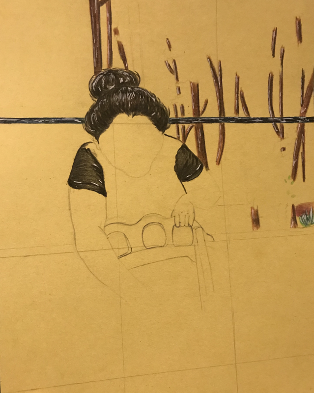
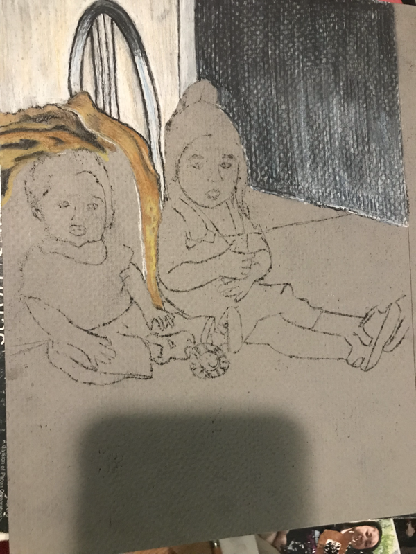
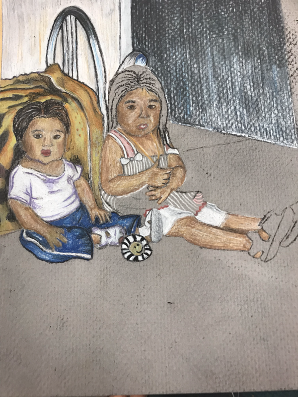
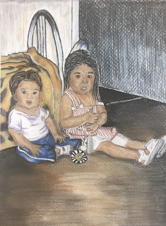
Concentration #1 Process Pictures

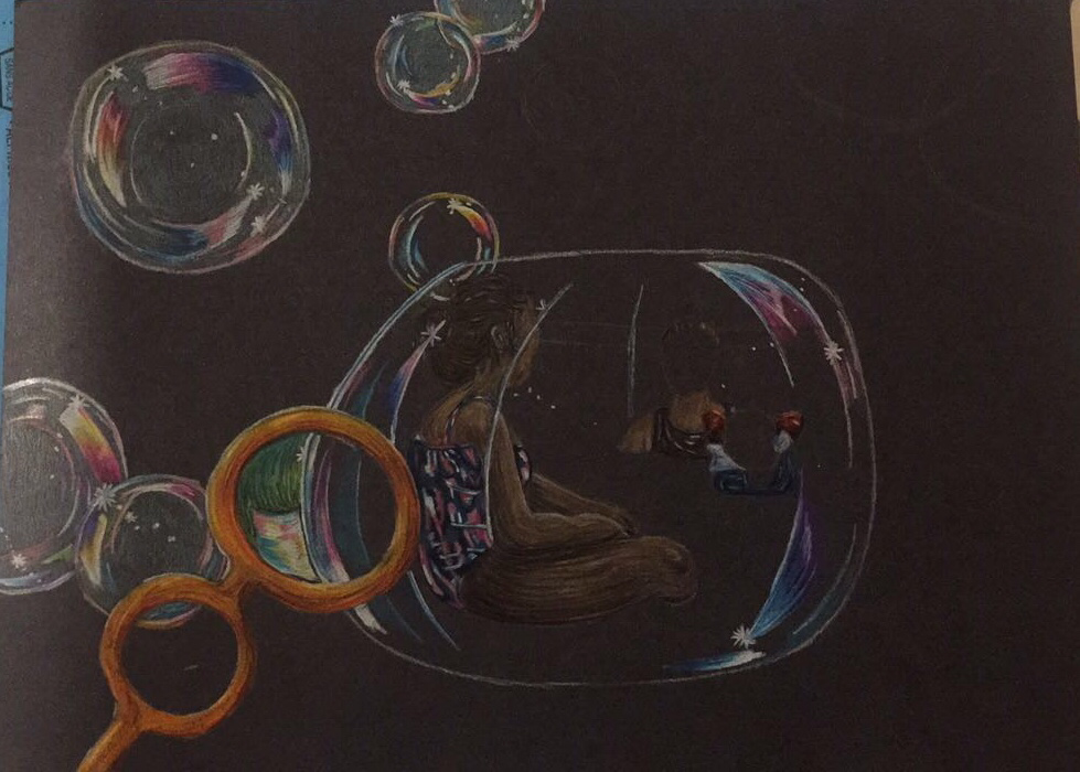

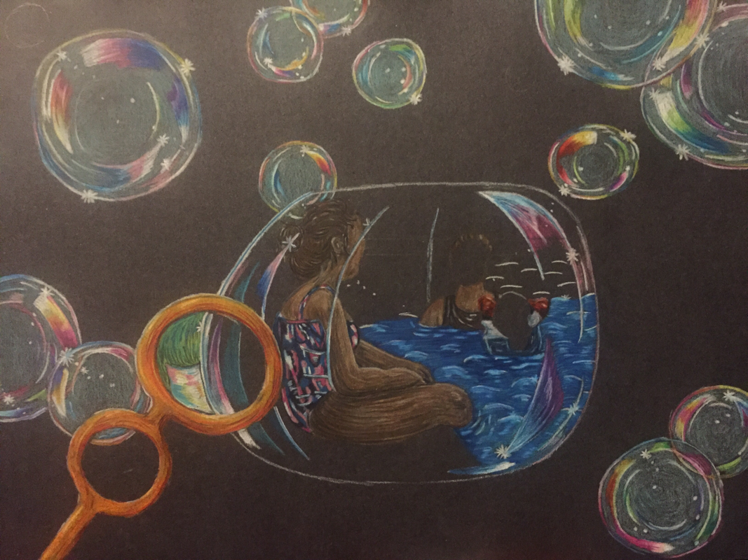
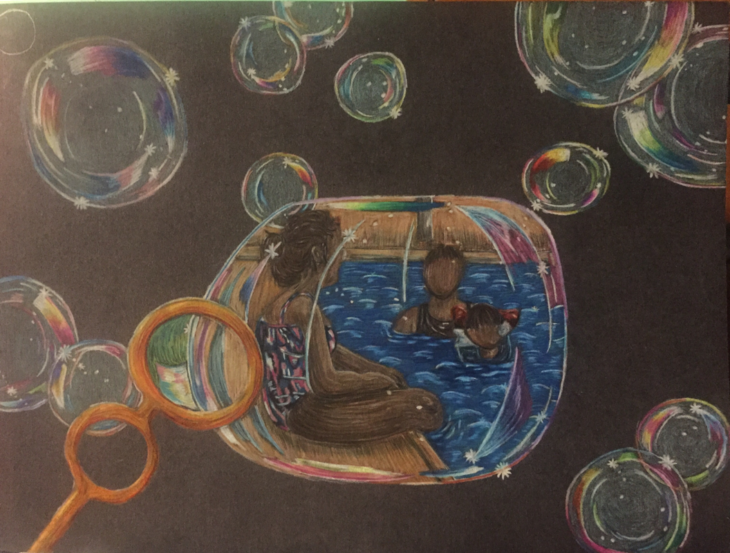
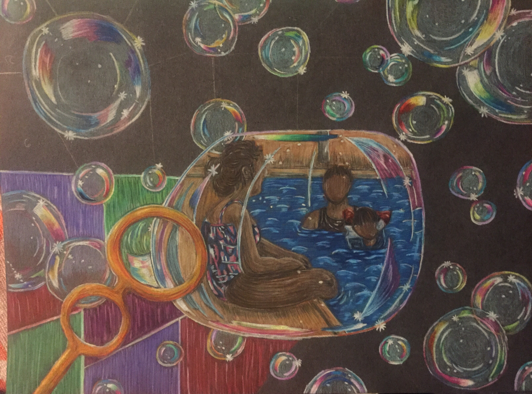
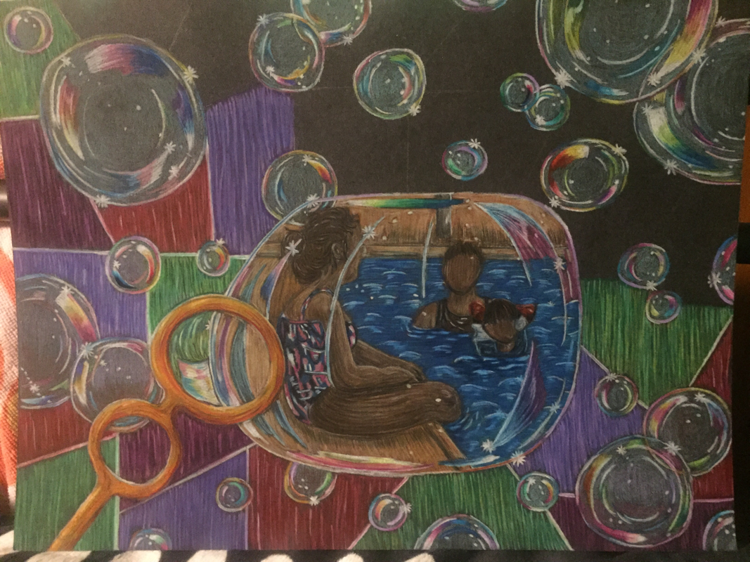
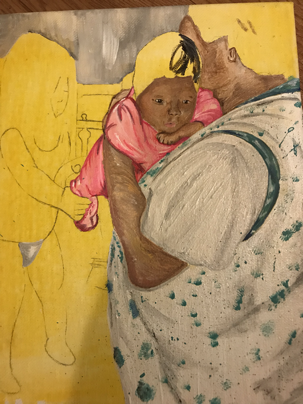
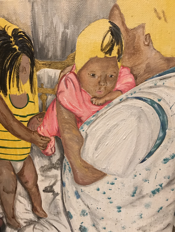
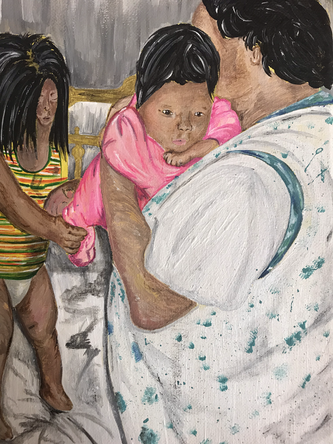
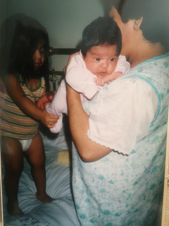
“Memorias Flotan”
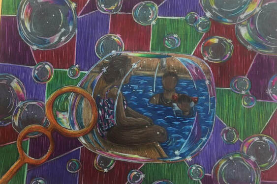
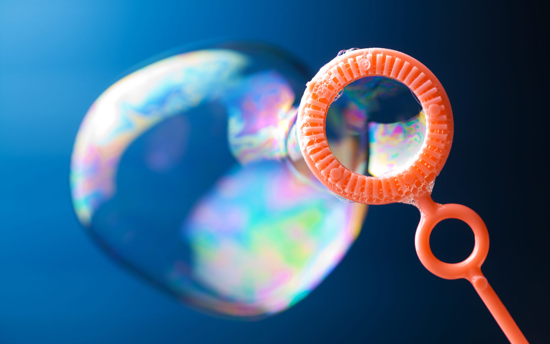
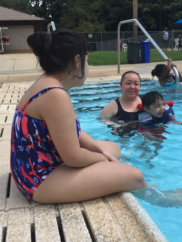
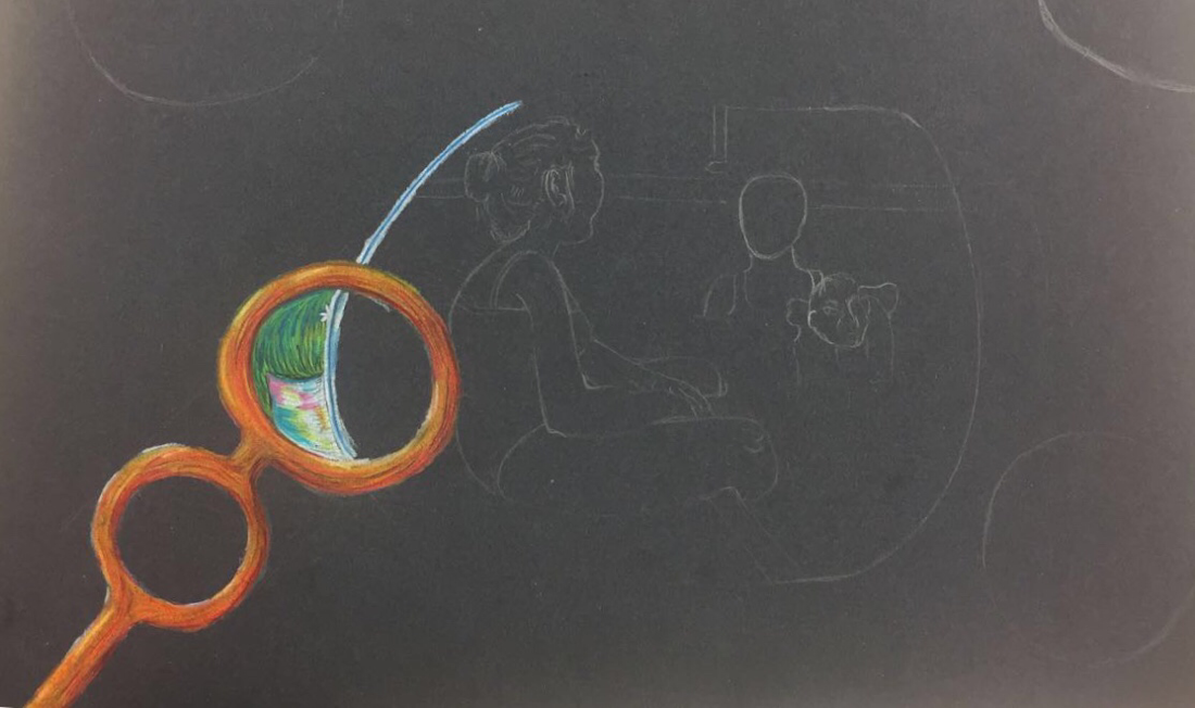
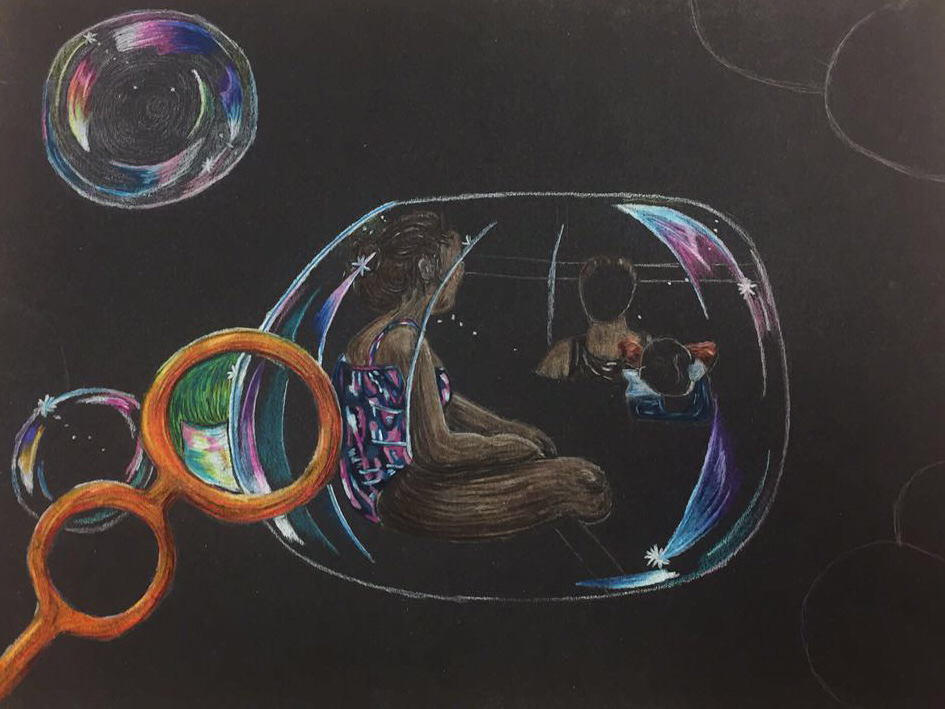
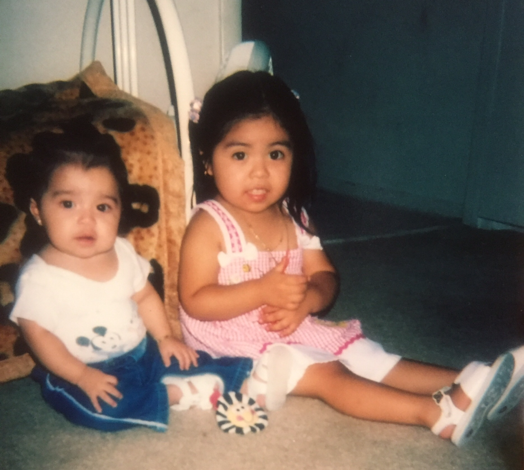
This is my first piece for my concentration project and the name of this project translates to "Memories Float". For my first project I wanted to make it in a abstract manner using prisma color pencils and combine memories from when I was younger to now that I'm older. The first memory being bubbles which relates to my concentration because when my sister and me were younger we would always go out to the porch and play with bubbles while my mom would prepare food or clean house or something along those lines. The second memory which was from now that my sister and me are older, we enjoy going to the pool especially over the summer and spend hours there.
To begin this project what I originally had in mind was to create this piece using the medium of paint but after I began to sketch and practice doing bubbles I ended up liking how it was looking with prisma and I'm glad I chose it. Using this medium really helped me out with getting the different colors in the bubbles and I feel like if I would have done this project in paint I would somehow managed to make this piece muddy and just ended up hating it. Also prisma isn't my strongest medium to work with specially when it comes to creating colors and blending since color pencil isn't the medium I turn to first its always paint but I think this was really a good turn out for me.
With the bubbles I really tried to define the the highlights using whites especially around the edges. I think the hardest part about making the bubbles was adding the different colors into them to give them a "realistic" view to them. For the bubbles I added the lightest shade of blue I could find to lightly color it because I didn't want to just leave it nor just make it white.
As for the inside of the main bubble which had the memory inside of it I added a little wand to show that on was "being blown". I think I should of worked more on the highlights to it and should of made the edges stand out even more. I think I did a good job with creating the skin tone although my sister isn't that dark at all but it worked. With the water I kind of just winged it to be honest because I haven't had much practice with doing water but I think I did a good job with the the highlights I did and the different shades of blue I added it and the soft but noticeable shade I did. I wish I would shaded the color of the ground like made it a more grayish tone.
Overall I think this project was pretty successful and I really liked how it turned out. I'm still indecisive about the background I like it but I feel like it takes attention away from the main concept. Besides that I'm happy with my first piece.
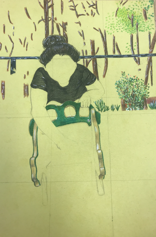
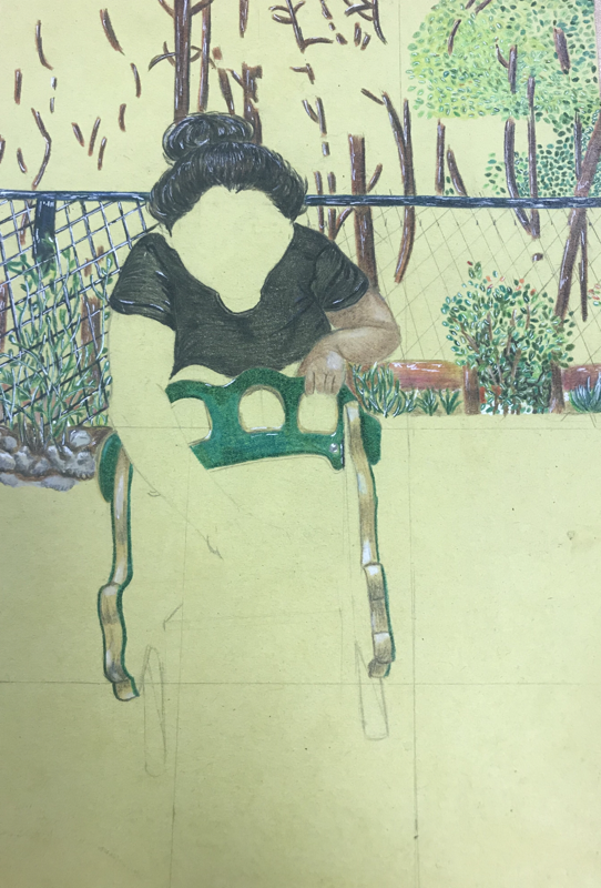
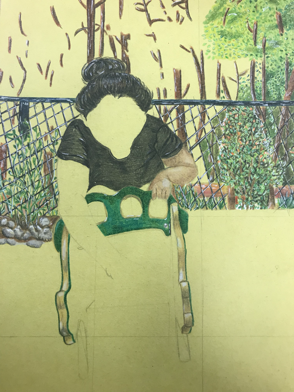
Concentration #2 Process Pictures
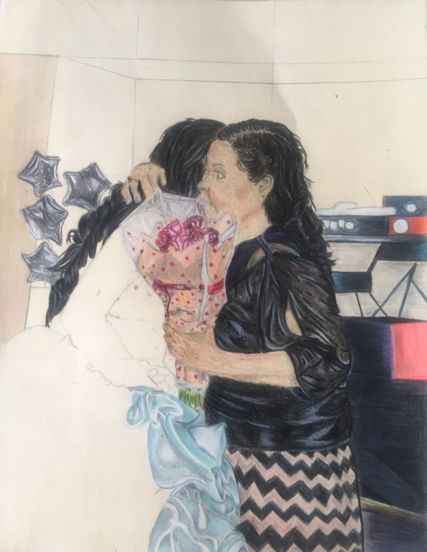
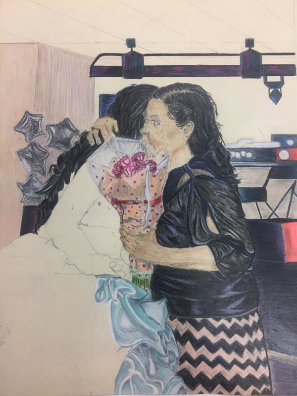
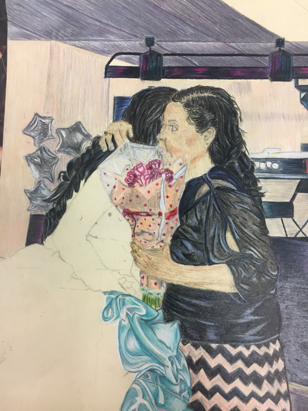
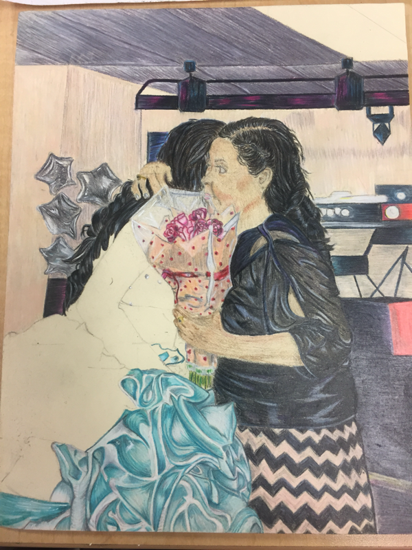
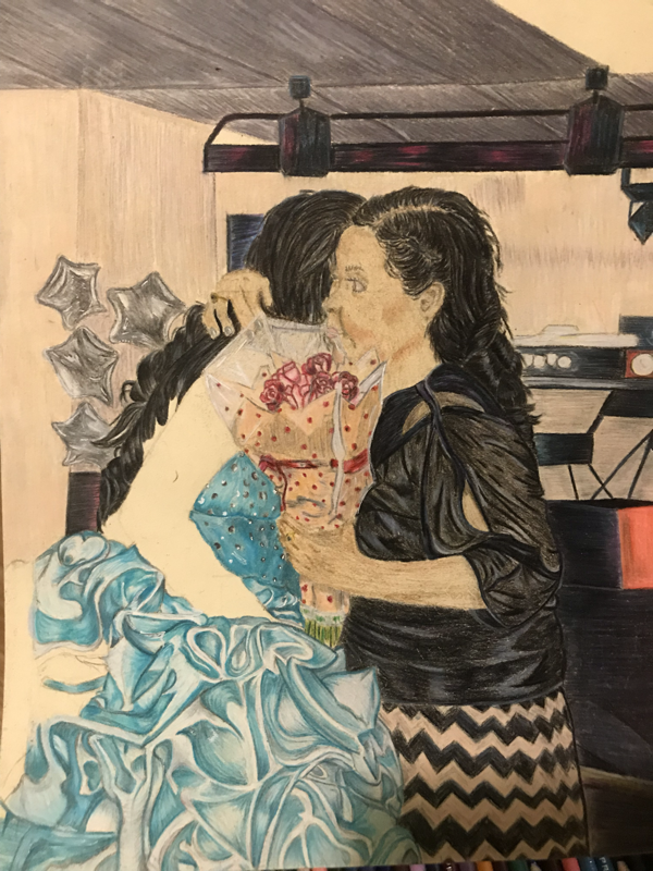
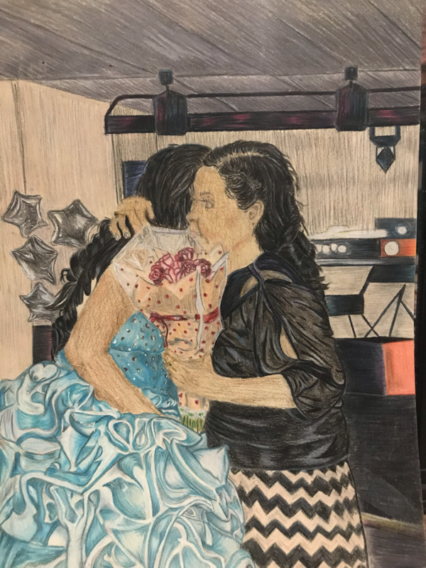
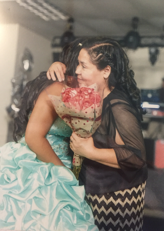
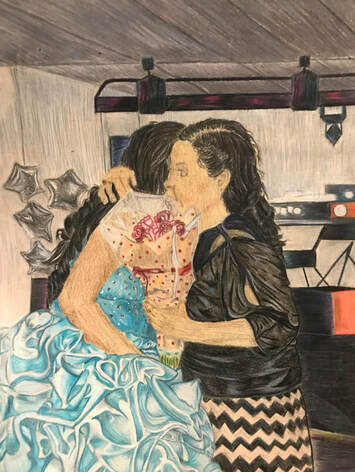
”Cuando Bailamos”
|
|
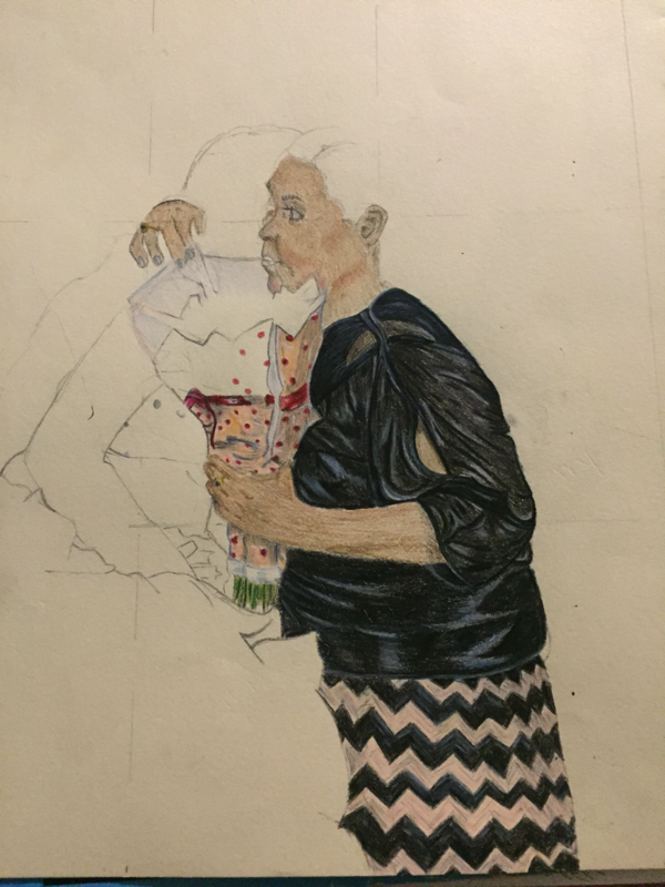
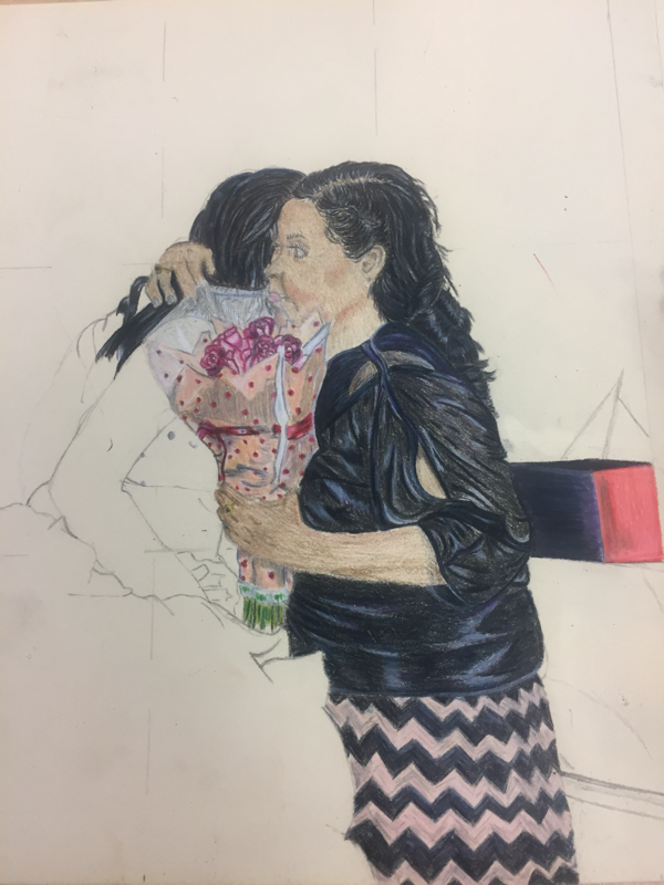
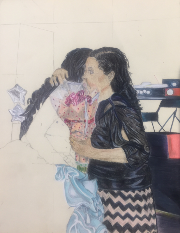
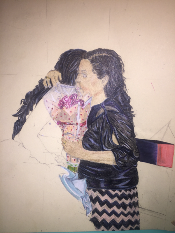
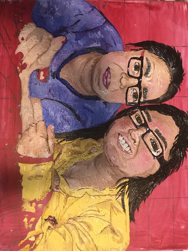
Title of my second piece translates to “When We Dance” I wanted to include this piece because it is important and special memory for me. The picture is of my mom and I dancing together at my quinceañera it holds meaning because instead holding a father daughter dance like every traditional quinceañera would I surprised my mom by dedicating a song to her. Along with the song, I got her a bouquet of roses which I gave to her as a gift for everything she had for me. This image to me shows how much love and happiness we have for each other and reminds me of all the effort, time, and money that my mom put into making my 15th birthday possible and not only that but everything she has done.
Just as my previous piece, I decided to work with prisma colored pencils which I’m really happy I choose because it came out so much better than I had originally had in mind. Throughout I incorporated more colors into the my piece and changed a few. Prisma isn’t my strongest medium to work with especially when doing faces or skin tones so I’m glad I didn’t have to much with that. I do wish I had more practice and made the skin look more blended and natural because it just looks layered and almost as if I didn't try with it. As for the hair I like how it came out with the textures and highlights I was able to add to make it seem realistic I struggled a bit because of the texture of the hair and the way in which it flowing since both my mom's and mine was curled. My main focus for this project was the fabric especially on the fabric of my dress due to all the bright highlights throughout it. I think I was successful with creating all the creases and some of the transitions between the darks and highlights I do wish I would have lightened up the creases more and not have them as bold. As for my mom's dress I ended up also adding in some blues and purples because I didn't want to just leave black.
I wish I would have changed the background of blended it out more to get rid of the bold lines because I feel like they stand out too much and take some sort of attention away and the blending of the skin. Besides that I'm pretty content with my final piece.
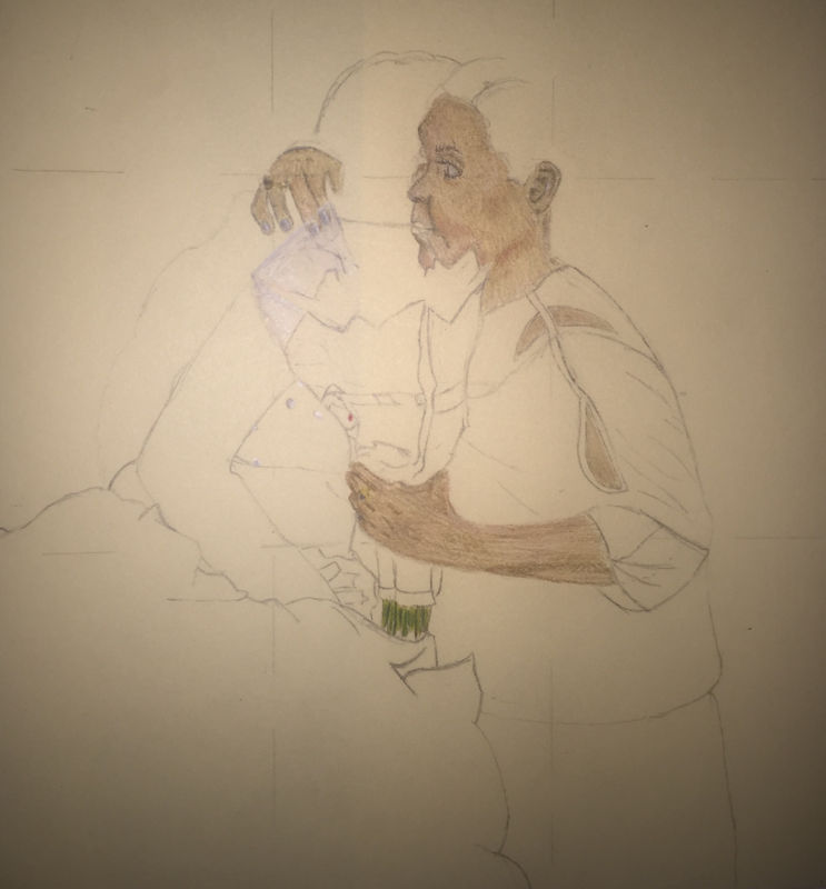
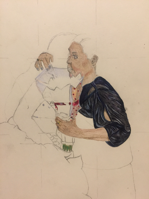
Concentration #3 Process Pictures
not named yet
|
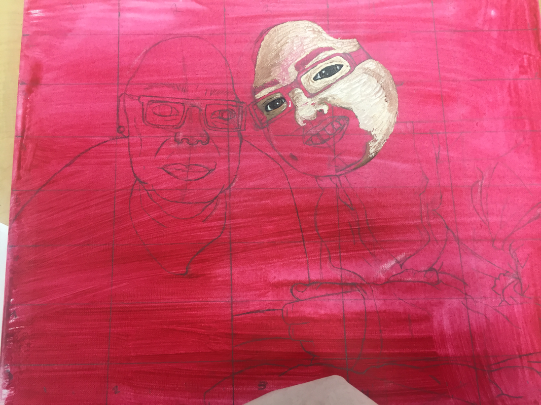
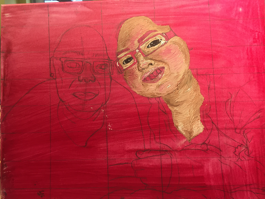
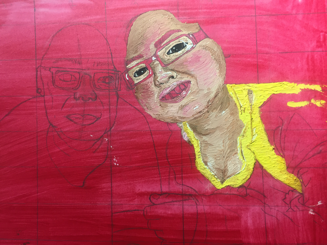
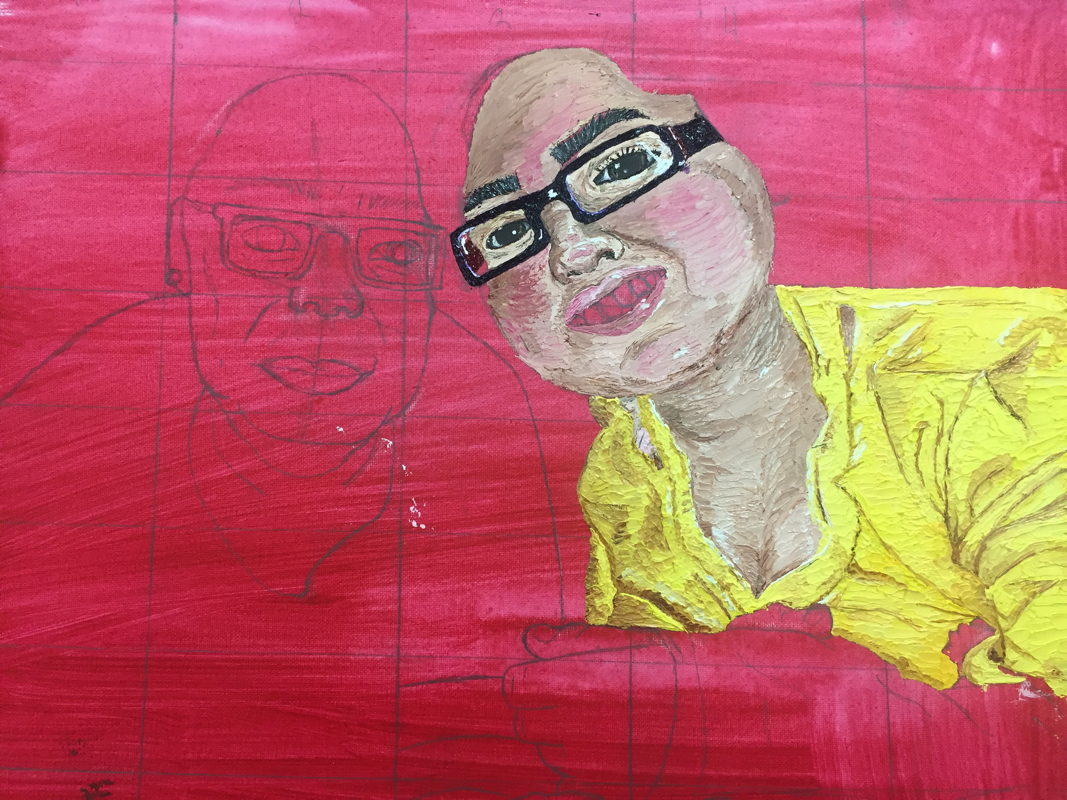
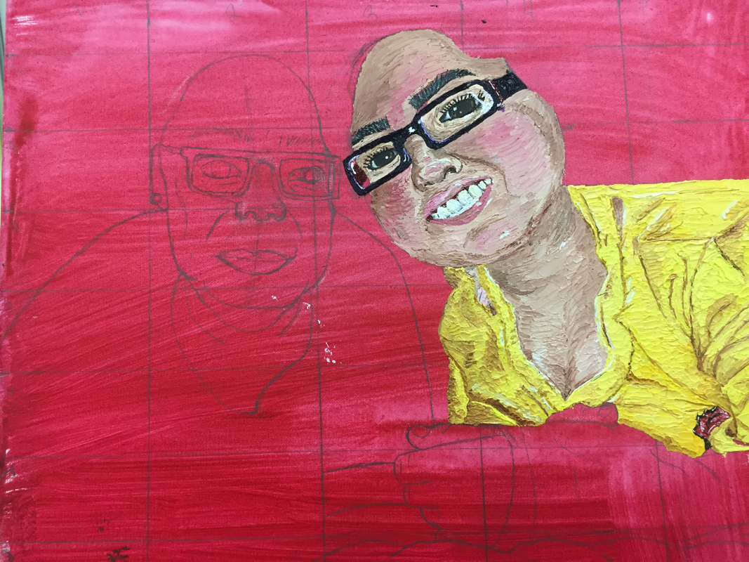
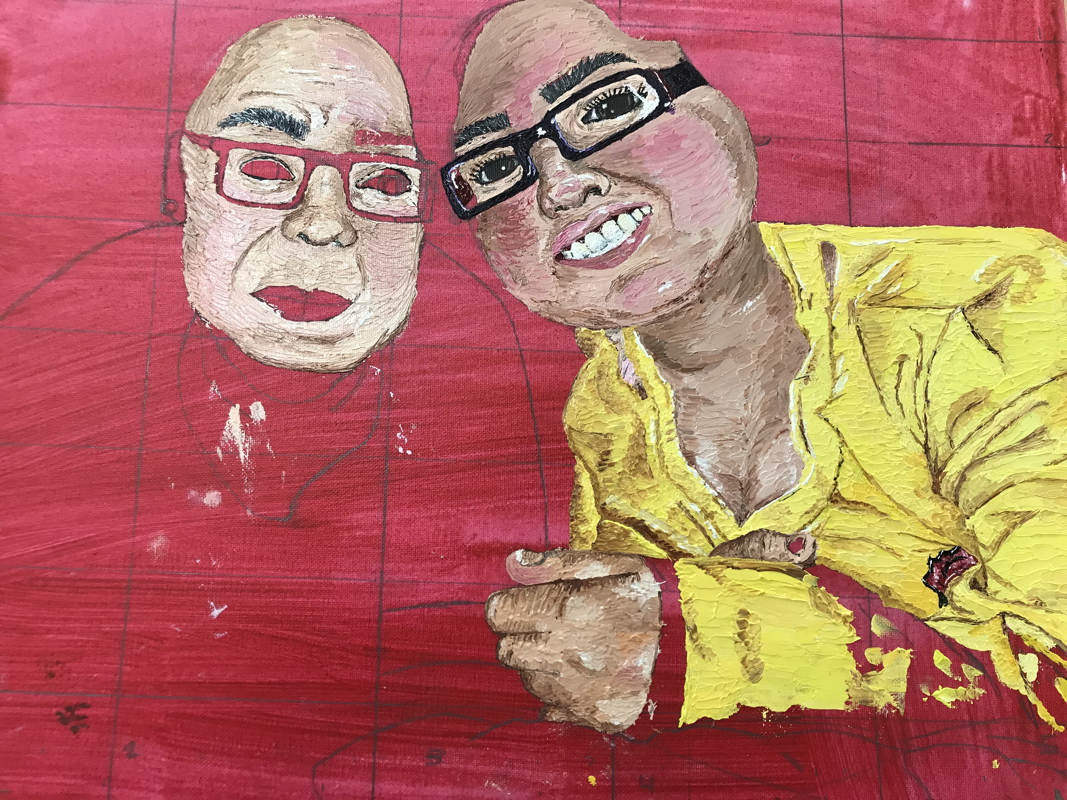
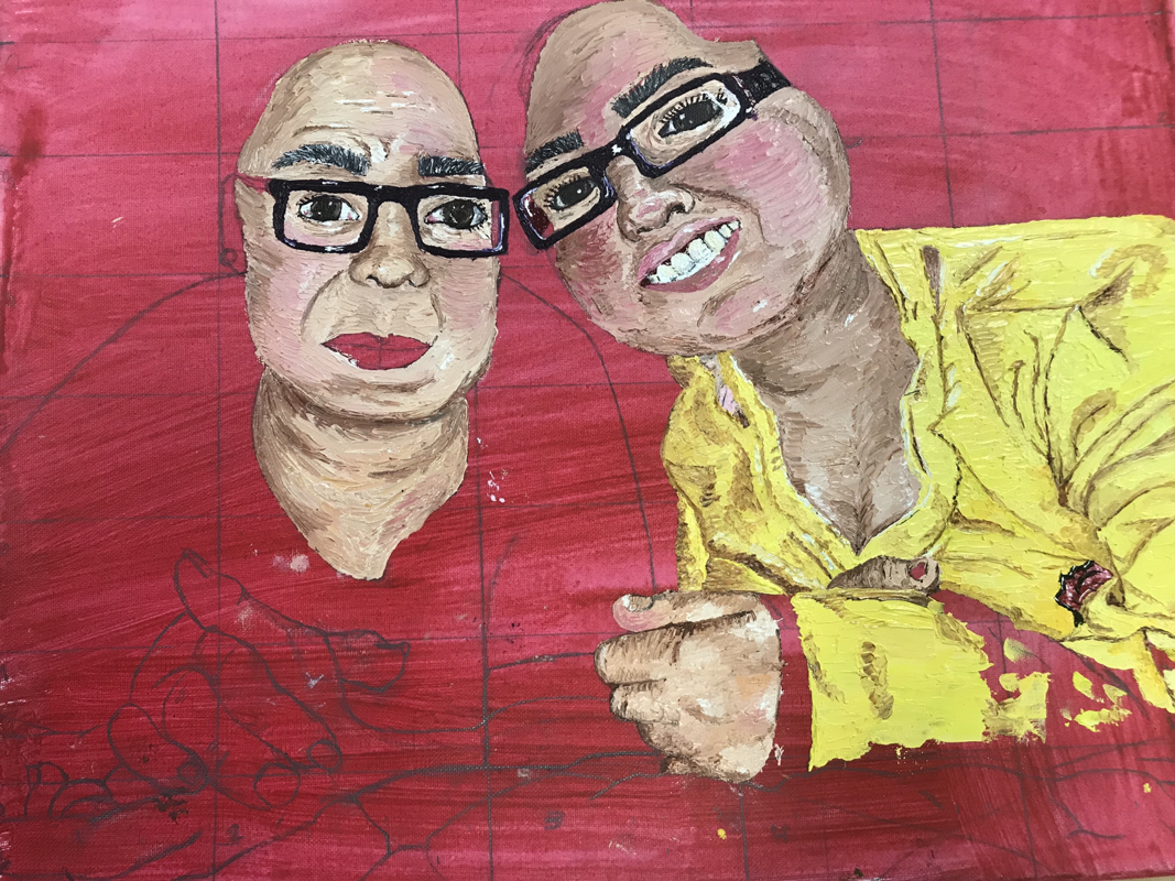
For this piece I am simply going off my reference picture and I feel like I’m doing pretty good so far with what I have got. When I started I began with a brush but the second day I went back to work on it I started using a palette knife like usual. Using a palette knife with oil is how I’m most comfortable. So far the most difficult task was doing skin tone because when I did my self portrait I used other colors that weren’t skin tone colors.
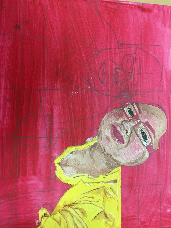
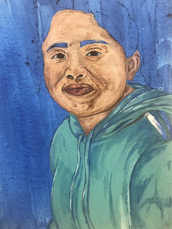
Back up for #3 "Nomas 4 Anos"
This small portrait was a quick portrait which I need to finish just in case I didn't finish my actual 3rd concentration which ended up coming in handy because clearly I haven't finished it. So this concentration was rushed and was completed in two class periods. Honestly there's not much for me to say about this piece other than it came out better than what I had in mind considering the fact that I just rushed it. I do wish I had spent a bit for time on the background but I feel like it gives it its own unique look almost texture like.
Concentration #4 Process Pictures
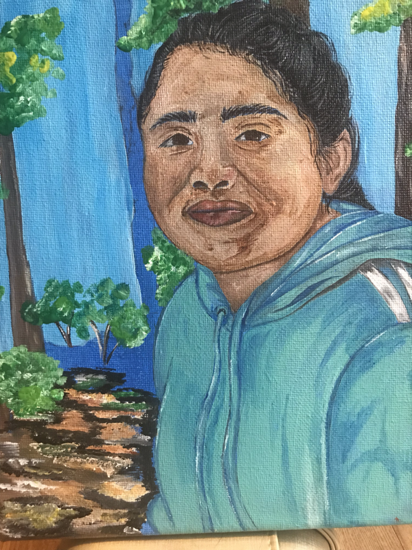
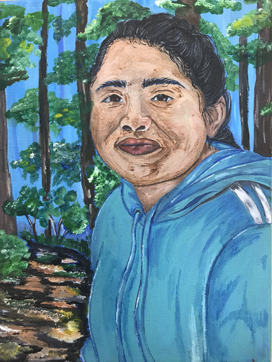
"Con Azules"
|
|
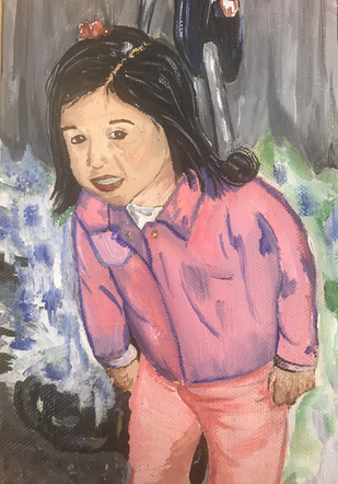
This concentration is a simple picture that I took of my sister Roselyn when we were out at the park just walking around during spring break. It had been the first time in a long time which both of us had gotten a day off because were always at school or at work and the temperature was good so we decided to go out and just have a relaxed day and just talk and catch up on everything we had missed.
The portrait was pretty quick it took me two days for this portrait there are many things I want to go back to and change or wish I would have changed or fixed with I first started. I want to change the background at least the blue because I think it takes too much attention away since it's such a dark shade of blue for a sky. Also just added more trees into the background because there’s so much empty space throughout and it just seems awkward to me. I also need to add more highlights and add more greens or yellows maybe even add some reds or blues into the leaves of the trees and just add more to get rid of the empty space. I did do one change to the picture which was I created almost like a path because I couldn’t figure out how to do dirt and it just started to become muddy and weird so I just had to work with it and made into the pathway which I think looks pretty good.
As for my sister's skin I wish I wouldn't have went so dark with the shadows and creases. My sister's nose I know I messed it up like the shape of the nostrils isn't right making the whole nose look weird and just not right and I feel like I could have blended it out better. I'm really happy with the hair and how I was able to create the texture especially considering the fact that my sister's hair was in a braids and since her is black I had to add random white to define pieces of hair and show the way in which the hair moves. I do need to blend out the line that's under my sister's chin because its too dark and create a darker shadow where my sister's neck touches her sweater on the left side.
Overall I'm happy with the final painting with the exception of the background and the small details on my sister's chin and neck.
Concentration #5 Process Pictures
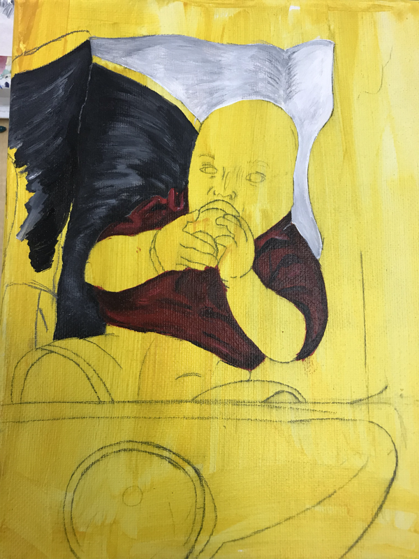
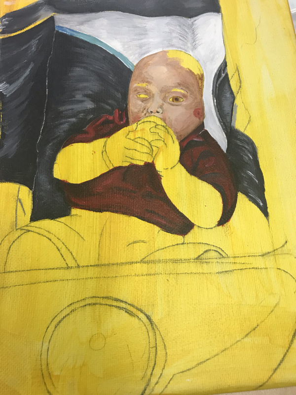
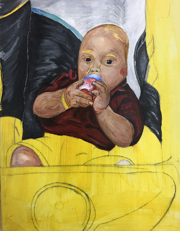
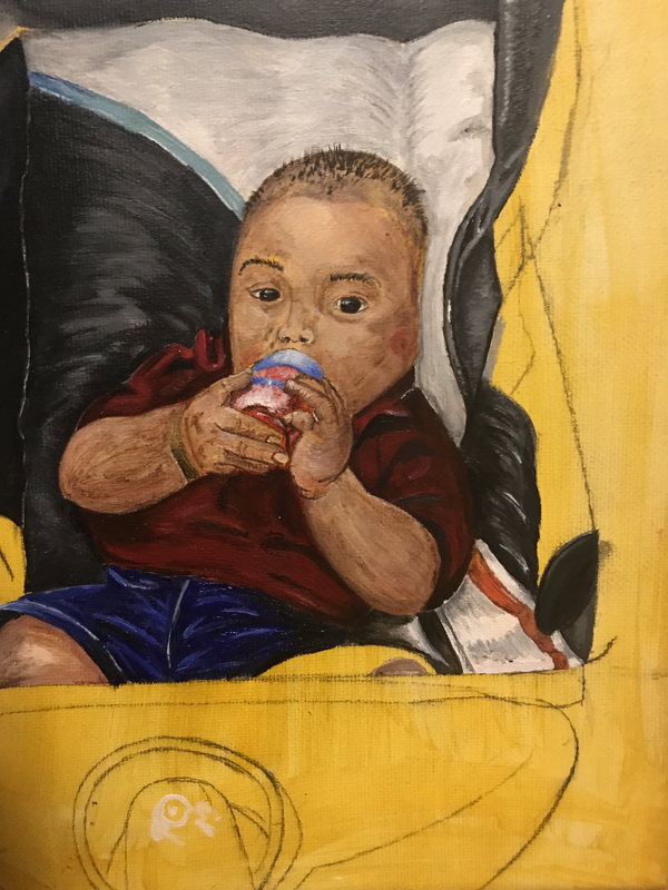
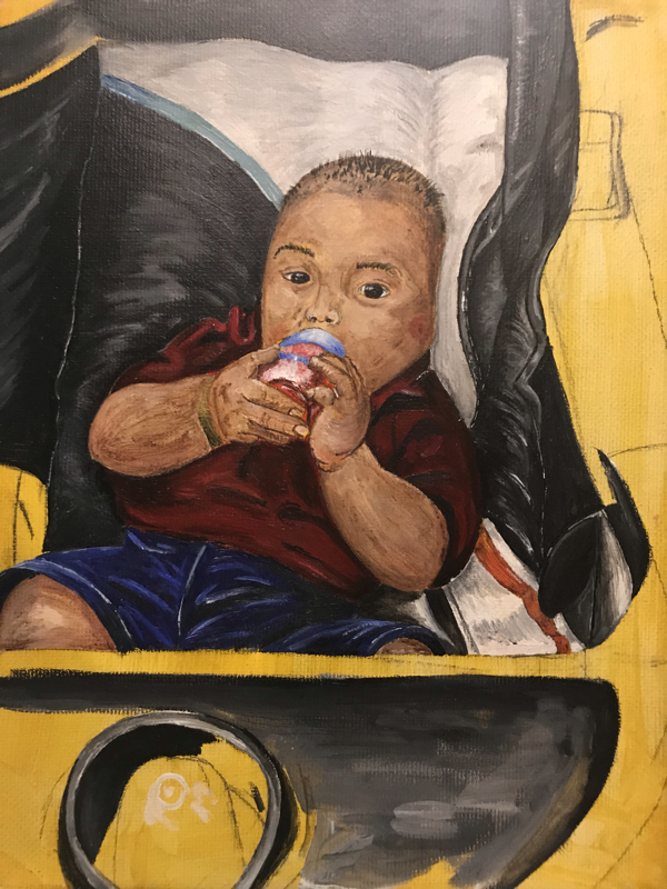

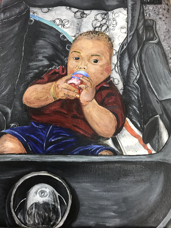
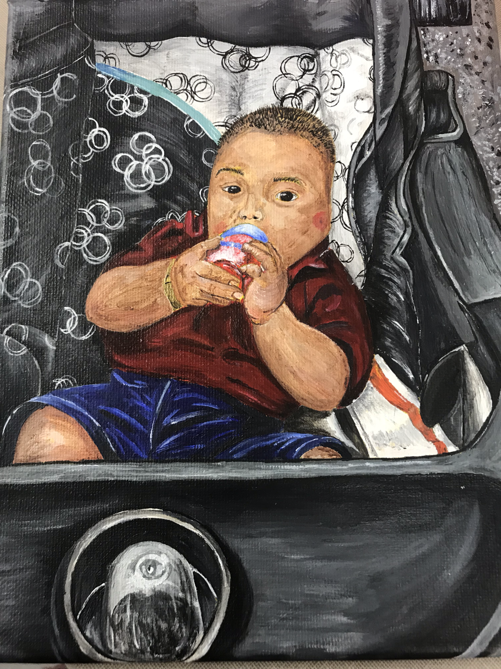
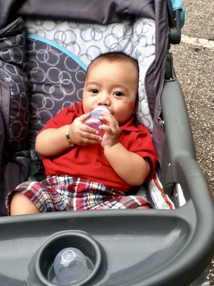
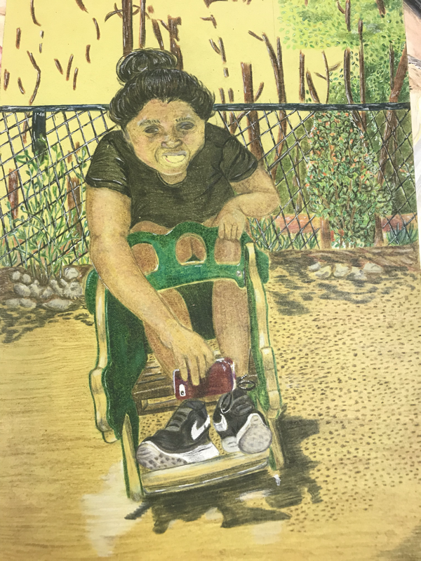
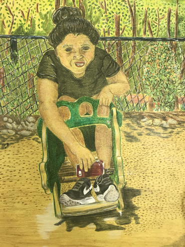
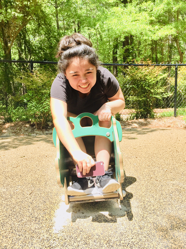
”El Único Niño”
|
|
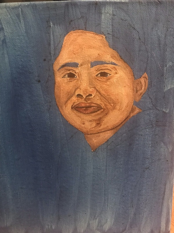
The name of this piece is “The Only Boy”, this cutie is my brother when he was about a year and it was taken 6 years ago. His name is Luis and he’s my half brother and I adore him although I don’t see him much considering the fact I don’t keep much in touch with my dad now that I’m older. Luis has won over my heart and I love him, he makes me so happy and sad each time I see him. Each time I see him I get amazed at how much bigger he has gotten which also makes me so upset thinking about how much of his life I have missed out on due to the lack of communication. Seeing him now and looking at this picture makes me think about how much time has gone by and makes me realize maybe that my parents separating was one of the best things that could have happened because I got a brother out of it.
This piece has to be my second favorite out of my concentration no doubt it makes me so happy just seeing it because I did it in such a short amount of time but it looks really good. I think my only issue with this painting is that in some parts you are able to see the yellow from the wash but it's nothing major. Now looking at it really closely I wish I would have added some eyelashes or simply just darkened up the top of the eyes a bit to show a shadow. For this piece I think the hardest part for me was creating his skin tone so that was main focus because I really just wanted to get him right which I think I did good also with getting some highlights on him. I could probably just go back and define the creases around his mouth to show he was almost like smiling in the picture. Besides that I think I did a good job on everything else like the stroller and the details on it and the transitions between the values throughout.
This piece has to be my second favorite out of my concentration no doubt it makes me so happy just seeing it because I did it in such a short amount of time but it looks really good. I think my only issue with this painting is that in some parts you are able to see the yellow from the wash but it's nothing major. Now looking at it really closely I wish I would have added some eyelashes or simply just darkened up the top of the eyes a bit to show a shadow. For this piece I think the hardest part for me was creating his skin tone so that was main focus because I really just wanted to get him right which I think I did good also with getting some highlights on him. I could probably just go back and define the creases around his mouth to show he was almost like smiling in the picture. Besides that I think I did a good job on everything else like the stroller and the details on it and the transitions between the values throughout.
Concentration #6
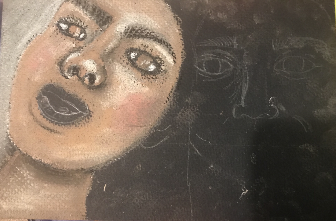
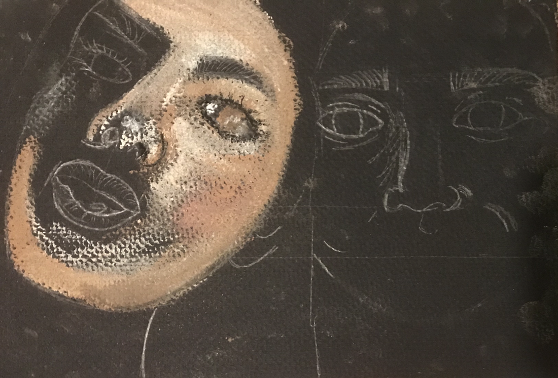
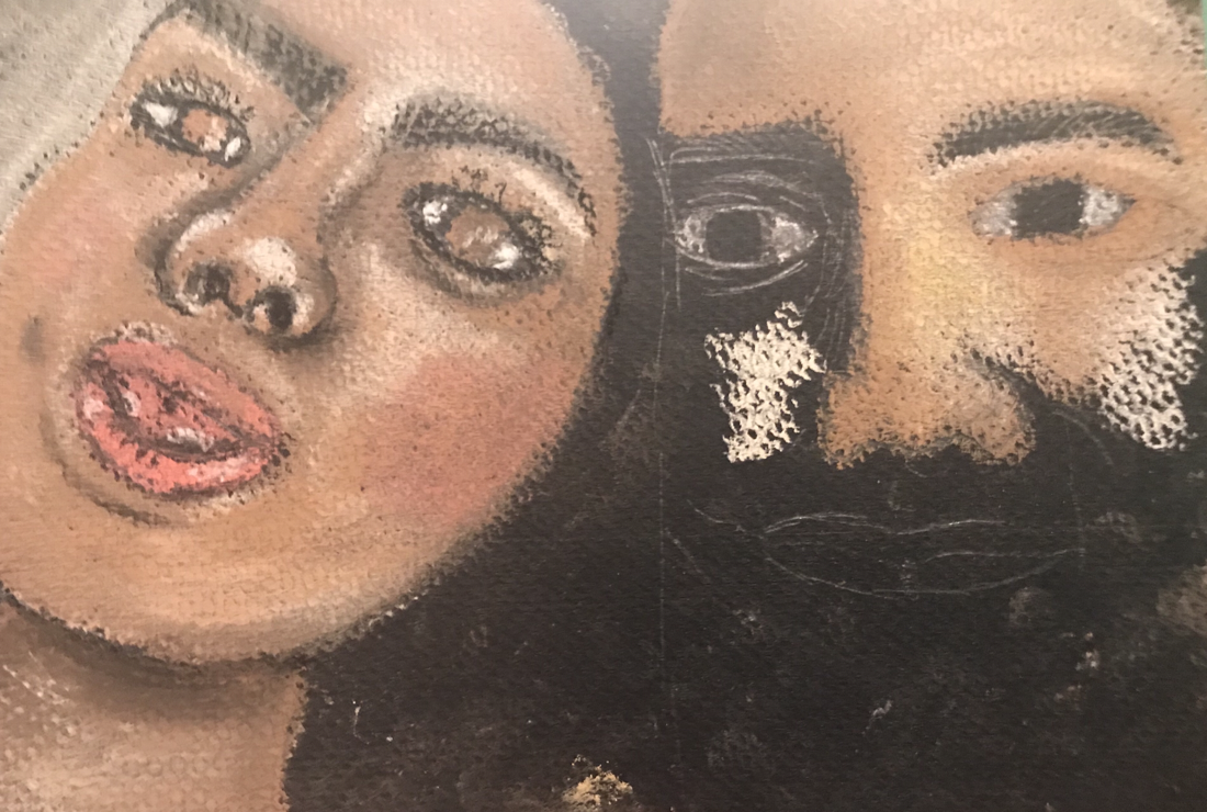
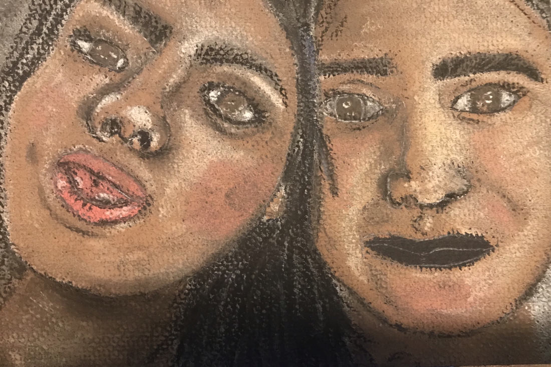
"Juntas"
|
|
”Together” is just a simple portrait of Roselyn and me done in chalk pastel. This is just a random picture that I found while looking through my camera roll which I had no idea I had but it was taken some time over the summer when I had a day off. I choose this picture because it shows how my goofiness comes out when I’m with my sister. Roselyn and I are always together even when we fight we always make up or we just see something and start laughing and we’re okay again. Honestly I think the longest I’ve ever gone without talking to her is when I’m at work even then we’re still talking. She’s the most constant person in my life we’ve always stuck by each other even when our parents spilt and we kept going from dad’s house to mom’s, riding the bus, playing, having the same friends. Even now we have lunch together at school and before I go to work we go out or just lay in bed together and talk. Although I don’t show it I love her and appreciate her.
This project like I said previously was done in chalk pastel and I simply went off the picture on my phone and didn’t make a grid or anything I kind of just winged it and hoped for the best. To be completely honest I think it came out pretty good considering I only took 2 hours in doing it and it was my first time actually using chalk pastel so for me that was pretty impressive considering I’m a slow worker. While doing this project I did realize that I probably should have used another different color paper due to the fact that my hair is black, what I ended up doing was making the background grayish and doing some hair over top of it. I think I did a good job with the blending of colors although I do wish I would have practiced beforehand. The facial features and value changes within the faces are good overall I do feel like I could have done better on my eyes and my nose but for the nose I think I just need to add a bit of more darks to make the nose look like it’s in the right perspective. As for my sister’s face I’m glad I didn’t mess it up and i think it actually came out so much better than my own face. I wasn’t planning on adding more I feel like adding more details when I get a chance with chalk pastel pencils.
Overall for this project I think it came out to be a good successful project and I want to keep working with chalk pastel to get a better feel for them.
Concentration #7 Process Pictures
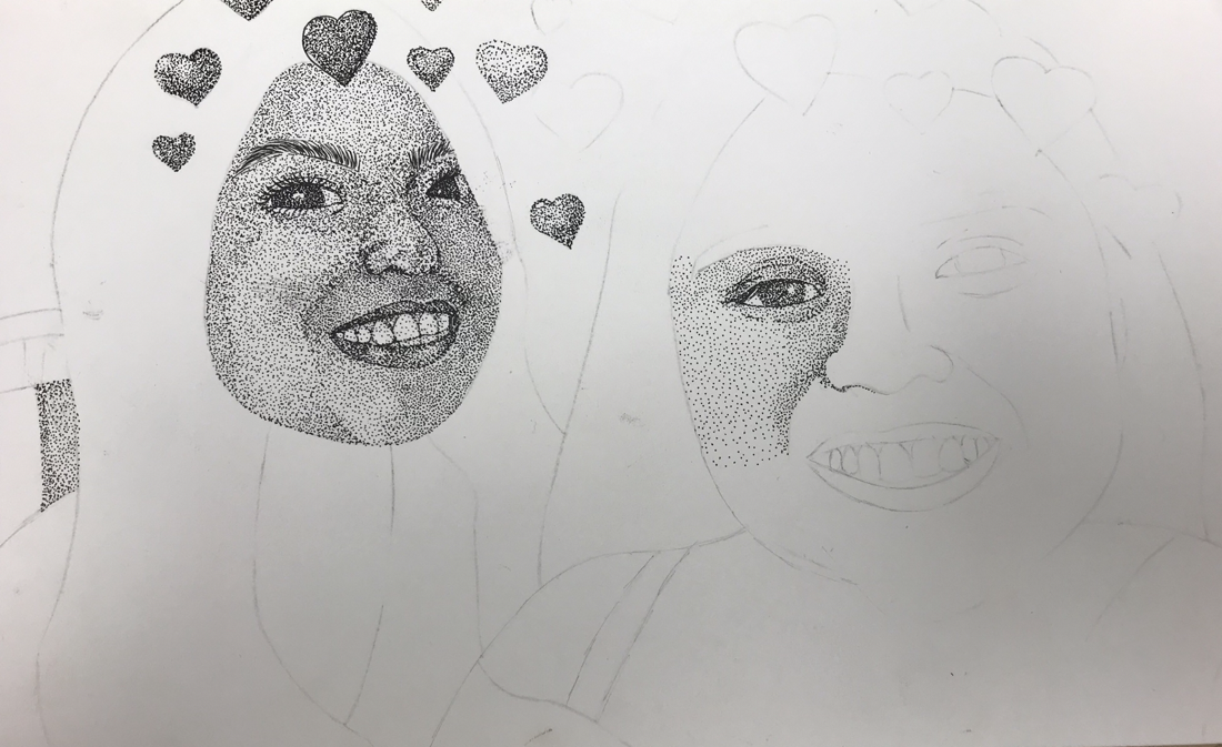
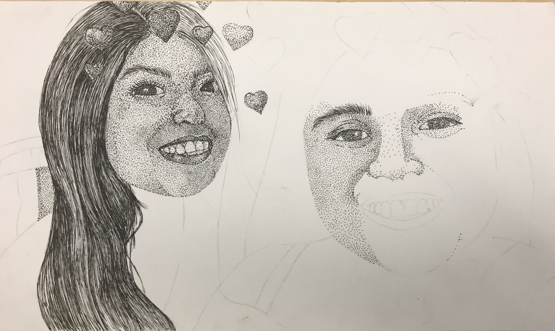
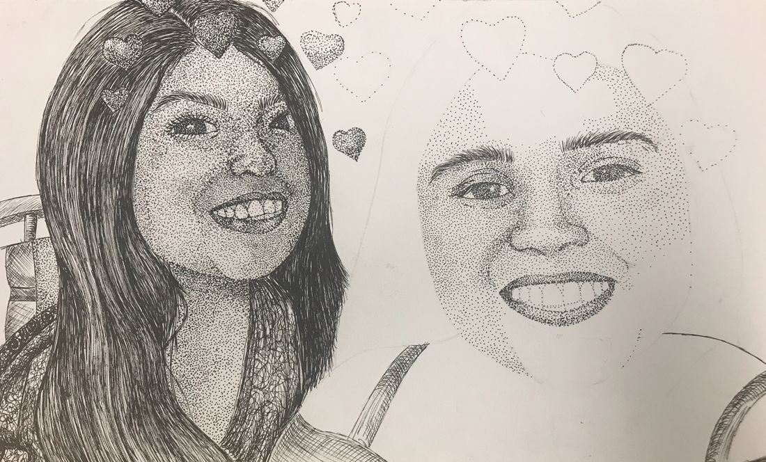
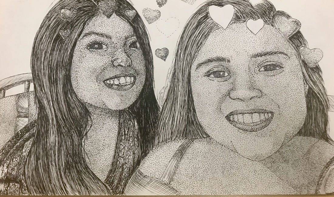
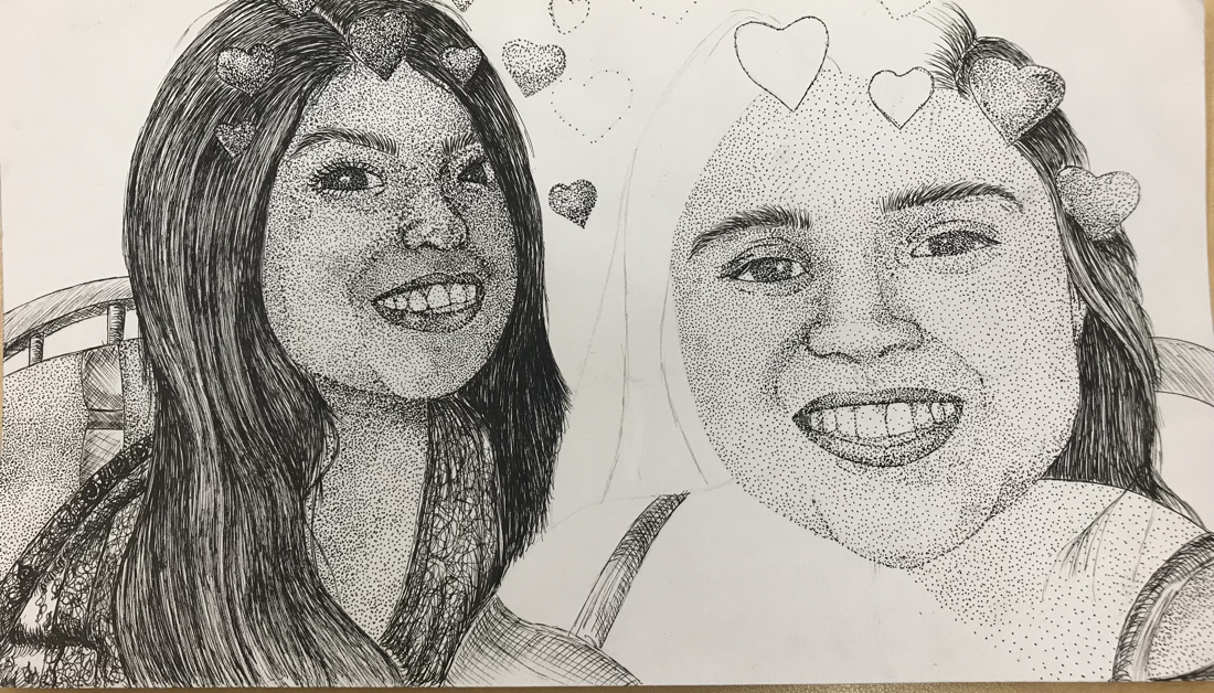
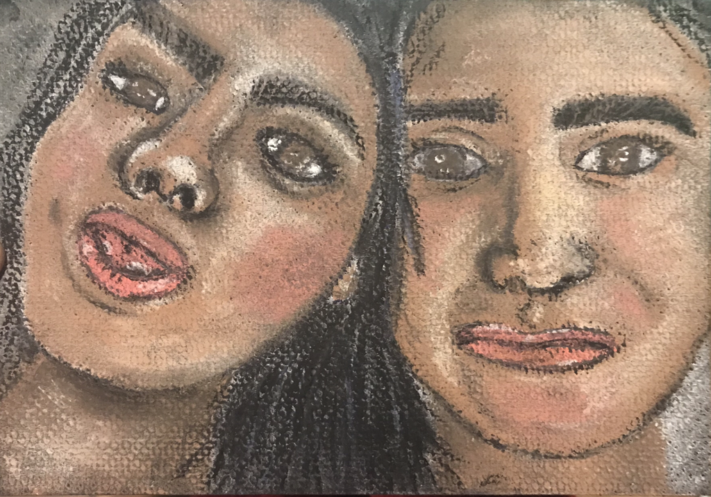
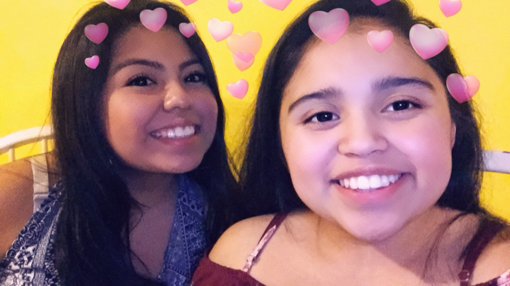
”Con Corazónes”
|
|
This picture is of my sister and me on Christmas Eve I want to say I'm not quite sure but it was around that time of the year and for this I decided to try and challenge myself by going with pen and ink as my medium. This piece happens to be my favorite out of my whole concentration considering the fact that I stippled the whole thing it went for the exception of the hair and the clothing. I'm glad I chose this as my medium because I have always said pen and ink isn't one of my strongest mediums to work with but doing this piece made me realize I actually do have some sort of potential and it's a medium in which I want to keep working with to improve as a artist.
For this piece I wouldn't change anything, I'm actually proud of the final result but I did struggle throughout the entire process of creating this. One thing that does stand out to me is my nose because when I was doing it originally I messed up on the shape and in order to fix it I had to darken up the area which in the picture that area is dark so it doesn't seem like anything is wrong with the picture so I guess I'm okay with it. While doing this piece I did struggle with creating different value changes due to the lack of practice in pen and ink because I didn't know if in current places I should have added more or less. In the end I ended up with doing a lot of stippling and simply having to go back into current areas in which I found I needed more shadows in. I did struggled in doing my sister because she's lighter than me so I didn't want to go overboard with the stippling which I ended up doing either way due to the shadows but somehow still managed to keep her lighter than me. Also for my sister's face I had to get her whole profile which was difficult unlike my face which I only had to get my side.
As for the other details of my piece besides the faces the process went by pretty fast like the wall background and the clothes except for the hair because I wanted to make sure I got some individual strands of hair and get the different highlights and shadows through in order to keep it realistic. I'd like to say I did do a good job on the hair and making sure you could see the way in which the hair flowed not just going straight down. The hearts is something that I wanted to keep in the picture which I'm glad I did but it was kind of difficult because I wanted them to stand out from the hair and not to blend which I ended up being successful with.
Concentration #8 ”Somos Diferentes Pero Iguales”
|

|
This image is a simple picture which I took of my mom and I and we both look genuinely happy. For this concentration I wanted to try something I hadn't tried since I took drawing class back in the beginning of sophomore year which was the one line contour drawing. For this concentration there's really not much that I can say much other than it took me a good 15 minutes and I really wanted to lift up my pen on multiple occasions and the facial placements are pretty accurate for exception of a couple.
Concentration #9 Process Pictures

"Travesuras"
|
|
This concentration is another image of my sister which now really thinking about I should of just made my sister my concentration because more than half my portraits consist of her. Just like my previous pieces I haven't been doing any sort of sketches and simply been going off the reference picture. This image is just of a funny memory from over the summer when my sister and I decided to go out to the park and she decided to start playing around.
I absolutely hate this piece, love this memory and my sister but no to this piece. I messed up her face I feel like if I hadn't messed up her eyes I would have still been okay with the end result but I did mess up her eyes and it is so noticeable there's no way for me to hide it. I like absolutely everything about the background and how I added all the different shadows. In all honesty it was completely my fault because I started the whole background and everything and completely avoided the face which I should of not done because that way if I would have messed up earlier in the game I would have been able to start over but I had already spent so much on the background that by the point I messed up on the face I didn't want to start it over so I ended up just working with it even though I completely hated it. Its the definitely the way in which I did the eyes but it got worse when I tried putting the white of the eyes on the left side because you can see it a small bit and it got blended with the darkness of the eye.
I did do a good job with the texture of the hair and I went back in with a white gel pen for the highlights of the hair. I did do the same with the fence by using gel pen, I also incorporated some blue into it because I didn't want it to simply be black. I think I did a good job with the blending of the skin in the legs and the hair which now if I tried going back to back the same color I would fail horribly. The left side of the background trees was done after I attempted the face so I began to give up and on the ground I gave up with the dots and didn't even completely finish it.
Concentration #10 Process Pictures
"En El Cuarto"
|
|
This image was taken from a album I had been looking through while trying to think of what my next concentration piece would be and I chose this one. Honestly I'm not even going to attempt and lie this piece looks horrible. I think the piece looked so much better before I went in and added the background, if I ever get a chance or ever feel like I'm just going to go back and just add a white layer of paint or something. I would also go back and fix my face because of the darkness of the picture I wasn't sure on how to do it exactly and after doing the legs and the arms on my body by the time I got to my face I had already ran out of paint so when trying to make the same tone I struggled, I most definitely need to back and fix that. I feel like without those small things I would like this painting at least a bit more.
I'm glad with the result of my sister my only two issues would be that I made her skin tone darker than what it actually is and I didn't blend out the highlights in her hair and they stand out too much. Now that this piece is finished it looks weird because of my mom's neck looks weird because it looks wider than what it really is. Overall with this piece I'm okay with it.
I'm glad with the result of my sister my only two issues would be that I made her skin tone darker than what it actually is and I didn't blend out the highlights in her hair and they stand out too much. Now that this piece is finished it looks weird because of my mom's neck looks weird because it looks wider than what it really is. Overall with this piece I'm okay with it.
Concentration #11 Process Pictures

“Cuando Éramos Niñas”
|
|
This piece was a pretty quick piece which was done using chalk pastel pencils I'm proud of this piece overall due to the fact that I haven't had much practice with it. I think for this piece the hardest part was the blending because I realized when layering chalk pastel after a while the colors tone down and become dull pretty quickly. Also creating the skin tone was pretty challenging because it was almost like working with prisma color which I’m not good at with making skin tones. When making the details on the face I found it hard because the pencils wouldn’t get as sharp as I would have wanted them to.
The details for the clothes I think I did a good job on even though once again I struggled because I had to create shadows and since that required blending the colors became pretty dull. At the end I realized that going back over with a thin layer brings back some color so that ended up being what I did for the end. My shadows and highlights are pretty good considering the struggle. I do wish I would have had more practice with chalk pastel because I actually enjoyed it and I feel like if I had more practice this piece would have turned out better.
The details for the clothes I think I did a good job on even though once again I struggled because I had to create shadows and since that required blending the colors became pretty dull. At the end I realized that going back over with a thin layer brings back some color so that ended up being what I did for the end. My shadows and highlights are pretty good considering the struggle. I do wish I would have had more practice with chalk pastel because I actually enjoyed it and I feel like if I had more practice this piece would have turned out better.
Concentration #12 Process Pictures
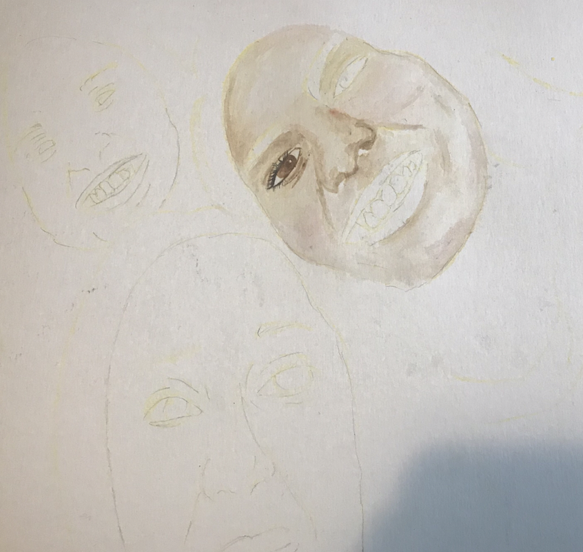

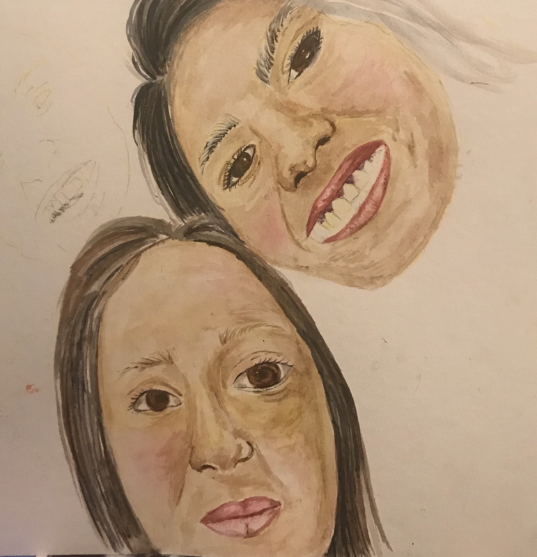
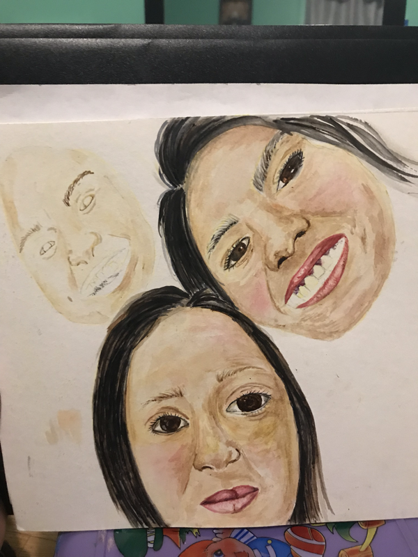
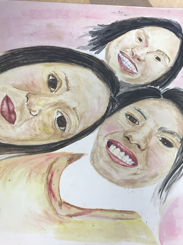
"Solo Tres"
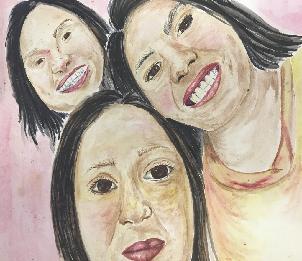
|
|
For my last piece in my concentration I tried out watercolor which is a medium I have worked with before but only for creating quick landscapes which don't really have much detail so this was a challenge for me. Besides the lack of practice with watercolor I think I was pretty successful with this piece although I didn't completely finish my sisters face because I needed to submit my portrait to college board. I think I was successful mainly because I have done so many portraits at this point I just tried and focused on the shadows and highlights of the face. I did so many layers because I was scared of getting too dark really quick. In the faces I also add some reds to bring color back.
I do want to go back and finish this piece or at least just finish my sister's face because it definitely needs more shadows to be added around the edges of the face and on the top of her nose near her forehead. I would also add shadows in her mouth as well because it looks too white. As for my face I want to go back and add more shadows on my teeth the ones that are further back to emphasize that they are further back also darken up my eyebrows. As for my older sister's face I think its pretty good overall.
I do want to go back and finish this piece or at least just finish my sister's face because it definitely needs more shadows to be added around the edges of the face and on the top of her nose near her forehead. I would also add shadows in her mouth as well because it looks too white. As for my face I want to go back and add more shadows on my teeth the ones that are further back to emphasize that they are further back also darken up my eyebrows. As for my older sister's face I think its pretty good overall.
