In Style of Artist Final
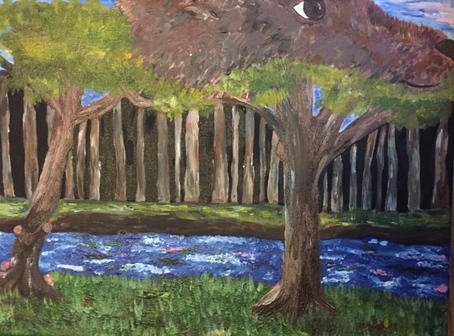
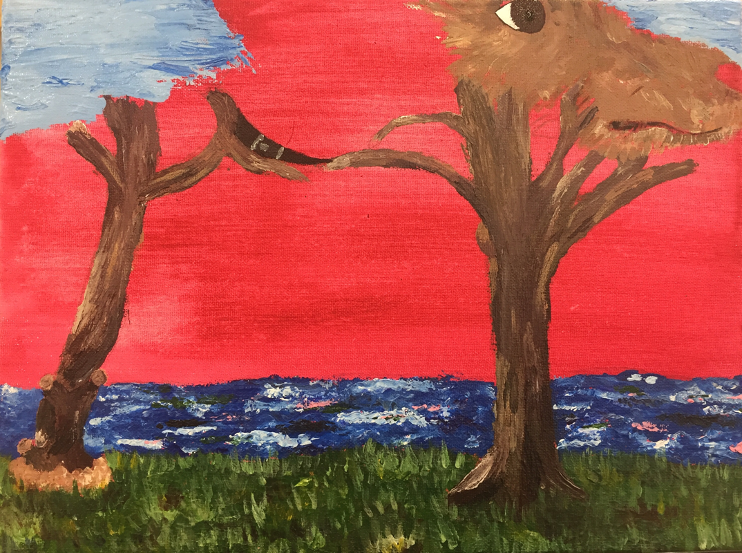
1. The referenced artist I got was Salvador Dali and four ideas I used from my research are Surrealism, bold colors, used the same colors throughout to create balance, and landscapes.
2. I think the craftsmanship for this painting was well executed considering I had never done a painting like this and this style was new to me. Although it was well executed and neat I wish I would of tried harder in making a smoother transition between the dog and the trees on the left side as I did on the right side of my painting.
3. I would say the hardest part of this whole project would be trying not to add to much detail but add shadows and lights to help show what each thing was but I did end up adding more detail on the foreground which was the grass to show that it was closer and everything was further away. I would also say the hardest part was the dog and trying not to add too much details onto it but also adding different colors to make it look as realistic as possible.
4. Most of Dali's paintings consisted of bold colors and blues with almost a golden touch to them so taking that in mind I used blues, greens, and dark colors. His paintings used very dark colors and used them in contrast of light colors which is why I chose to work with browns and blacks to use them in contrast from the bright colors and whites.
5. My landscape reflects Dali's paintings because in a variety of his paintings trees, tree branches and twigs and are used throughout so when planning my project I tried finding pictures of trees and started thinking how incorporate them in my painting. I also kept his style of surrealism in mind when planing out my project which is why I chose to incorporate my dog into it.
6. If my artist were to see my painting I think he would be impressed about how I tried my hardest to follow in his steps and tried to paint something inspired by some of his own work.
7. If I were to recreate this project again I would try and make a smoother transition between the dog and the trees. I would also place everything lower so I could of done more the sky because when I finished the dog and the trees there was no more room for me to work on the sky and add more.
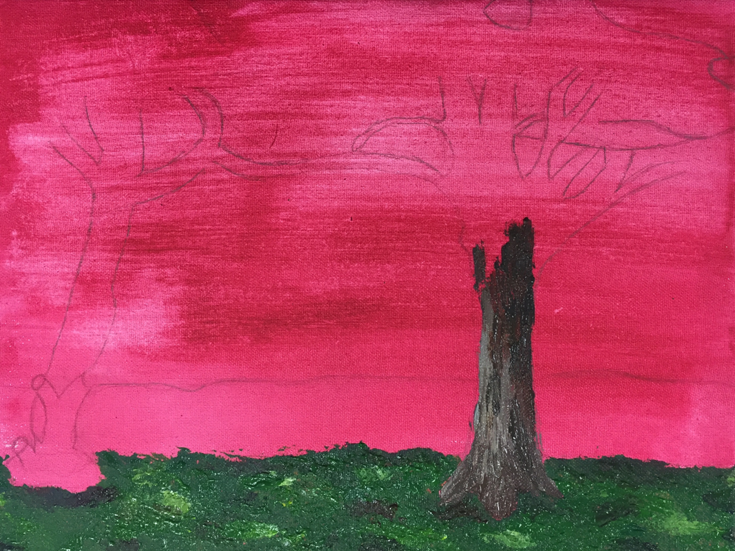
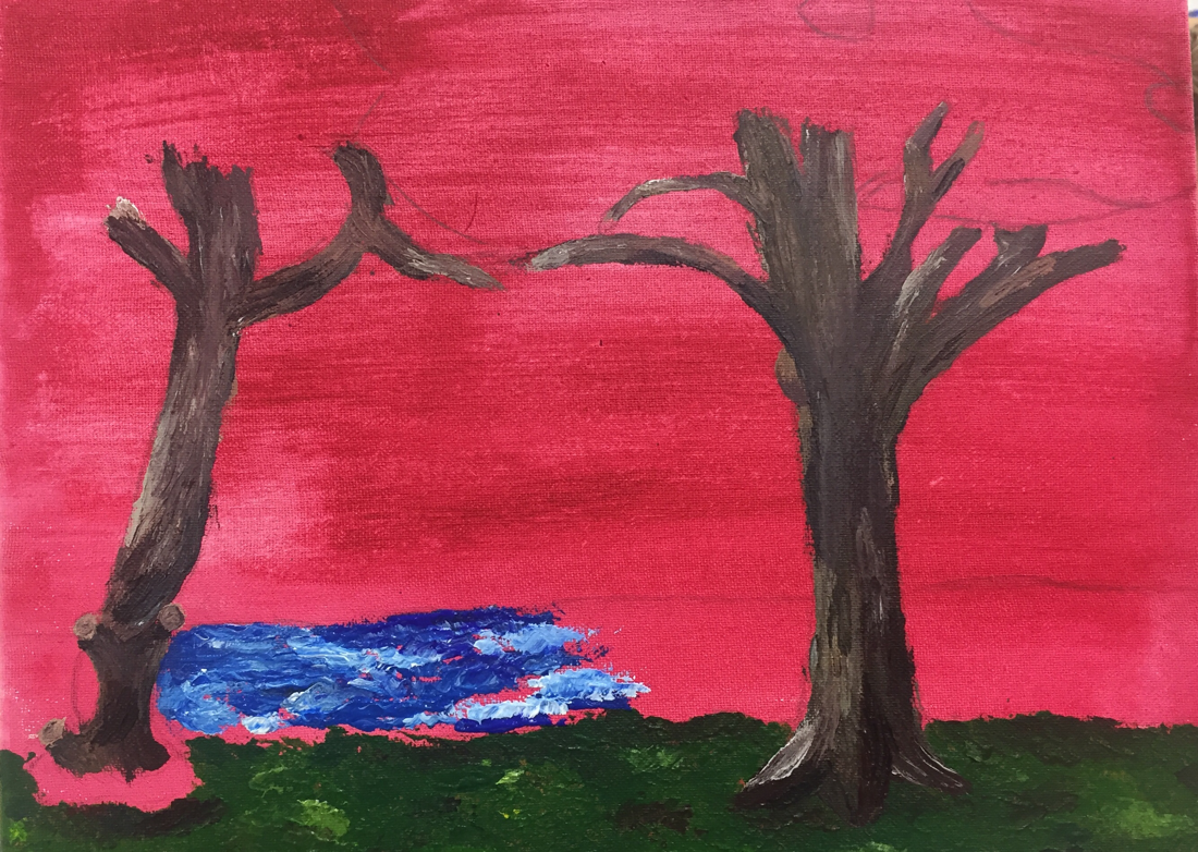
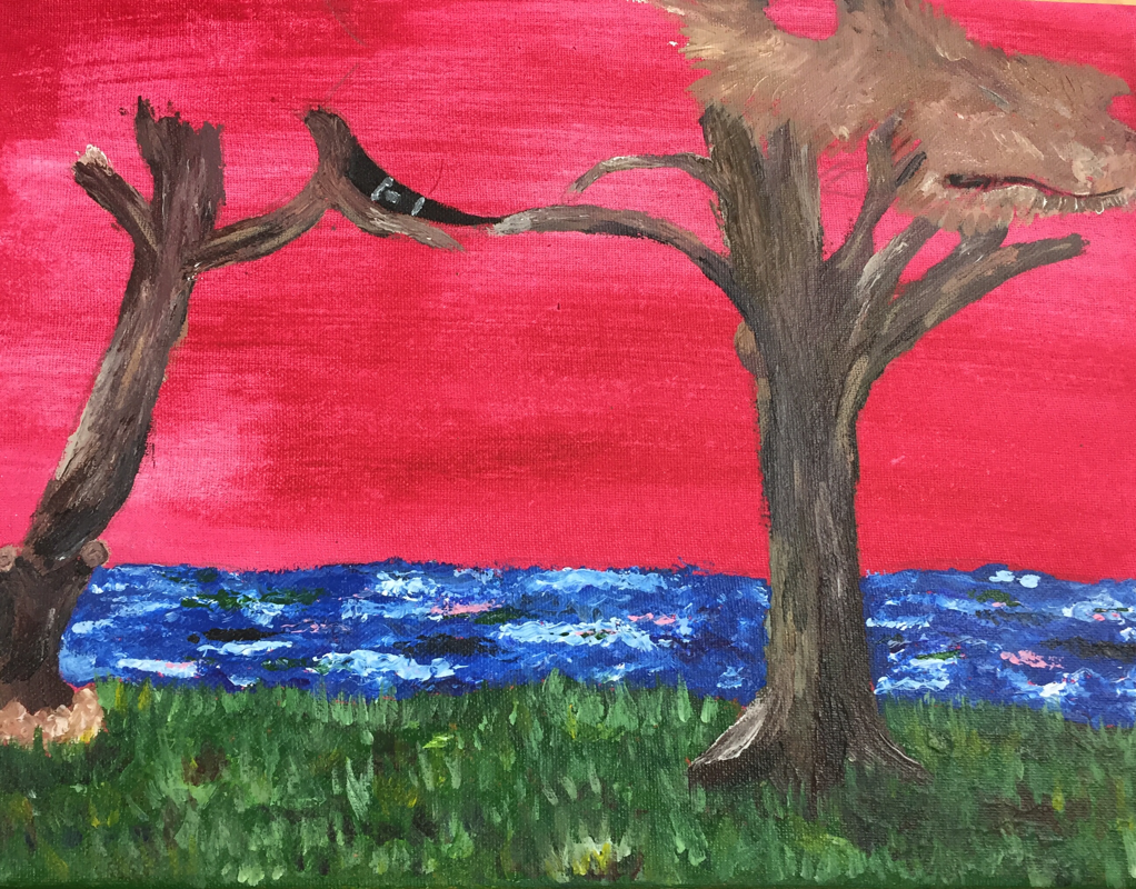
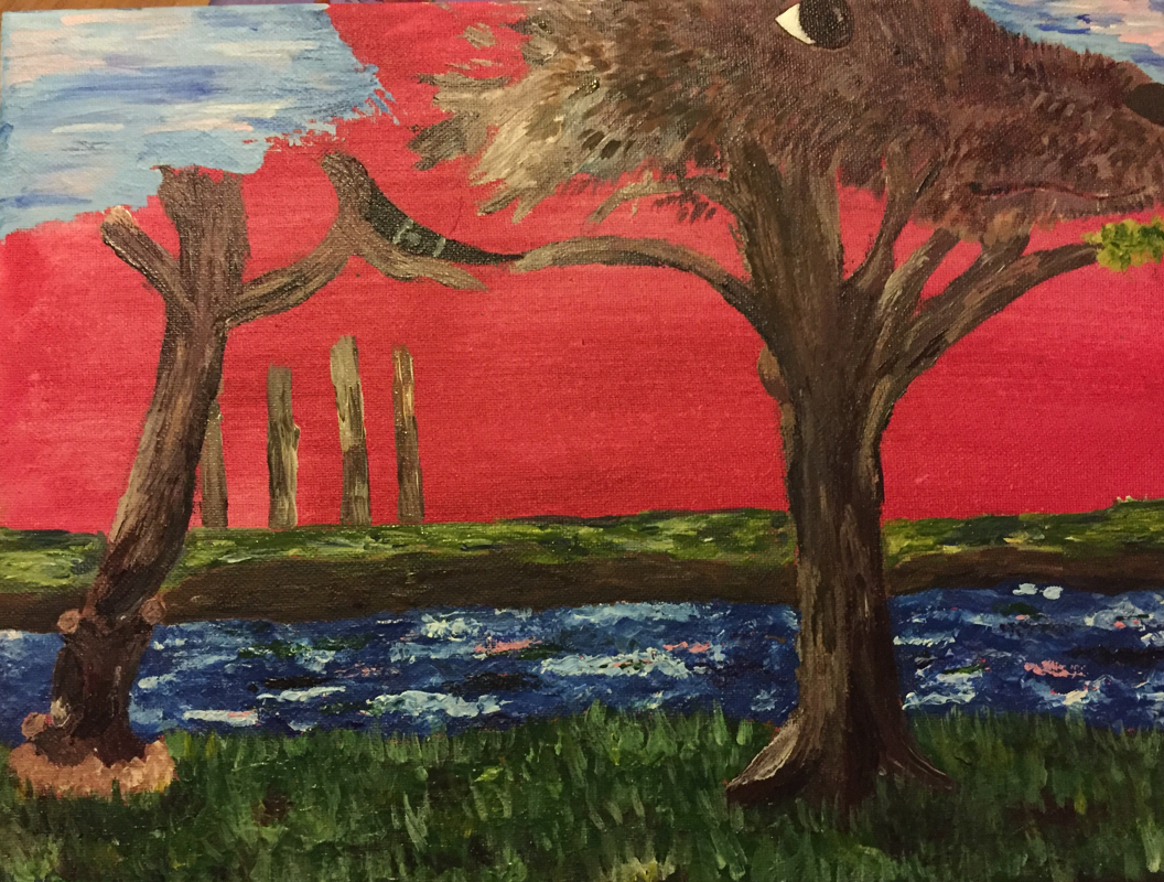
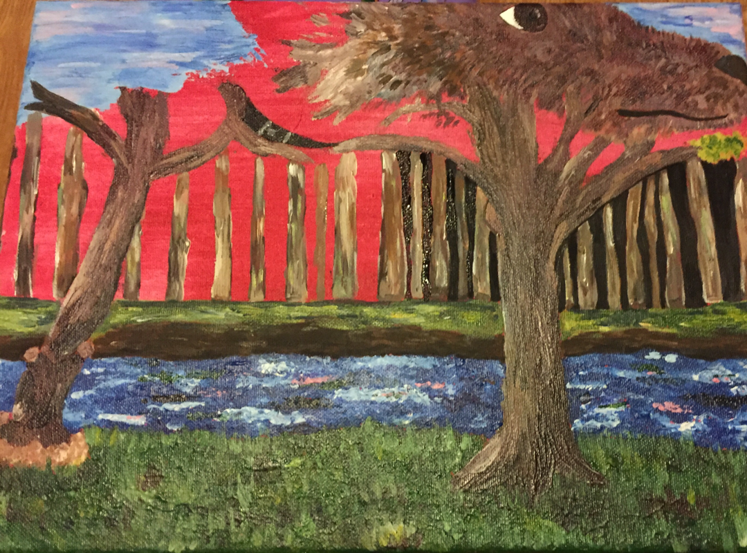
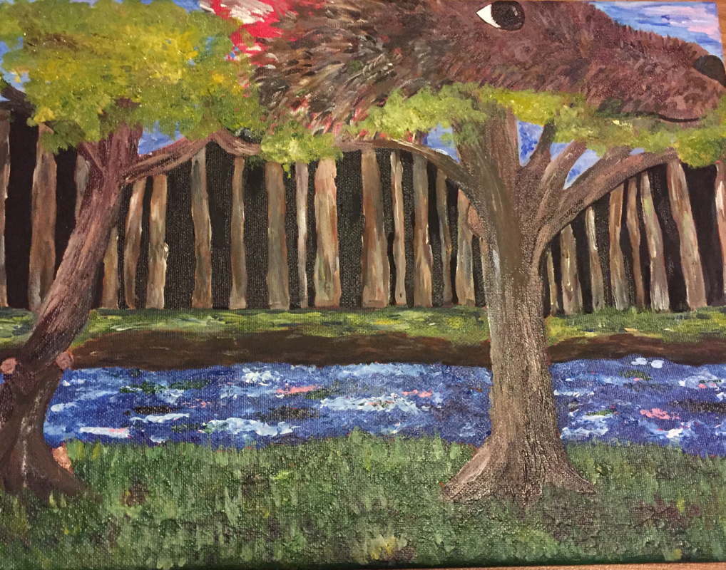
In Style of Artist Process Pictures and Sketches
Piece of Painting
|
|
|
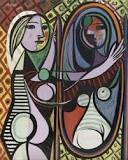
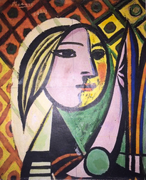
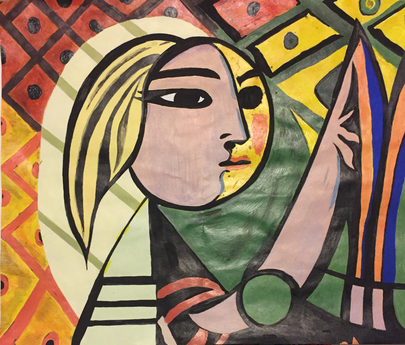
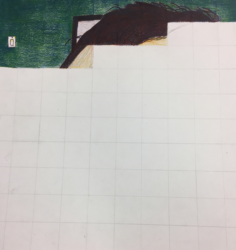
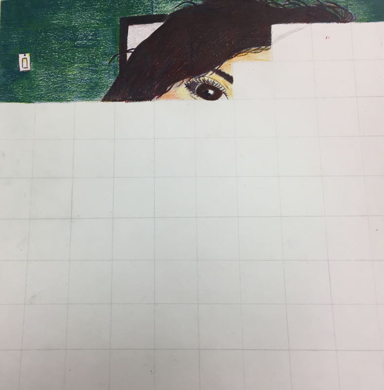
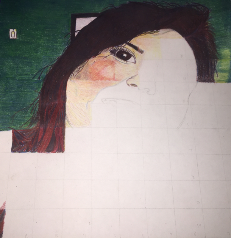
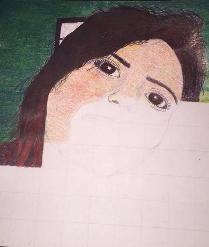
On the far right, you can see my recreation of a portion of a larger painting being "Girl Before a Mirror" by Pablo Picasso. I think I was able to execute the assignment in a successful manner although I did struggle when making some of the colors.
Acrylic Paint Value Changes and Color Wheel
|
|
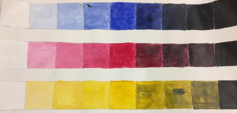
To start off the acrylic paint lesson, the first assignment was to create 3 different value charts expanding from white to black using the primary colors. The next assignment was to create a creative color wheel.
Food Clay Final
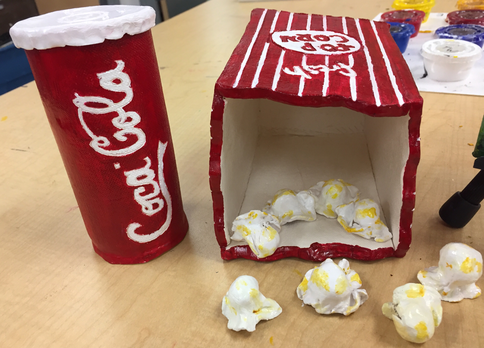
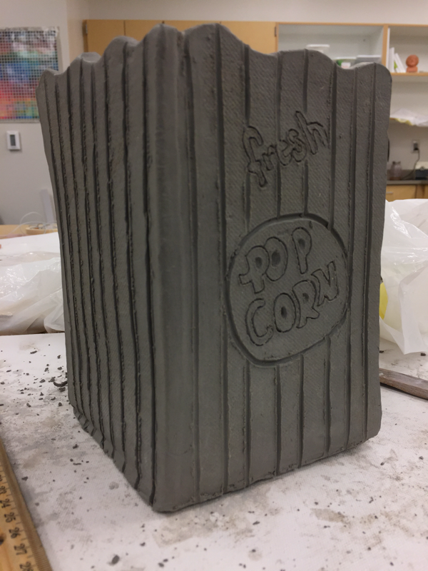
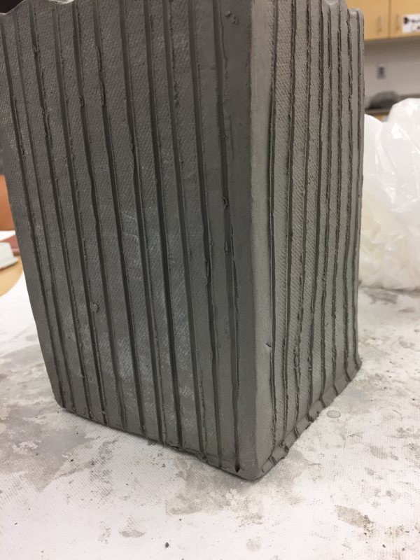
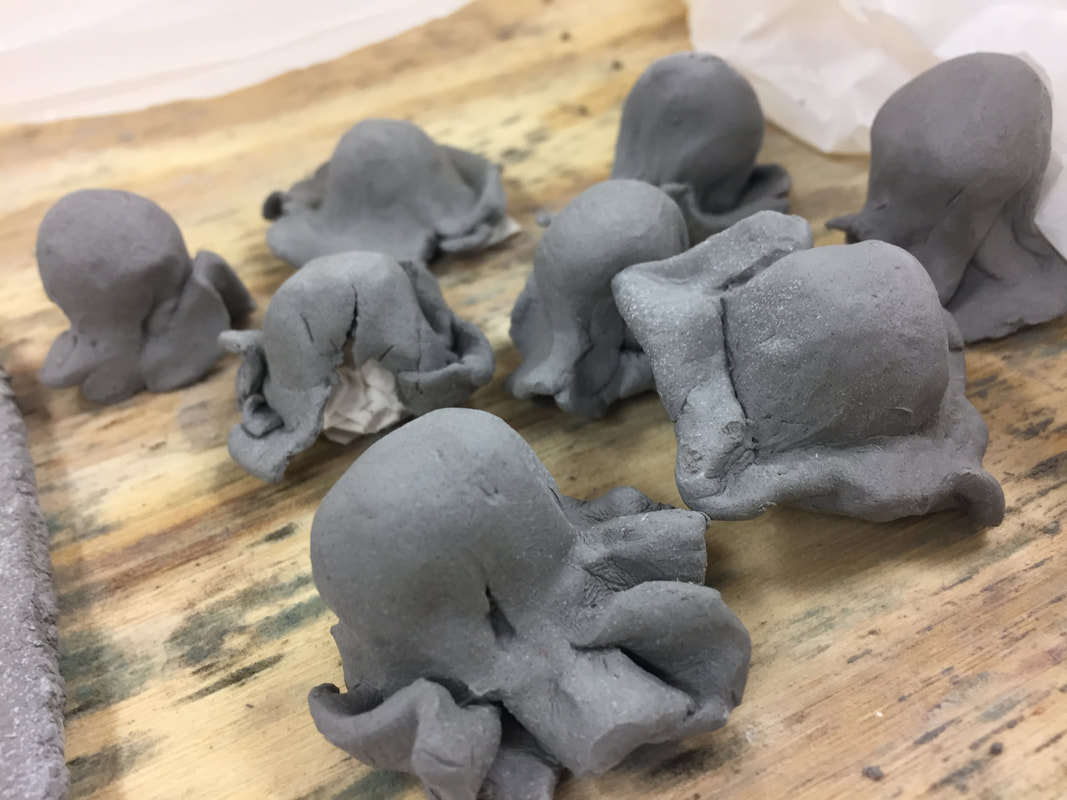
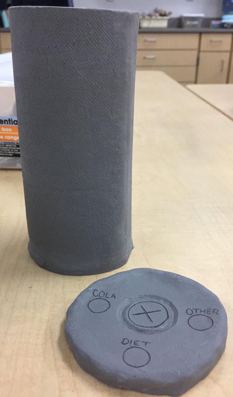
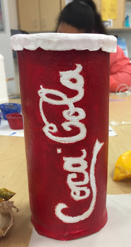
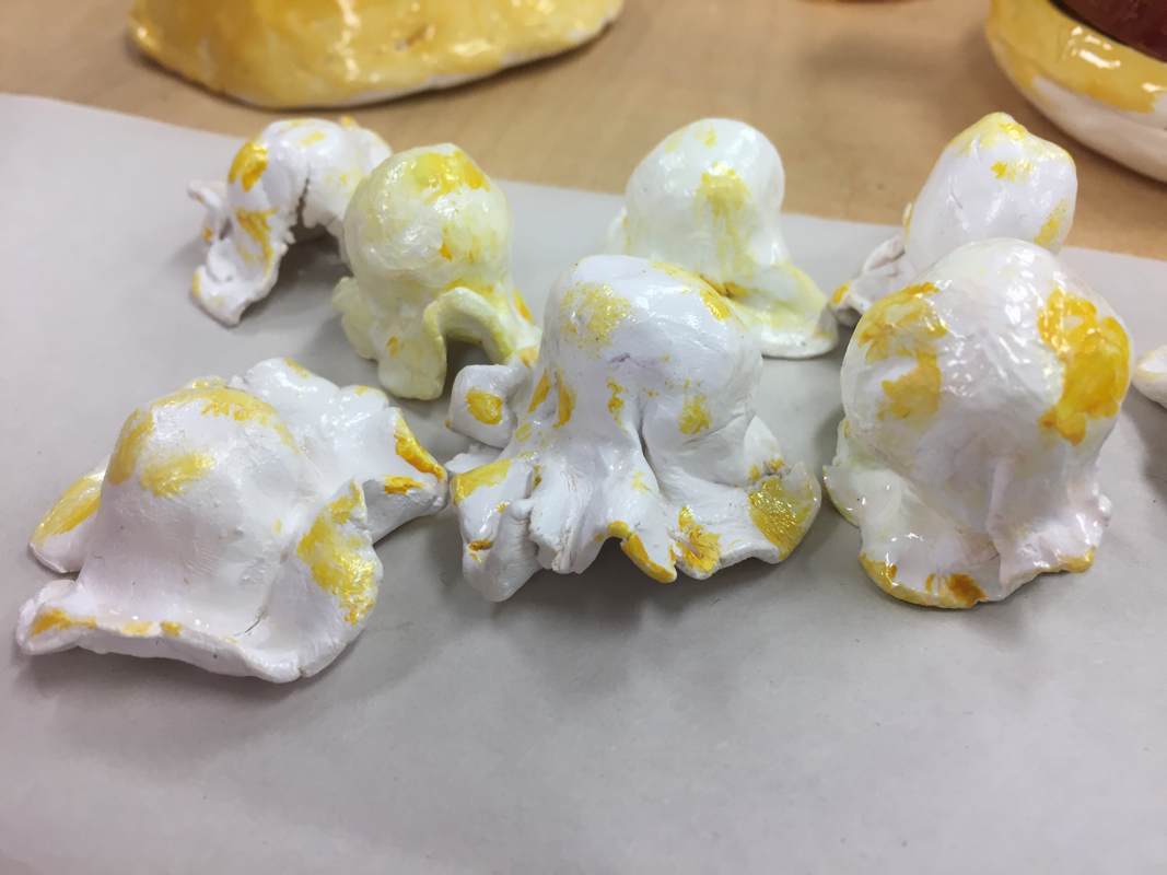
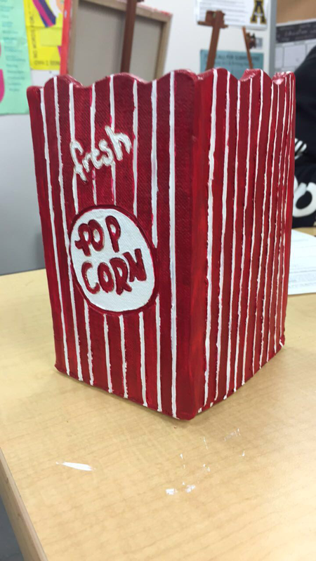
1. I think my craftsmanship in my sculpture could of been more neat for example I could of tried and made the edges more smooth but overall I do feel like it was well executed despite of some of the rough edges. I feel like I did a good job when recreating every object I made but when painting the popcorn I think I could of done a better job to make them look more like actual popcorn instead of just looking like I put blobs of yellow paint anywhere I could.
2. I think the most difficult part of this project was creating the box because when I first made it when storing it away it fell apart. The next day I wasn't able to come to school so when I did come back the box had dried up more than I had expected it so when putting it back together it was harder due to the dryness of the clay but somehow I was able to put it back together taking me a whole class period. The next day when trying to work on it again I came to the realization that where I had put it back together there where too many cracks and I would fall apart. With that I had to ask for help being told to water it down completely and once the clay soaked up the water to repeat and I did this for a whole class period while doing other pieces. I wasn't able to work on my clay for a day due to how wet it was so I had to wait until it dried in order to add in all the details I wanted. I also struggled on making the popcorn and getting them to be the right shape and making sure they weren't too big.
3. I do believe the colors that I choose for my sculpture work harmoniously although I do wish I could of done a different color on the lid of my cup because I feel like it looks too white and it need some darkness to create contrast. I also which I could of done a warmer shade of red on both my box and cup but overall I think the colors turned out okay.
4. I do think my sculpture looks interesting from all views at least that's what I tried to do.
5. When doing something in 2D you simply have to focus on one side and just make that side look as realistic as possible but when creating a sculpture you have to make sure everything looks realistic and you have to focus on all sides of what you're creating. Also when creating something in 2D it's easier to know the placement of darks and lights to show where light hits or doesn't but in sculpture you don't due to the fact it all depends on how on the object is place and the amount of lighting in that moment.
6. For texture I didn't use a variety of tools. In order to smooth out some of the edges I simply used my finger and water. In order to do the letters in the box, lid, and cup I used a needle so it could be small and thing and I added water in order to smooth out the small pieces of clay that fell out. On the box I carved in lines order to show the difference between the red and white. As for the popcorn I made the top look semi-smooth with the bottom not look perfect and with wrinkles.
7. I do think the popcorn look like popcorn. Although I do feel like I could of done better when painting them.
8. If I could redo my project I would of been more careful when storing my clay because that held me behind a couple days and I would of also taken more time when painting my project. I would of also made more popcorn to fill up at least half of the box.
Food Clay Process Pictures and Sketches
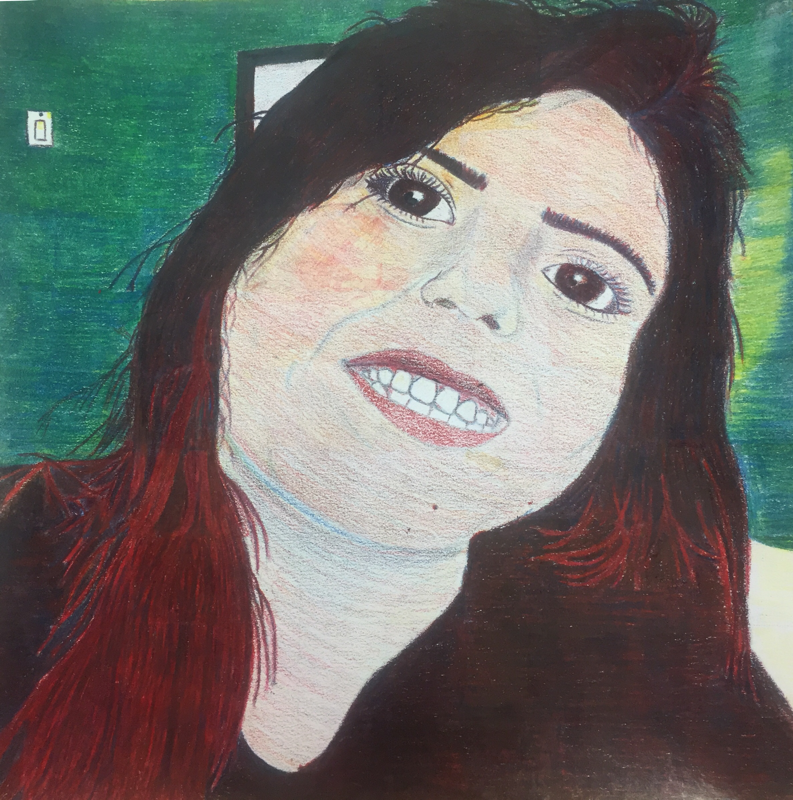
Colored Pencils Self Portrait Final
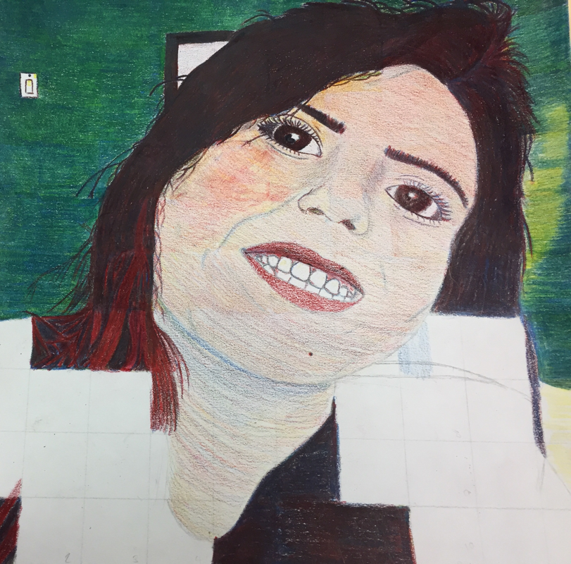
1. I believe my overall craftsmanship was pretty good considering I had a difficult time trying to keep the pencil shavings from making a mess. I do believe I could of done a better job with blending the colors on the skin but I was afraid to mess up the coloring. Meanwhile I do believe I did a good job with blending the color of the wall color and shirt even though you can still see where some places are lighter than other places.
2. I had a difficulty time creating the right color for my skin but after multiple tries on a separate piece of paper I figured it out. I had a had time creating individual pieces of hair like in the picture that were sticking up. Drawing my hair on my shirt was difficult because I had to make sure I didn’t blend my hair with my shirt and I had to color and blend around the red pieces of hair. I also struggled with added more color or blending it at the end because after so much layering it eventually just started scraping off and I wasn’t able to add more color onto it.
3. I did follow the directions, it was important to draw each box separately because it helped make sure everything was properly placed and the right size. This method help keep everything in proportion.
4. I create value changes with colored pencils by using different pressure on the pencils. I also tried using blue where I needed to show where there were shadows. As where I needed to show where there was light I used the white of the paper and added yellow depending on how much light was hitting that area.
5. I was able to create the colors I wanted for my portrait by first practicing on a scrap piece of paper before going onto my final. For my hair and shirt which were black I used all three colors and mainly focused on using red and blue to get the color as dark as possible. For my eyebrows, I used the same technique as in my hair and my eyes I used the same but used a bit more yellow so my eyes wouldn’t look completely black but dark brown. The redness in my hair, I used red and added some blue onto it so it wouldn’t be so bright. For my skin, I used all the primary colors but focused on using red and yellow and a bit of blue of add darkness to certain parts of my face. Finally for the wall, I used blue and yellow and kept layering it until I got the color I wanted before blending it.
6. I feel like I could improve my portrait by adding more color onto my skin and not be so afraid of using the blending pencil on it. I think I could add more details into my face like where there are creases to make it more realistic or look more the picture.
7. Looking back I do feel like I was prepared for the project but I do wish we could of gotten more practice and that would of helped me be more successful with my portrait. After doing the activity with the magazine pictures I felt more comfortable with using colored pencils and I was able to practice with creating colors by blending and creating transitions with value changes.
8. I felt like Marlena did a excellent job with mastering the techniques. She was able to create the colors or got as close to the color as she saw in her picture creating a more realistic piece. She was able to add shadows and highlights to her portrait and made a good transition between them. Her portrait had so much detail and it was so precise to the picture creating a realistic look.
Colored Pencil Self Portrait Process Pictures

Color Pencil Color Wheel
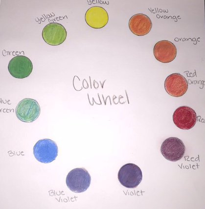
To create the color wheel only the 3 primary colors were used.
Color Pencil Magazine Drawings (Not Finished)
|
The assignment was to look for 2 textures, 2 fabrics, 2 value changes and 1 hair. Once those pictures were found we were to cut them 2 by 2 inches and redraw them in our journals.
Color Pencil Practice
|
|
To start the color pencil lesson, we began by practicing by drawing shapes in which we would create smooth transitions. We also used different colored paper to show how colors show up differently.
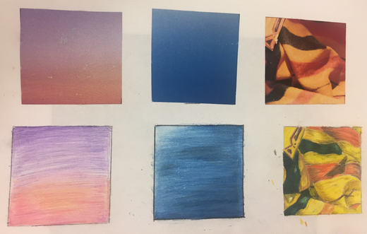
Watercolor Final
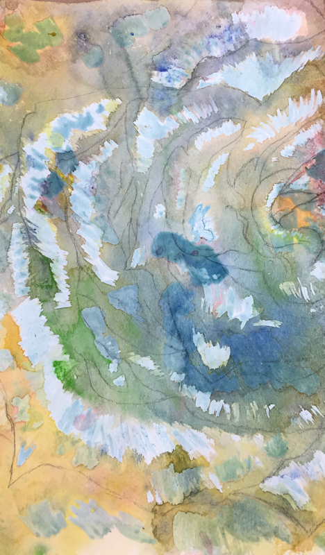
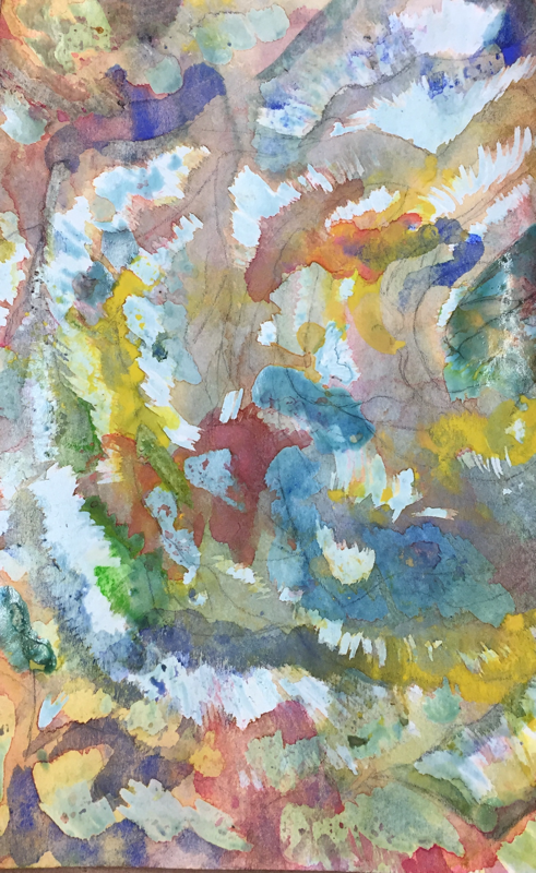
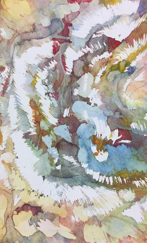
1. In order to create the poured watercolor painting the first thing that needed to be done was choose a picture and draw it on watercolor paper. The next step was put masking fluid where you wanted to keep the highlights. Afterwards was pouring watercolor and move the paper. Once the colors where you wanted them, you had to wait for it to dry and repeat the process.
2. Throughout the process some difficulties I faced were trying to make a color I wanted and liked. Another problem I faced was when I would layer the masking fluid sometimes I would accidently layer it on top of each other and it would being to fall off.
3. I learned that a watercolor painting isn't just created by using a paint brush, you can simply just pour it onto the watercolor paper. I also learned that you have to patient and can't rush the process. I learned that you have to know where to place the masking fluid and also you have to be careful when layering the masking fluid.
4. If I were to do this project again I would be more careful when blending the colors together and also plan ahead where I'm going to place the masking fluid.
5. The use of layers allowed me to create colors darker and create contrast between different layers.
6. I do feel as if the mini watercolor lesson were beneficial to my learning expansion went it comes to watercolor because it allowed me to be more successful with my end results. It also allowed me to be more careful when poor on watercolor on certain areas because I knew if I added to much of different colors onto different areas it could of easily turn brown and muddy.
7. I do believe have a guest speaker and talk to us was a good experience and it was very helpful to me at least. It allowed me to expand my knowledge with watercolor and I was able to learn a completely new way to work with watercolor in which I hadn't been able to beforehand.
8. Some insight that I got from the guest speaker about being a professional artist would be that you meet a lot of new people which follows with finding new techniques and discovering easier ways to create art in a easier way. For example, the guest artist explain that to create more texture in depth you could use a paint brush to apply water but he once met someone who instead of taking a paint brush the artist would just spit into it because it made the process faster and you'd still get the same end result.
Watercolor Fruit Techniques
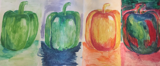
The class assignment was to paint the image that was given to use using different techniques and color schemes four different times. The first one was using a monochromatic color scheme which was simply using different shades of grade to create. The second image was made using the cool colors which consisted of blues,purples and greens using the technique of putting seran wrap over top of it while it was still wet to create a texture. The third image I created was using warm colors which consisted of yellows, oranges and reds. Ending with the last image which was created using complementary colors.
Watercolor Practice
|
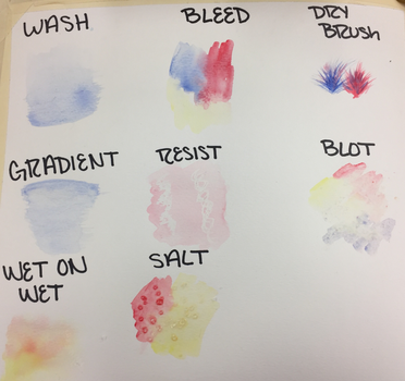
|
To begin with watercolor, we started off with learning different types of techniques that would help and afterwards we created three different value charts and shapes. The last assignment was paint a apple apply all the techniques we had learned previously.
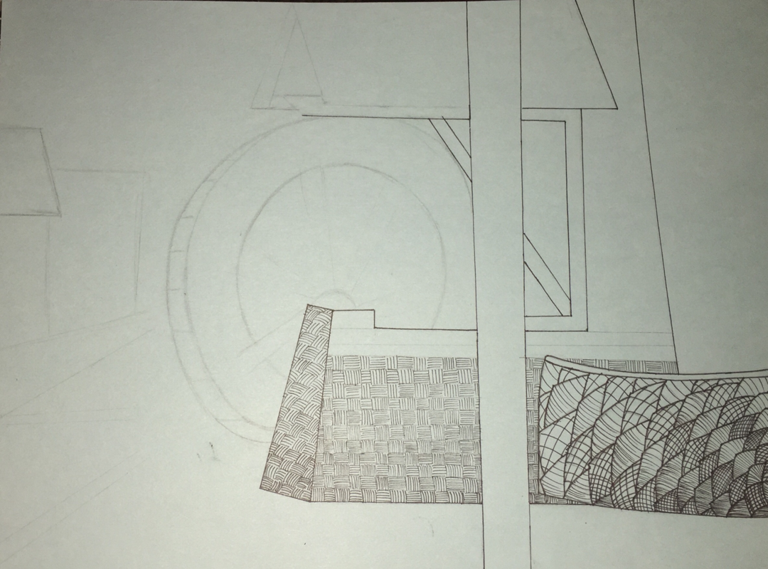
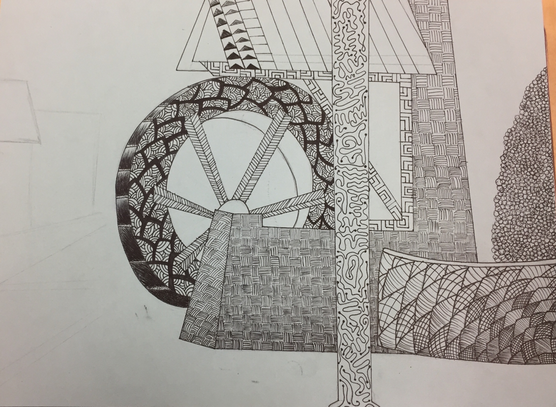
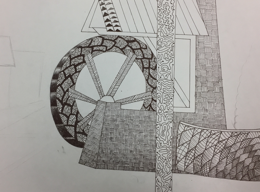
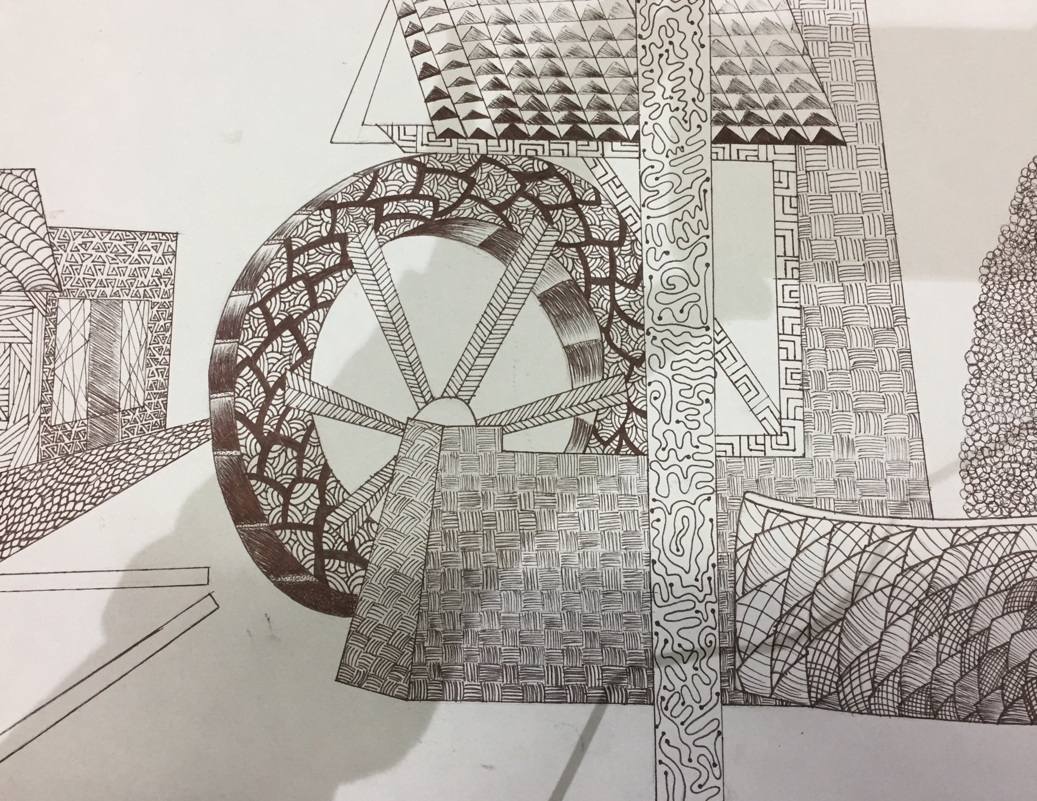
Pen and Ink Final
|
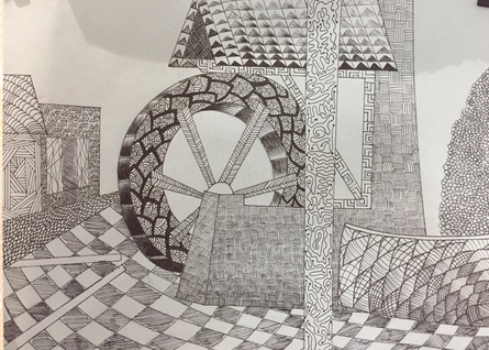
|
1. For my composition I ended up combining two pictures that I liked. The first picture was of a waterwell with some trees and the second picture was a picture of downtown Cary. I feel like I could of done better on the composition of the side walk and made the pattern so is followed the curves. I feel as if I should of added something to the background because I feel as if that became the center of attention when that wasn’t what I had originally had in mind. For my main focus I put the waterwell in the center unintentionally but it would of better if I had put it more towards the right so it wouldn’t be directly centered.
2. The texture and the pattern were important in my final project because it helped create and define different objects.
3. Value was important in the project because it made it more realistic, create definition within, and the usage of value created contrast.
4. For the craftsmanship I should of spent more time and tried to focus on creating my project darker in a way. I should of also tried and created every pattern so they followed the way of the object.
5. I feel like I was successful due to the practices we did beforehand in class. Although I personally feel like I could of practiced more and done a lot better.
6. When applying the pen and ink technique it was important to know and understand the concept because you need to know that pattern are very repetitive and they can get lost within each other. Also a lot of variation can be lost and end up looking the same if the right value isn’t being placed.
7. As a growing artist I believe that with I have learned to have better time management and always make sure there is a contrast in value or else everything with begin to look the same.
8. If I could recreate the my project I wouldn’t change much of it because of all I am pretty content with the end result but I would try and create more values to create contrast and add something to the background to get rid of all the open space.
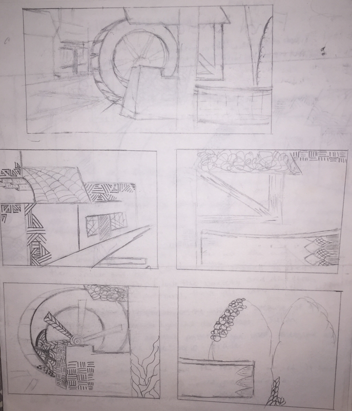
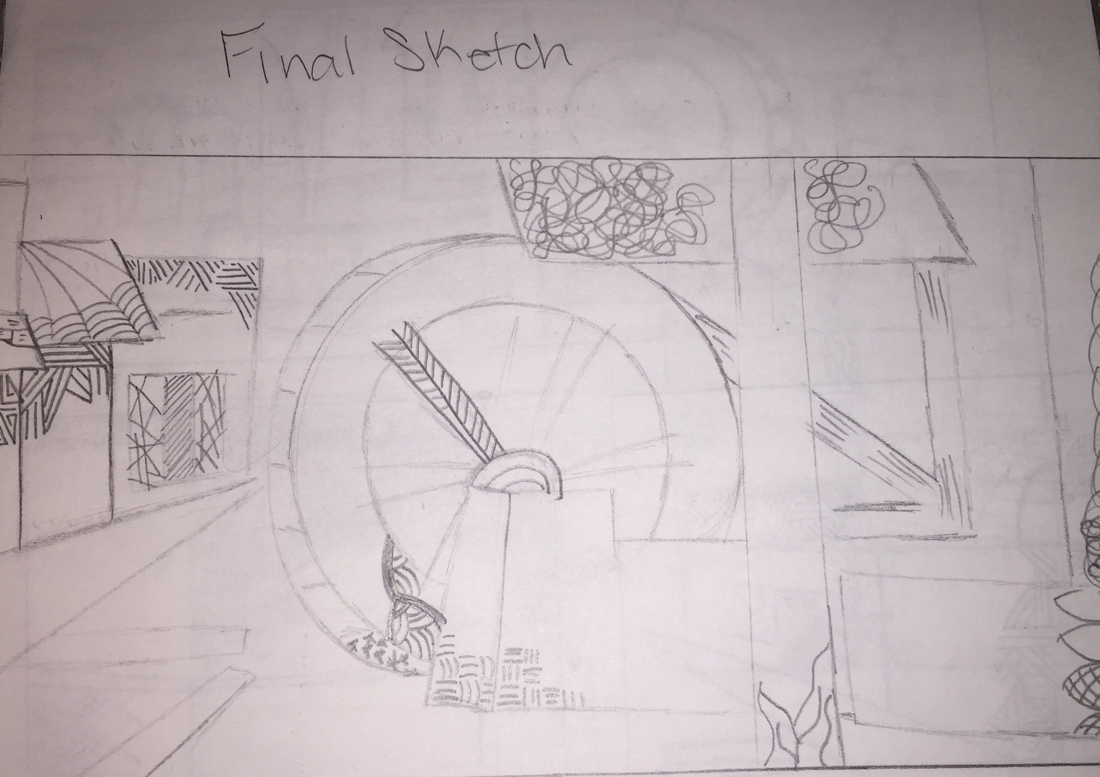
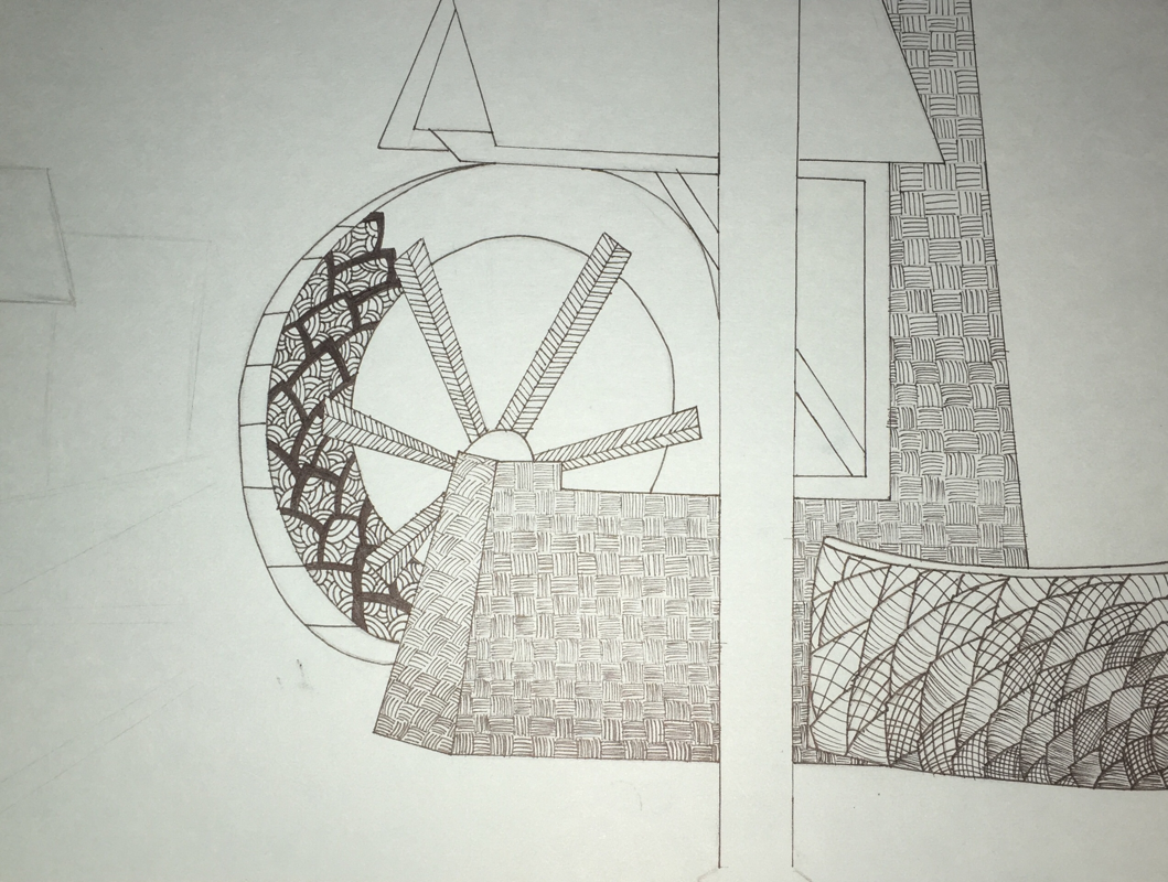
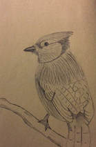
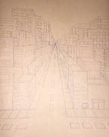
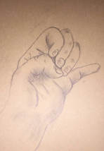
Pen and Ink Process Pictures and Sketches
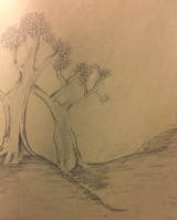
Landscape
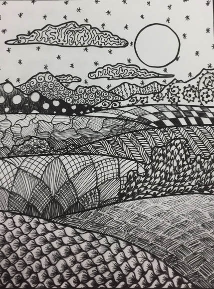
This landscape was made based on the 100 patterns we created on our own to create depth within the drawing to show where light hit and where there were shadow.
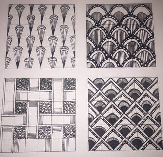
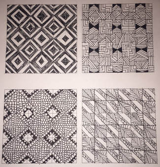
100 Patterns
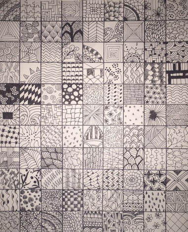
The class assignment was to create a range of 100 different patterns on own.
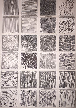
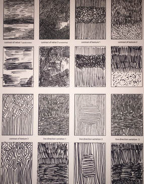
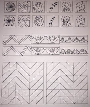
Pattern Elements &Contrast and Variation of Strokes
|
|
|
|
|
The first two sheets shown above where patters given to us and we were later to copy it ourselves in the boxes created beneath the original one. The next two pages had a design already in them which we had to finish in the space available and the last page was for designs/patterns of our own.
Stippling Techniques
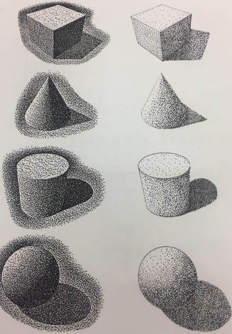
This was a class assignment in which we continued to practice with stippling and had to copy the objects on the left and recreate them on the left to practice showing where there was light source.
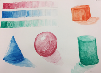
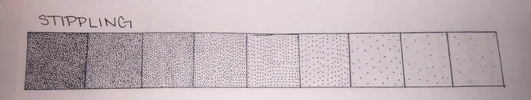
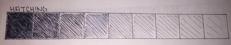
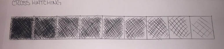
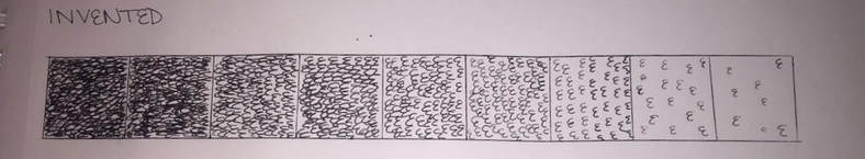
Value Charts
|
|
|
|
To start the pen and ink lesson, we created value charts from black to white using a pen and different techniques.
Assessment
|
|
|
|
These are pictures of the first day of class and it was an assignment to see what we already know.
