Art 4 Reflection
Well what can I say ? This class has gotten me so stressed but I think that’s also my fault because I’m also taking painting class and I’m a slow worker so I fall behind really fast. Besides that I love this class so far and I'm ready for next semester to start and continue working. Everyone helps each other out to become better artists and improve ourselves as we go with the critiques. I have learned so much this semester and I have figured out how I want my art to be done and my weaknesses as well as my strengths. I have met many new people and gotten even closer to others.
Coming to this class I've come to realize that I actually really like working with prisma color pencils I just hadn't given it a chance. I also realized that in my art I always define my lines when doing details like when doing trees and creating shadows like on walls. When I was looking at my work now and then looking at previous years I can really tell I have grown as a artist and I have really gotten better at blending paint. Also the main thing I realized is that I'm not good at time management but I manage.
So far this semester my favorite piece of work I've done was my self portrait because it shows how much I've grown as a artist specially with blending colors and my technique when using oil paint. My all time least favorite was the nature mechanical because I feel like it doesn't show me as an artist. I really feel upset with myself for not doing because I know I could of. This semester has really helped me become the person I want to be as an artist especially in the way I'm not scared anymore to challenge myself and get out of my comfort zone. I’m glad I decided to take this class and I don’t regret one bit.
"Life's Changing"
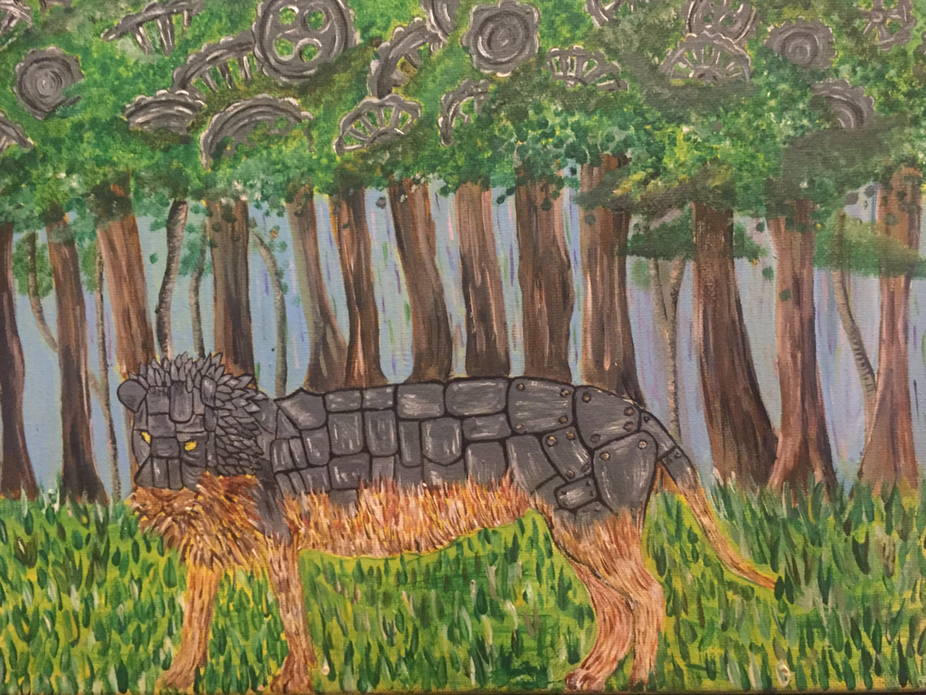
I'm just going to go straight to the point with this project and go ahead and say I don't like it. I honestly don't when I first started thinking of the idea I really was into it behind it but the more I worked on it the more I simply hated it. Honestly I don't even know what it is about this painting that makes me not like it or if it's the idea behind at this point. I just wish I could go back and restart it completely and try doing it in a different way or just use different colors or change the medium. But now all I do know is I could of most definitely done so much better.
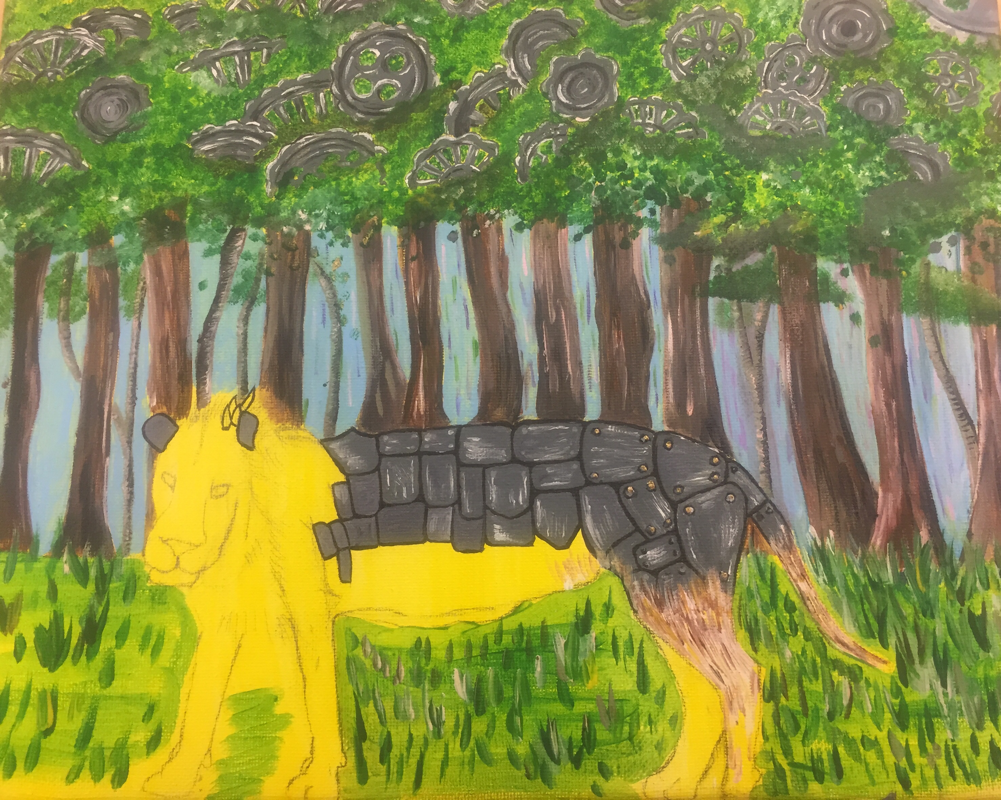
I can say I like the wheels and the highlights I have to them and the shadows I created underneath them which I made by using purples and some reds. I also like the highlights I did on the metal of my lion and that's about it. I can't say I like anything about it besides that i really don’t like the fur. I don’t like the colors I used I feel like they don’t go good together and making the whole painting look weird. I just wish I could go back and change it. If I could go back and restart it I would definitely go back and do it in colored pencils how I had originally had in mind but I ended up changing my mind for some reason maybe it would have turned out better.
I can say I like the wheels and the highlights I have to them and the shadows I created underneath them which I made by using purples and some reds. I also like the highlights I did on the metal of my lion and that's about it. I can't say I like anything about it besides that i really don’t like the fur. I don’t like the colors I used I feel like they don’t go good together and making the whole painting look weird. I just wish I could go back and change it. If I could go back and restart it I would definitely go back and do it in colored pencils how I had originally had in mind but I ended up changing my mind for some reason maybe it would have turned out better.
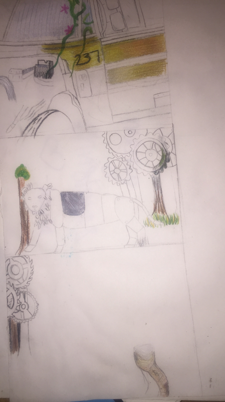
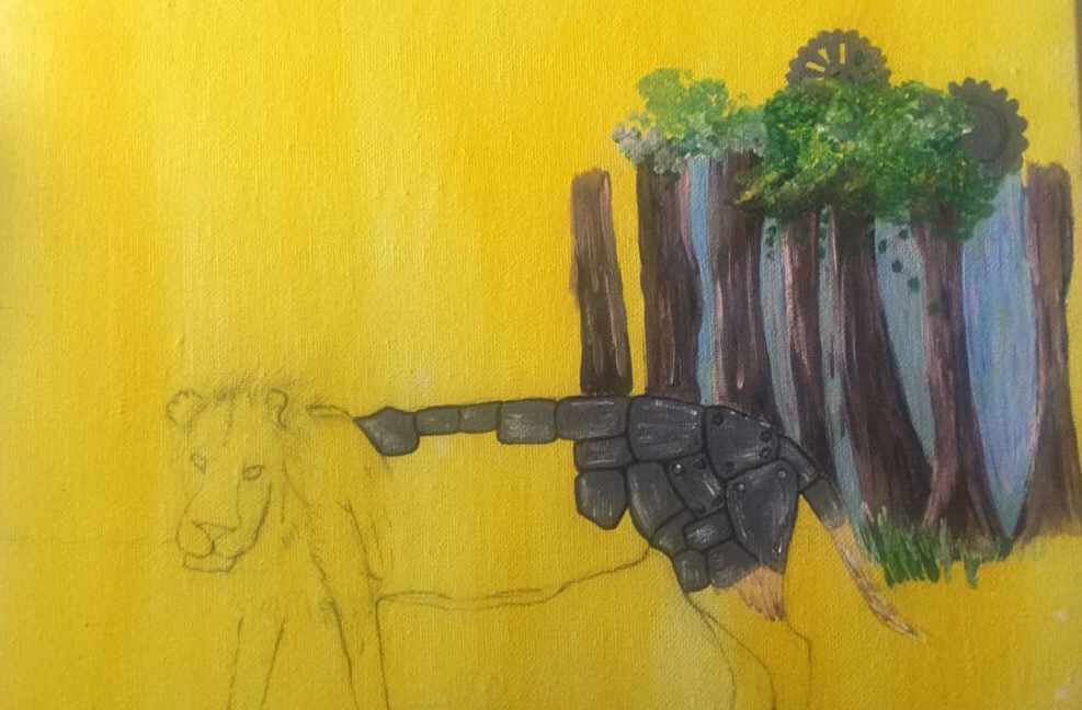
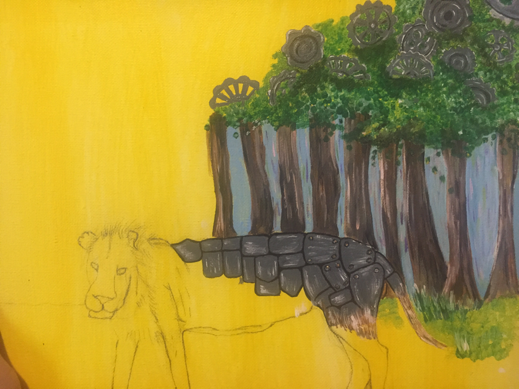
Nature Vs Mechanical Process Pictures
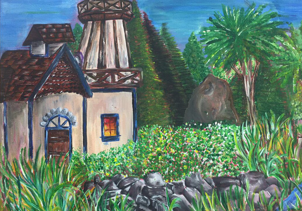
"Out of a Fairytale" Final Picture
|
|
This is my final product which I used acrylic paint for because while I was doing this I was doing a project for painting in class in oil that way it would balance out and that way the process would go by faster since it actually dries unlike oil paint. Which didn't go by any faster since I'm not the fastest worker to begin with but in all honestly I'm glad I chose to do this in acrylic paint. I'm happy with my final project I feel like it's something that would come out of a children's book.
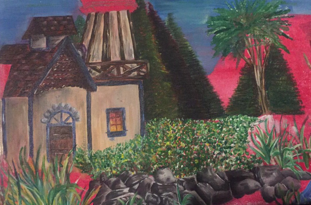
When doing my landscape I wanted to make it realistic but turns out I'm not too good with that. I like the colors I used throughout especially for the house/cottage I feel like it gives it a small cozy feel to it which I really like. Although my painting doesn't look completely realistic I'm happy with my trees and grass with all the colors I added into them like some reds and purples to darken places up. Also yellows and whites to bring out highlights to define the grass. I really like how my rocks came out with all the shadows and highlights I added to them giving them a unique look to them. I did struggle with my trees in the back ground because I wanted to make them so you could see each individual tree not just have them mushed together as one like I have done in the past with some of my other pieces.
If I could go back and work on this again or restart my project there's not much I would change besides my sky I would like to add more values into it because it looks like I just over it with just one shade of blue. Other than that all I feel like there is left to do is go over some other parts in which you can still the red from the wash but besides that I'm happy with my result.
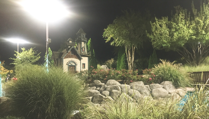
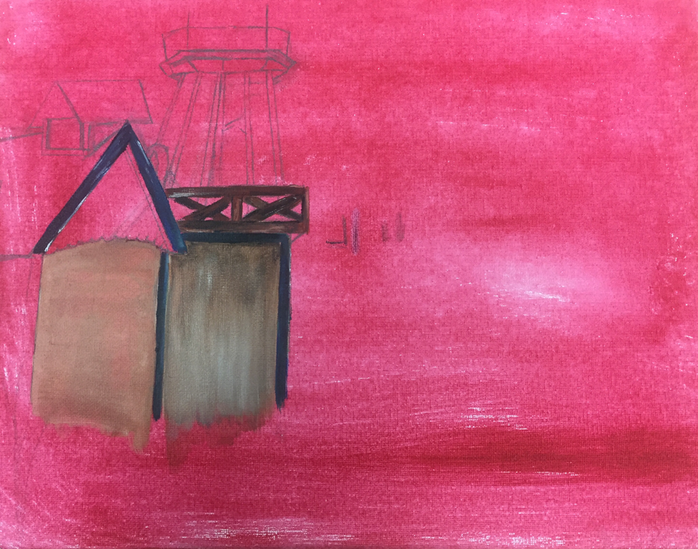
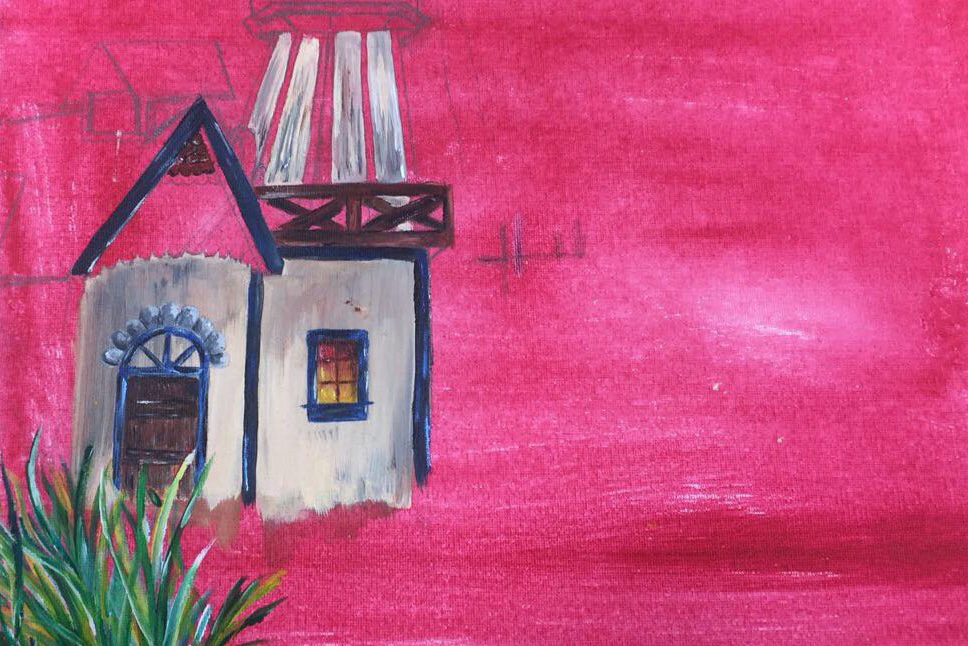
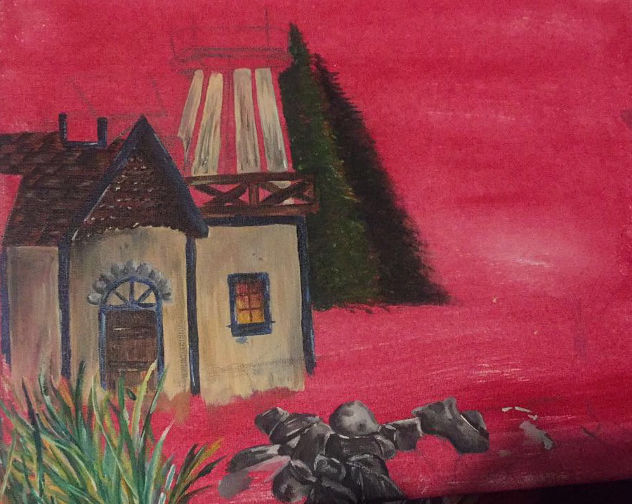
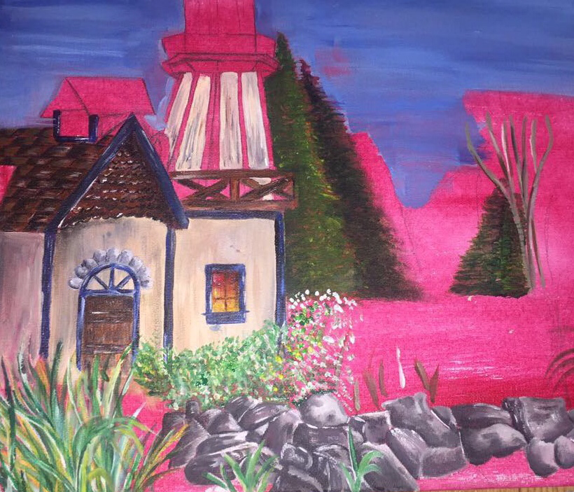
Landscape Process Pictures
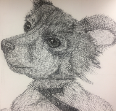
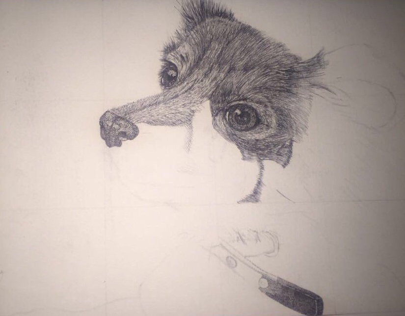
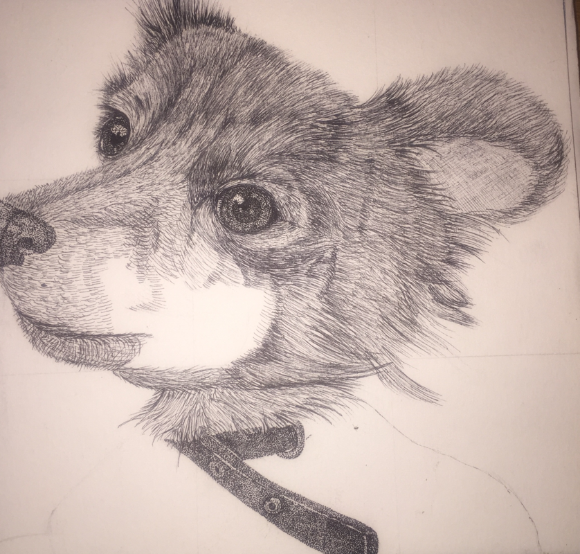
Animal Portrait Final
|
|
For my animal project I did my older sister's dog Snoopy which she's had since he was about 8 months. When it comes to this project I'm okay with it, I'm not happy with my final product but I'm also not completely disappointed with it. Reason being I actually didn’t practice or make any sketches for this piece I kind of just dove in and hoped for best and simply just went off based on my reference picture. I decided to go with pen and ink which was completely different from everyone else in class but I'm happy choose it. I was originally going to do mix media with pen and ink and watercolor but after so much detail I gave up on the idea of watercolor and just stuck with pen and ink.
The thing I most found challenging was the fact that the fur goes in various directions and since I'm simply just using black ink I feel like some of the fur just blends all together and you can't see where it's going. I kind of do wish I would have chosen another medium so it wouldn't just be black and white like prisma color pencils for example. If I could go back and change anything well I would manage my time better that way I could had done the watercolor and also taken more time on the fur and added more details.
When I get the chance I am most definitely going to go back and darken up the bottom and just various places and just add more details because I feel like looks awkward due to the fact that the top right has so much detail and darkness and the rest doesn't. I also feel like the head is so much bigger than the rest of the body or maybe its just that that I need to add more fur onto it or if its just the actual picture.
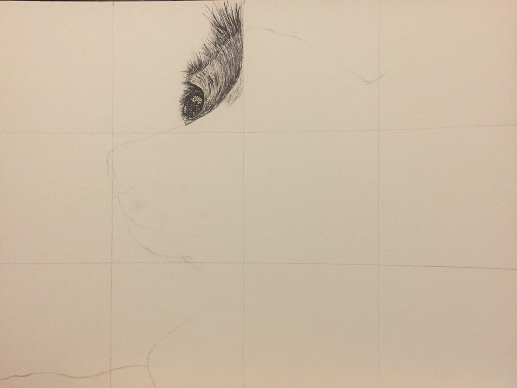
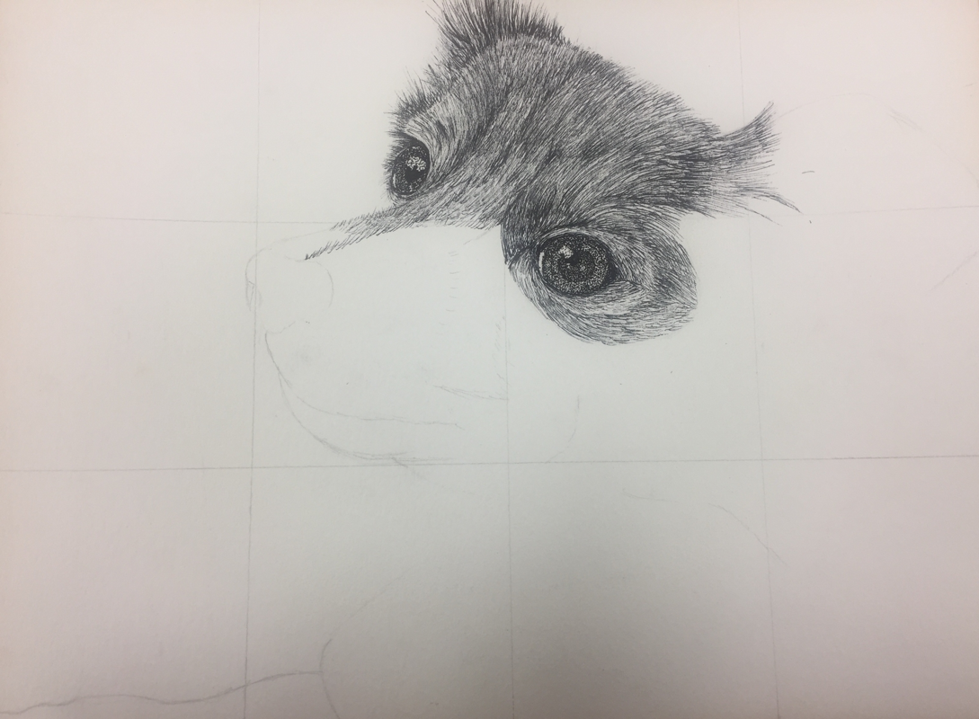
Animal Portrait Process Pictures
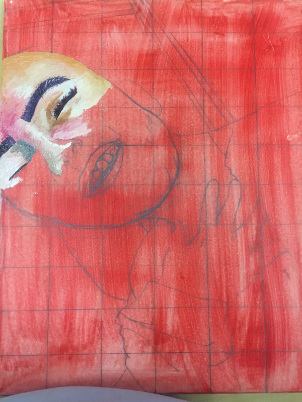
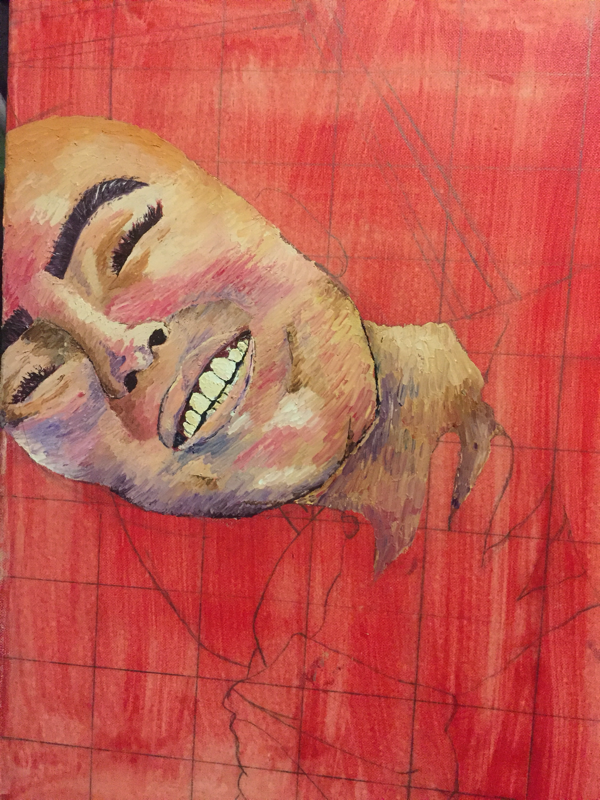
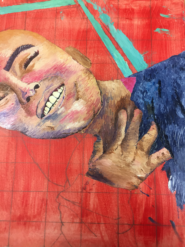
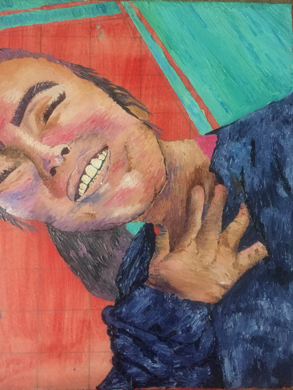
"Help Why Am I so Colorful?"
|
|
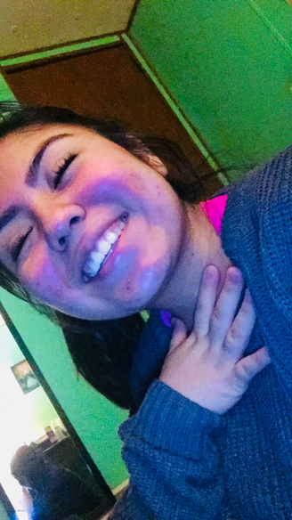
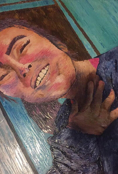
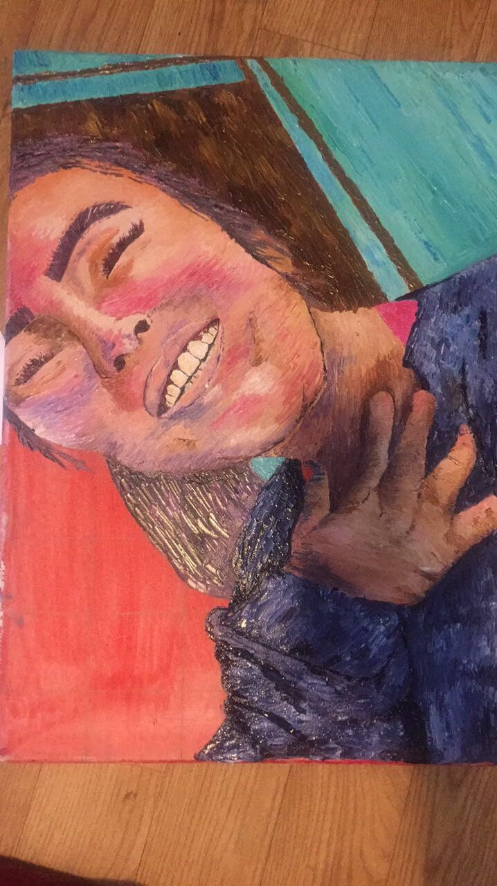
This is my final self portrait and I really do believe this is my favorite piece I've ever done. The medium used for this was oil paint which is my favorite which I have mentioned many times before. As previous projects this semester I decided to challenge myself by going out of my comfort zone and simply using palette knife. I'm really proud of myself because I stuck by it throughout my whole painting and never once used a paint brush which was one of the most challenging things especially when getting smaller details. I've done self portraits in the past and they were not successful or the best to say the least so this really was one of my greatest achievements.
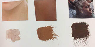
When I first started I was really scared with doing my skin tone because even when we were doing the practice I struggled to get the right tones and I also choose to change it up and add colors which included blues, pinks, and purples. With the skin I think I did a really good job and I'm proud of how I managed to not let it get muddy. Towards the very end I just kind of winged it and hoped for best. Throughout this process I did accidentally get some blue onto my skin and I just had to work with it and I think it came it really good because it helped with creating more shadows because my original plan was simply to use purples and pinks. I think one of the hardest things I had do was getting I details like my eyelashes and getting the effect of individual hairs on my eyebrows. Also my nose was hard because I couldn't get the right shape at first and there were different colors on my nose. One of the things I'm most proud of were my teeth I honestly took me a whole class period and a whole lunch period just working on them, the only thing I would change about them would be darkening the ones that are further in the back of my mouth.
Overall like I said previously I'm proud of my final project with the value changes I was able to create throughout my whole portrait and textures. There's not much that I would change besides some small details like darkening my back teeth and like lightening the edge of my face because I feel like it stands out too much.
Self Portrait Process Pictures and Sketches
Practicing Skin Tones and Facial Features
|
|
|
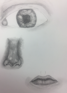
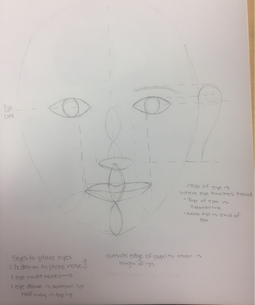
Before we actually began the whole journey into creating our self portrait, we got a chance to practice making skin tones which was really helpful and all though it looked simple doing it, at first I still managed to struggle. At the very end it was completely worth it. We also practiced doing facial features and their placements.
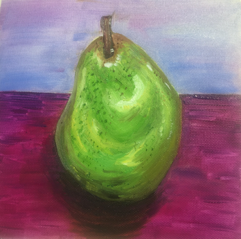
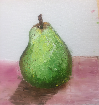
Oil Paint Practice
|
|
The class assignment was to practice painting the fruit that was placed in the middle of our tables using oil paint. One of the painting was to painted with only using a paint brush while the other one was to be painted with only the use of a palette knife.
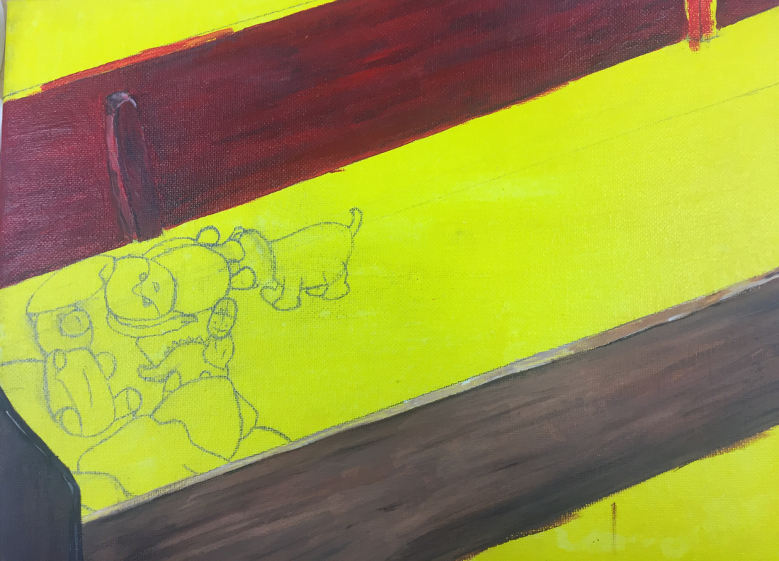
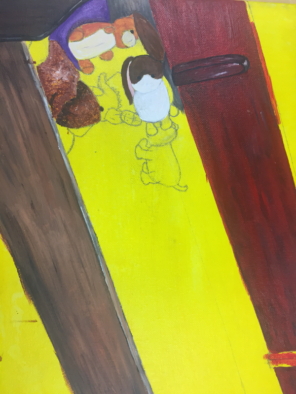
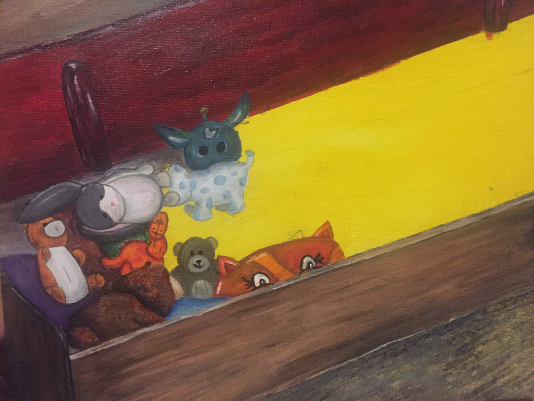
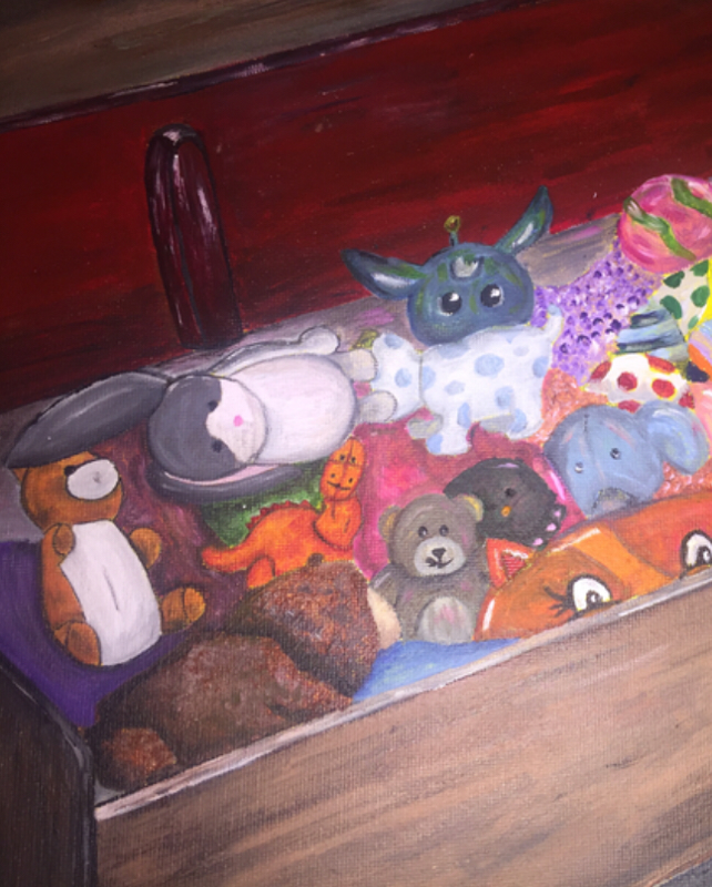
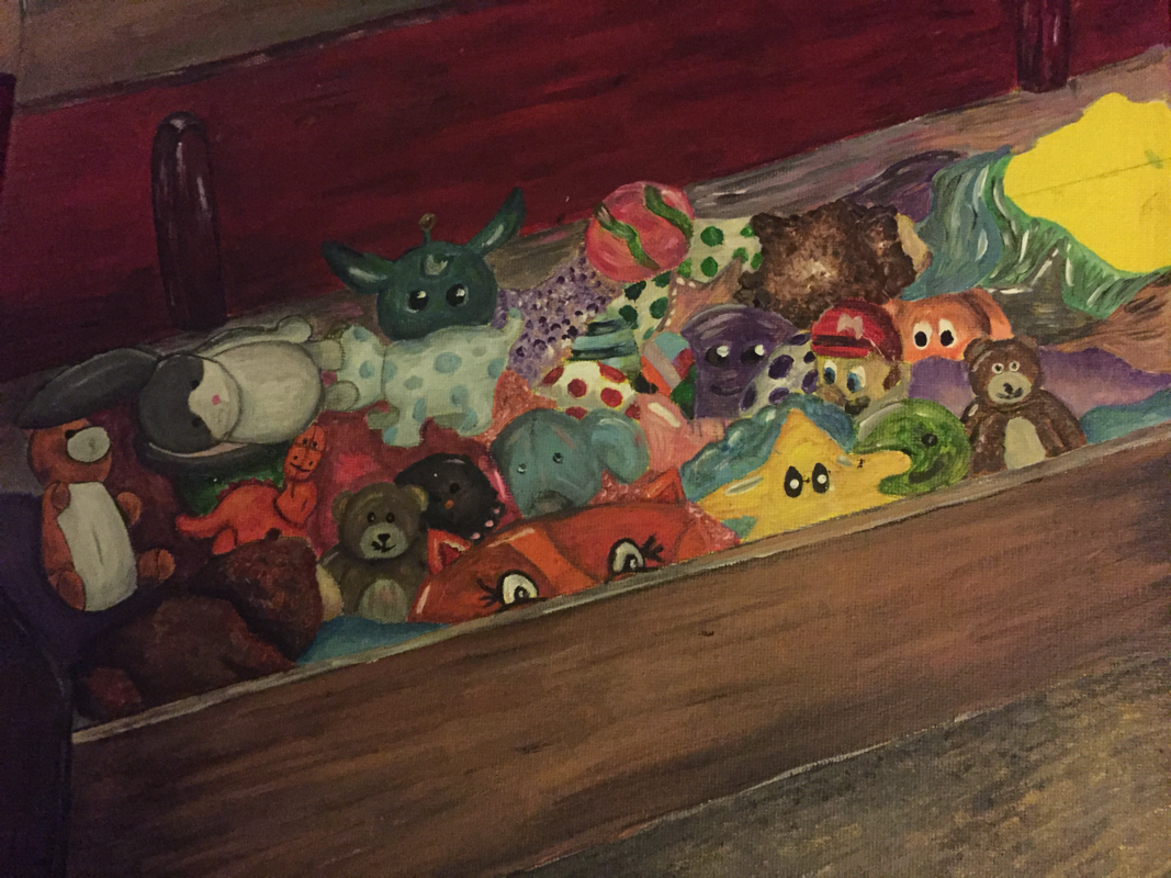
"What's in the Chest ?" Final Project
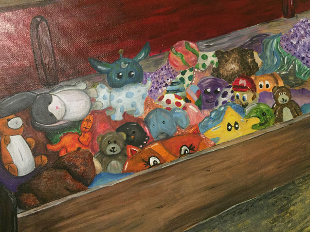
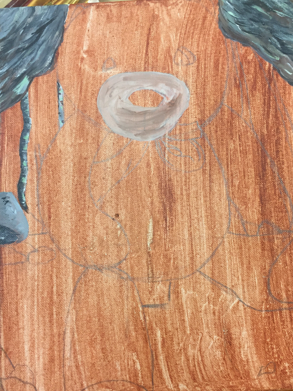
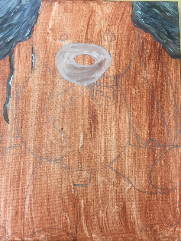
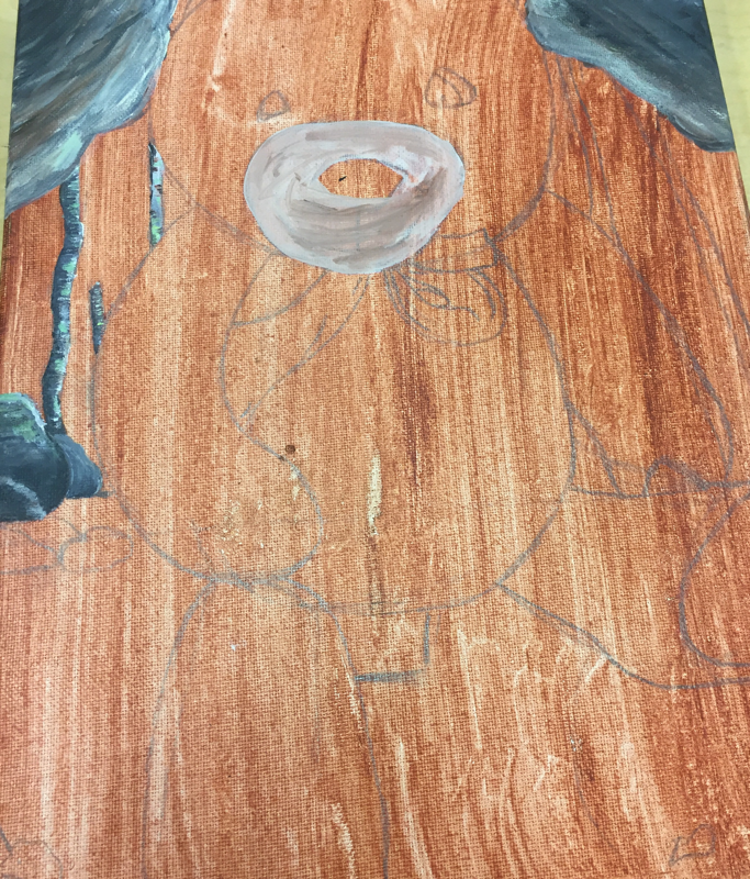
For my interior spaces project, my two final ideas were between a box of donuts or inside a toy chest. I wanted to challenge myself into something harder and I found a box of donuts to be “too basic” as some would say. Which ended up making up my mind and it being the toy chest because I knew that would have various of textures and value changes found within in and it’s something I really want to work on. Meanwhile as for the medium, I chose to keep it on the safer side and my choice was painting which is my favorite for my final. The type of paint I ended up choosing was acrylic paint which isn’t my favorite so I choose that to challenge myself that way I could get more practice with it.
The toy chest itself was tough to do because of the wooded texture to it, the different value changes made the wood texture difficult. The yellow base color made it hard for me to get the red which resulted in me mixing burnt sienna and red to eventually get red helping me create the look of wood I wanted. I spent so much time on the wood it’s self that by the time I actually got to what was inside the chest I was complete over it because I know the hard part was just about to start.
The inside of chest actually came out better than I had originally had in mind and had more colors than I originally had planned. I tried to still keep some of the yellow from the wash which is something I hadn’t had in mind until someone mentioned it and I’m glad I took that advice but I do wish I had thought of it myself and would have keep more yellow because only one of the toys had yellow and I simply feel like it looks awkward and out of place. Towards the very end onto the further right I just started to give up in all honestly.
As a result, I think I should definitely add more shadows to emphasize the fact that the toys are on top of each other and just overlapping. That would really help me with some of the toys that I think that just look like they are floating due to lack of shadows. Overall I’m proud of my final project all though I’m so over it. There are still some small details I want to go back and change but other than that I’d say this project is pretty complete the way it is now.
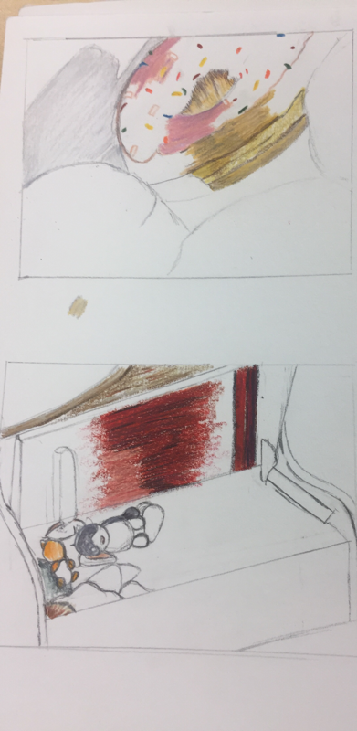
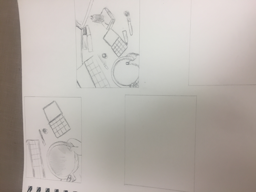
Interior Spaces Process Pictures


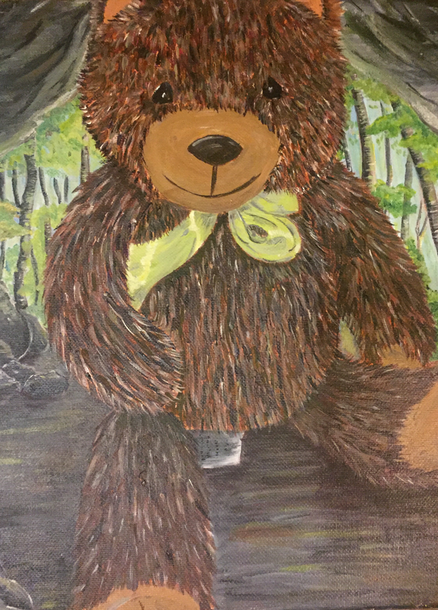
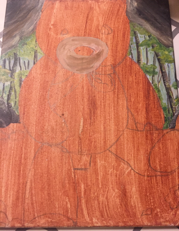
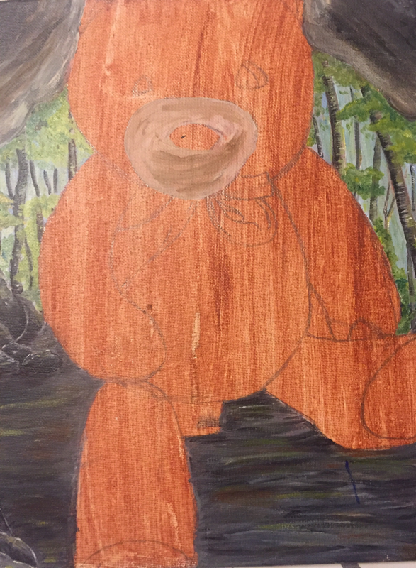
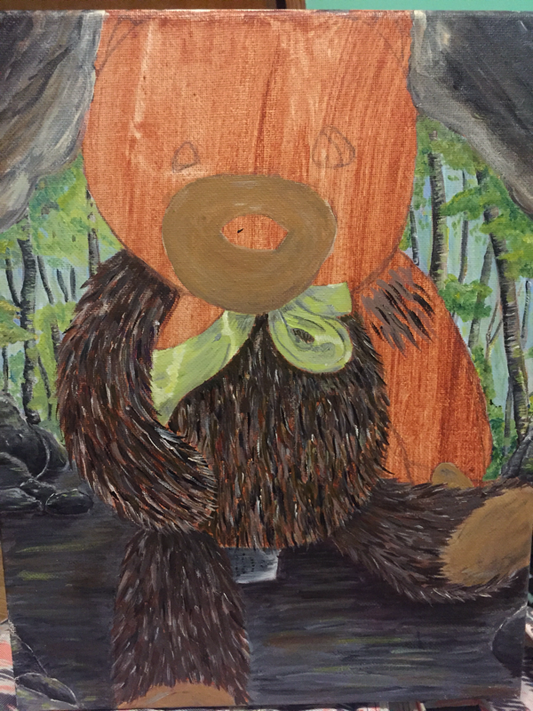
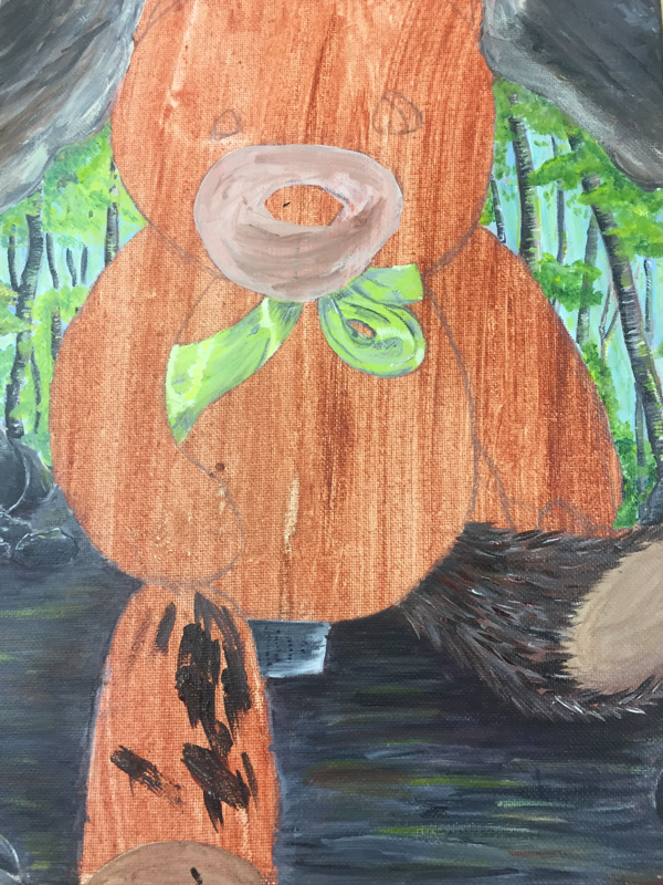
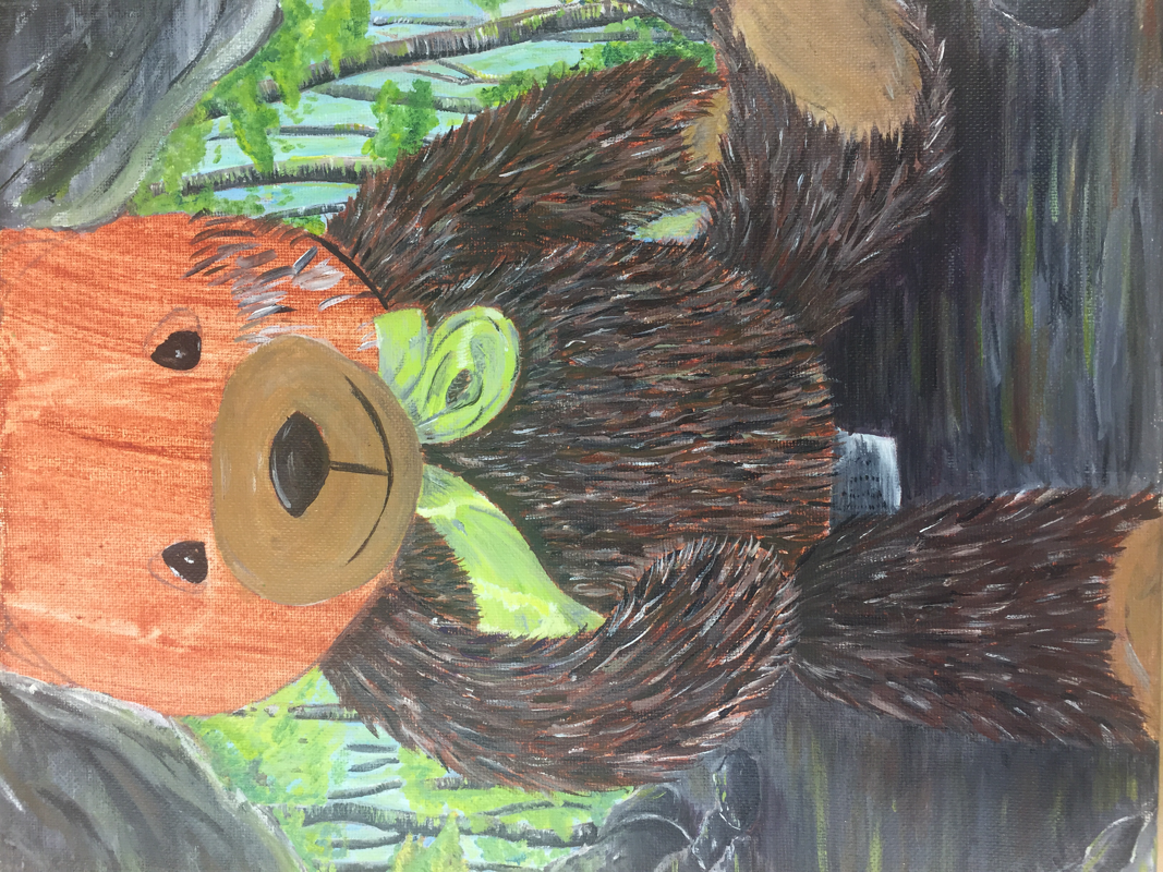
”Cuddles” Final Project
|
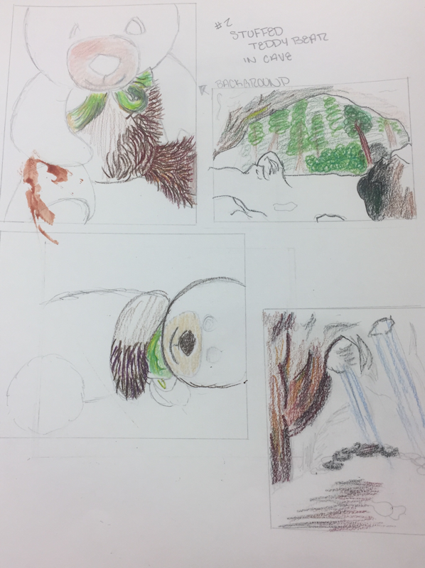
When it came to this project one of my ideas was to use various boxes of food and food itself to create a city. Which is something someone had done in the past prior to me which is why that ended up not being my final project. Which lead me to my next idea being just a simple old teddy bear that’s just on my bed and has been there for as long as I can remember. I choose to make my teddy bear extraordinary by placing in a cave which is something you wouldn’t typically see and that’s how everything began.
For this project the medium being Used was acrylic which I really enjoyed considering painting is my favorite medium although acrylic isn’t my favorite. In my composition I decided to put the teddy bear in the middle and up close to get the detailing of the fur which required layering in order to add all the different values and color changes. Layering was a very important concept in this painting which took patience which I don’t have much of but it helped me getting painting get to the point in which I wanted. I struggled with making the top of the cave behind the teddy bear I had to go over twice to get it to how it is now and had had time figuring out where the light would hit and it’s coming in. I think overall I did a really good job I’m proud of the final outcome which isn’t something I say as often as I wish I would. Although even now that’s it’s finished I’m still a bit unsure about the cave like the top but I think at the end adding some green into which wasn’t a lot really helped get the look I wanted. I really liked the back ground and how it creates a contrast to everything else which is dark and brings back those bright colors which is something I like having in my art. I’m proud to say the least about the detailing on the teddy bear and all the colors I used to create value changes. To be honest normally I would say “if i were to do this project again I would change this or that” but as for this project I really wouldn’t change anything about it. |
“Cuddles” Everyday Object In Process Pictures
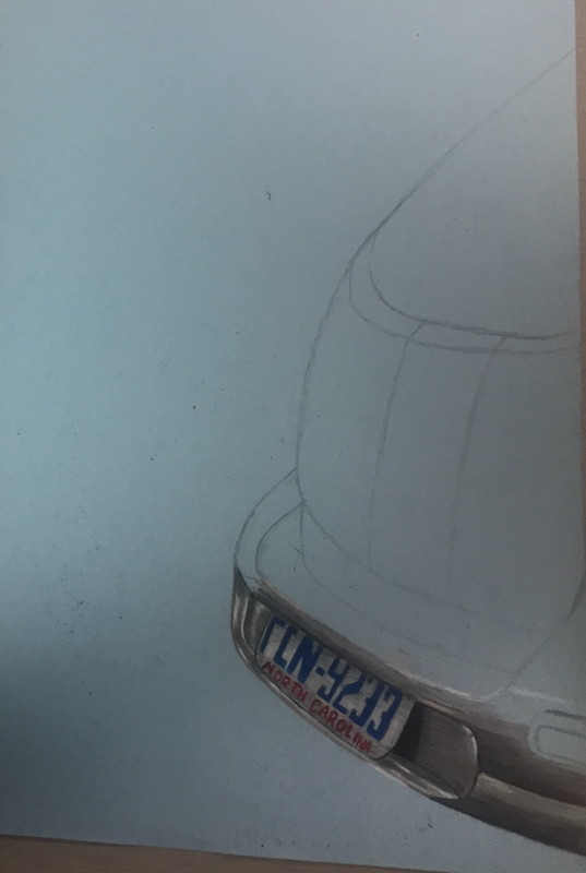
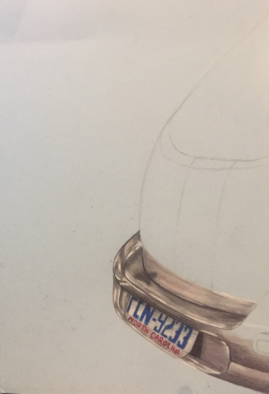
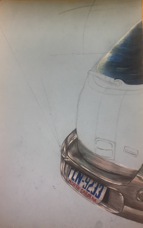
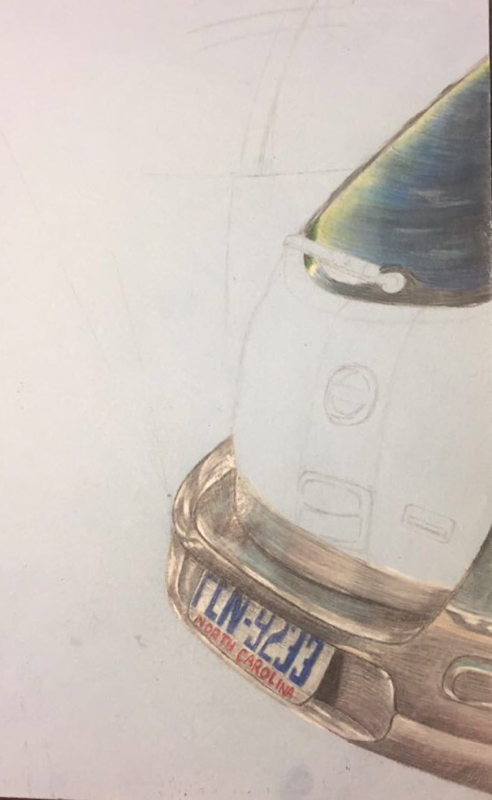
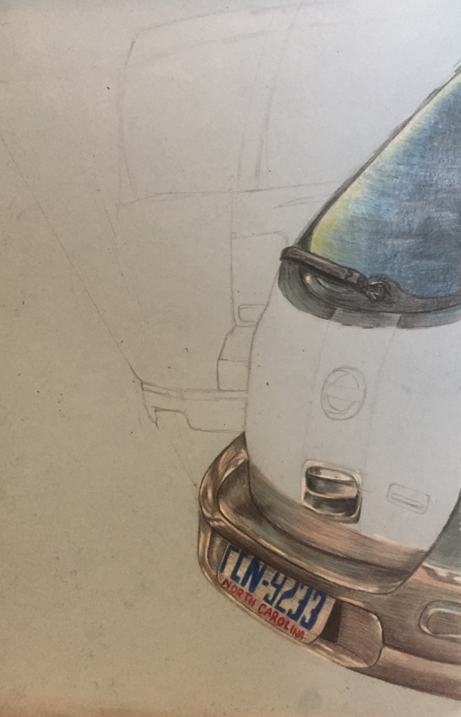
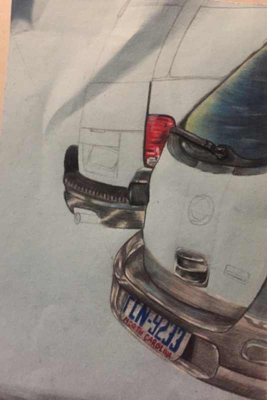
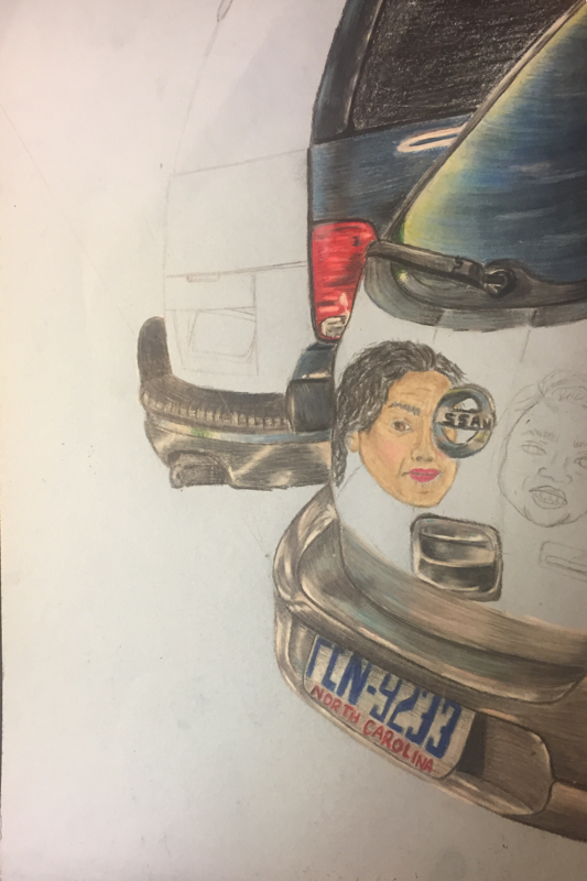
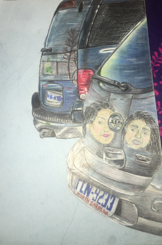
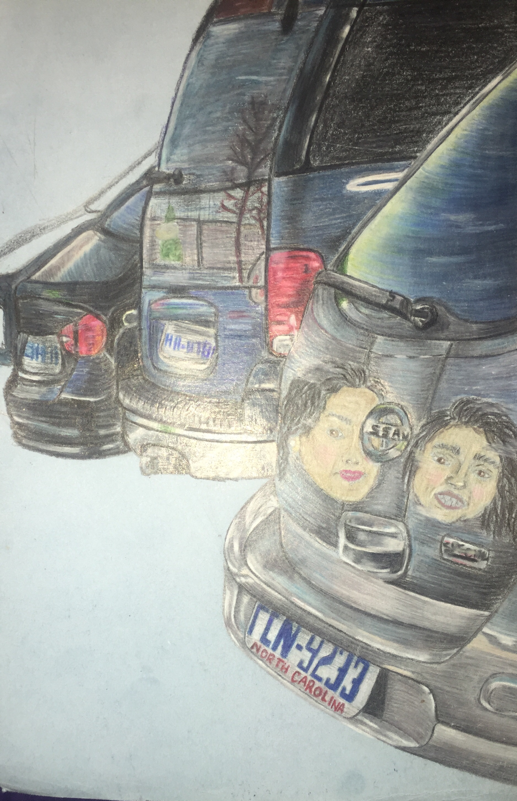
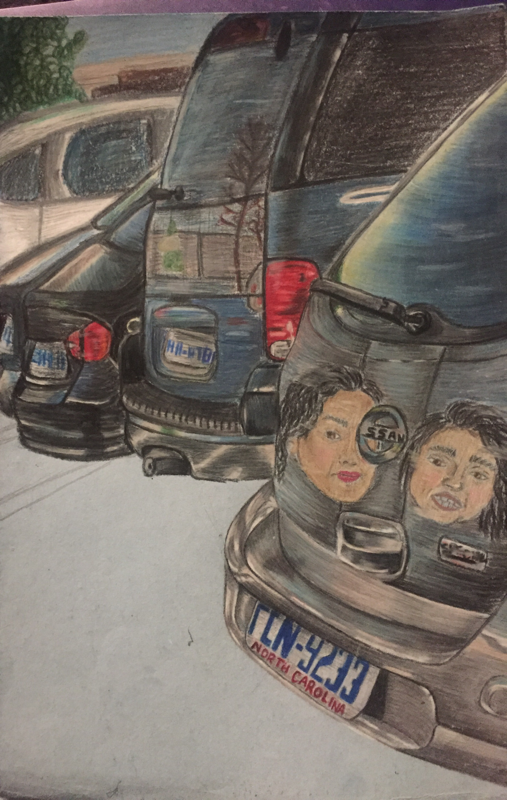
”Car Views” Final
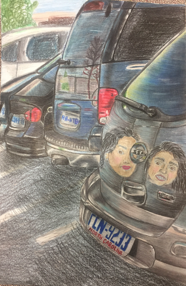
The purpose of this project was to demonstrate or reflection ourselves in a drawing without actually putting ourselves in the drawing. This reflects me because the two faces being shown on the car are images of my sister and my mom to who I happen to have a really close relationship with. This also reflects me because now since I'm always at school or working the only time I actually spend time with my family is when we are in the car even if we are just going down the road to the store and it’s just quality time with them. To begin I’ve never actually fully worked with prisma colors besides in Art 2 when we did the self portrait using the 3 primary colors.
This is my final project overall I’m pretty happy with the final result considering it was my almost like my first time actually using prismas. I think I did a pretty good job with the blending of colors and trying to make it realistic. I do wish I had spent more time on the road and the detailing of it I feel like if I had spent more time on it my final result would of turned out better and it would of changed the final result. I struggled after a while with the layering specially on the grey car because I had added so many layers eventually when I tried adding more layers the color just begin to come off. On the blue SUV I wish I would have blended the reflection more to make it seem like a actual reflection because to me it doesn't look realistic I feel like it looks like someone drew that image directly on the car not a reflection. Also I wish I would blended more the faces into the car or something to make them fit more. With all that being said I am pretty content with the final result with the except of a few things.
This is my final project overall I’m pretty happy with the final result considering it was my almost like my first time actually using prismas. I think I did a pretty good job with the blending of colors and trying to make it realistic. I do wish I had spent more time on the road and the detailing of it I feel like if I had spent more time on it my final result would of turned out better and it would of changed the final result. I struggled after a while with the layering specially on the grey car because I had added so many layers eventually when I tried adding more layers the color just begin to come off. On the blue SUV I wish I would have blended the reflection more to make it seem like a actual reflection because to me it doesn't look realistic I feel like it looks like someone drew that image directly on the car not a reflection. Also I wish I would blended more the faces into the car or something to make them fit more. With all that being said I am pretty content with the final result with the except of a few things.
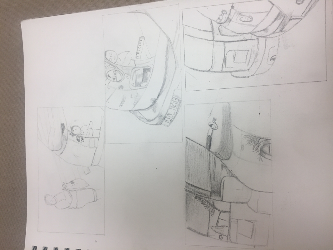
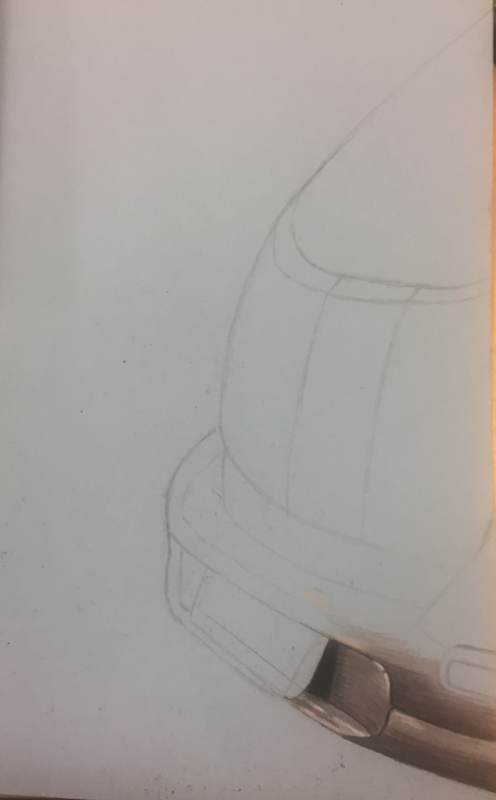
”Car Views” Reflection Sketches and Proccess Pictures
Artist Statement
Art is form in which we can communicate to viewers. When I make artwork I don’t think about what I want to communicate to people looking at my work. I don’t do it for a specific reason or to try and make a point. I do it because it’s something I enjoy and it’s something I want to improve each time I work on a new piece. When people look at my new projects or ones I’m currently working on I want them to see some sort of improvement from the previous ones. With that being said I guess what I want to communicate and want people to see how I’m learning to make myself a better artist. In my art I’d like to say I show emotions with the colors I use or how I try to define certain areas of a painting or drawing specially create value or small detailing. To me showing emotion in my art or at least trying to is important because it makes it easier to connect with others viewing it. To me a “good“ artwork are ones with colors and full details I enjoy looking at all the small detailing that someone can incorporate into a piece of art.
