Bob Ross Painting
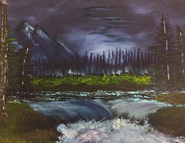
This painting was based of a painting that Bob Ross did in one of his videos. When I first watched the video it seemed easy by the way he did it but once I started doing it myself it wasn't. Even though it was hard I am proud of the end results. Overall I think this was a good experience while it was difficult to recreate his painting, I would consider following along with another of his video.
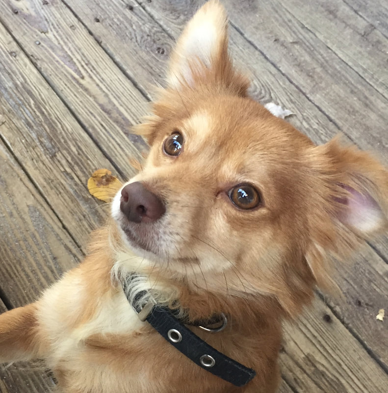
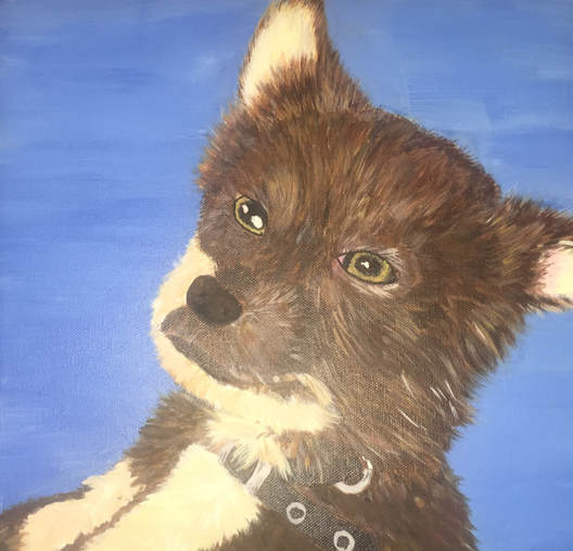
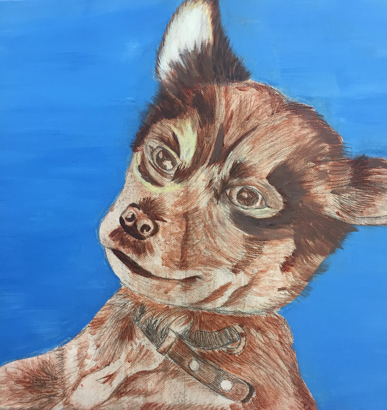
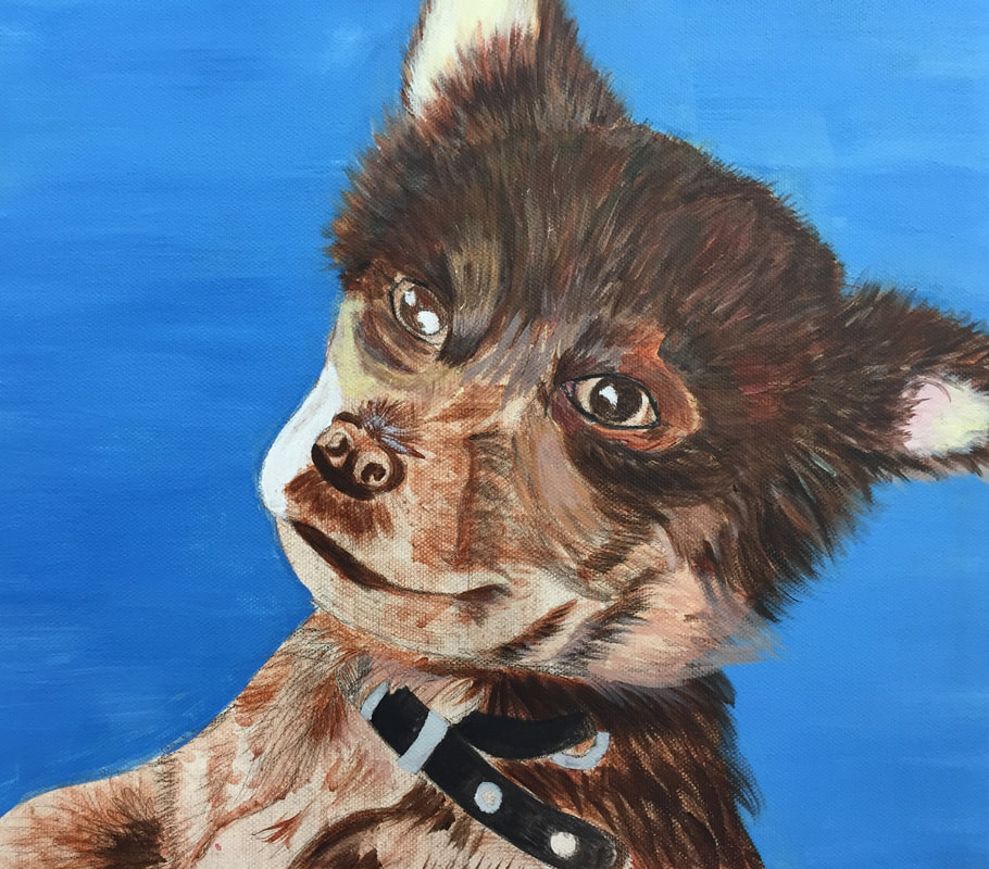
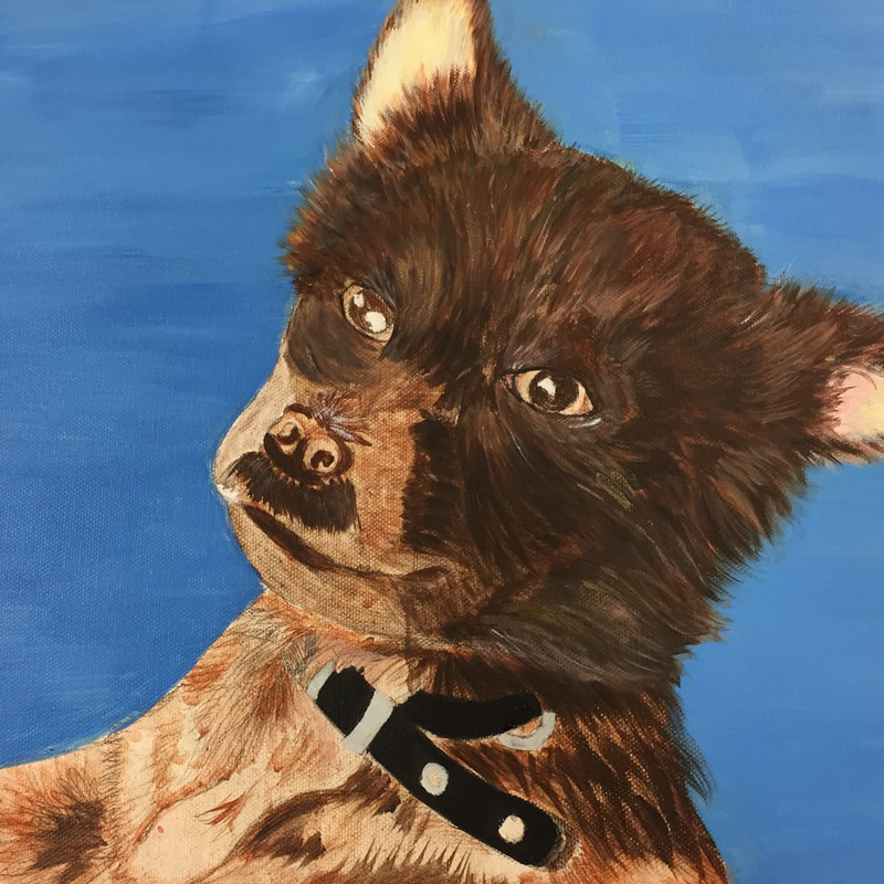
Animal Portrait Final
|
|
This painting is my older sister's dog Snoopy, In the beginning, I had intended to create the background a wooded porch as it was seen in the picture but I ended up choosing against it and making it a basic color. In order to make my painting more successful I feel I should of spent more time on the mixing of color and making him a litter shade of brown. If I could of went lighter it could of helped not making him look odd and not realistic when making the bottom side of his mouth and bottom left almost a really light yellow almost white. With the fur, even though I feel like it's too dark I'm happy with the final result due to the fact that I was able to incorporate multiple colors into it not just different shades of brown. I feel as if I was the most success when creating the eyes and around the ear areas. Overall I believe I did a successful job while I am proud of it if I had the chance to redo it, I would.
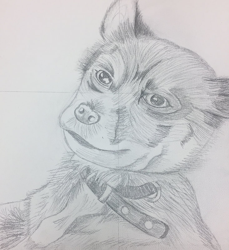
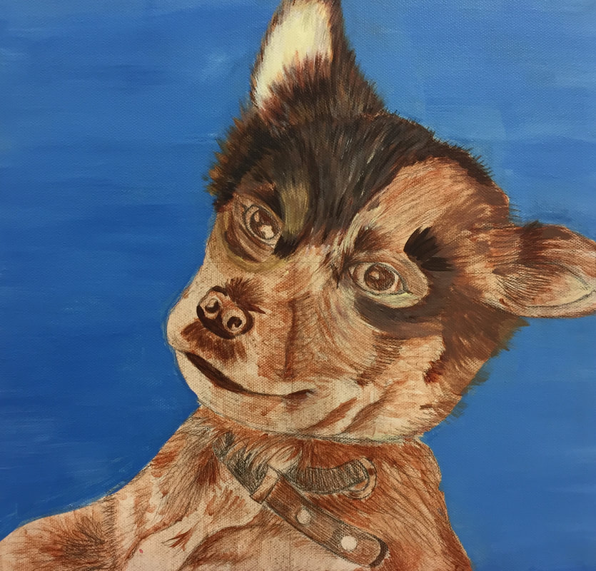
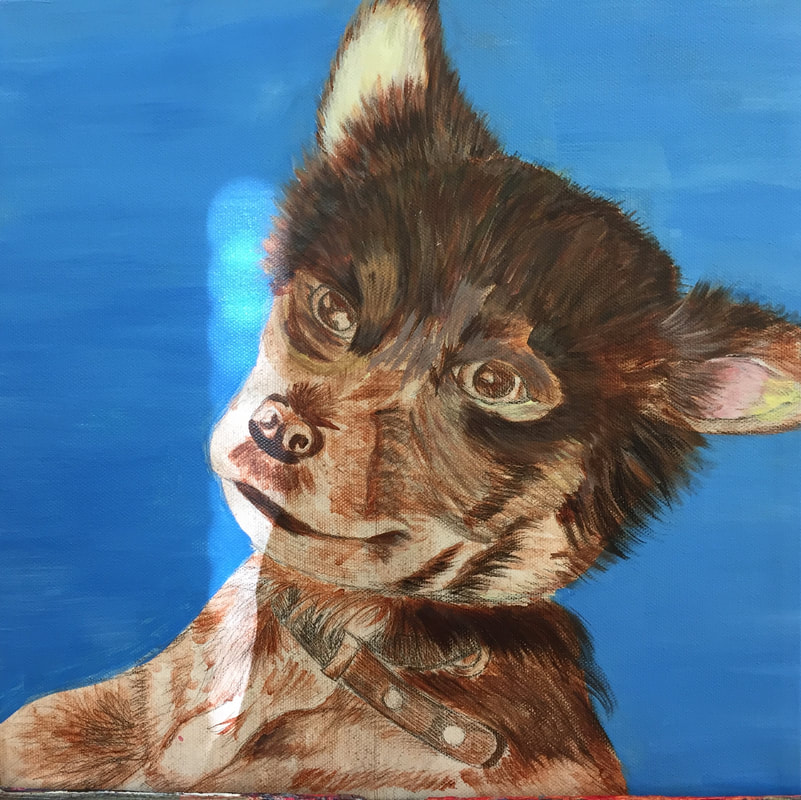
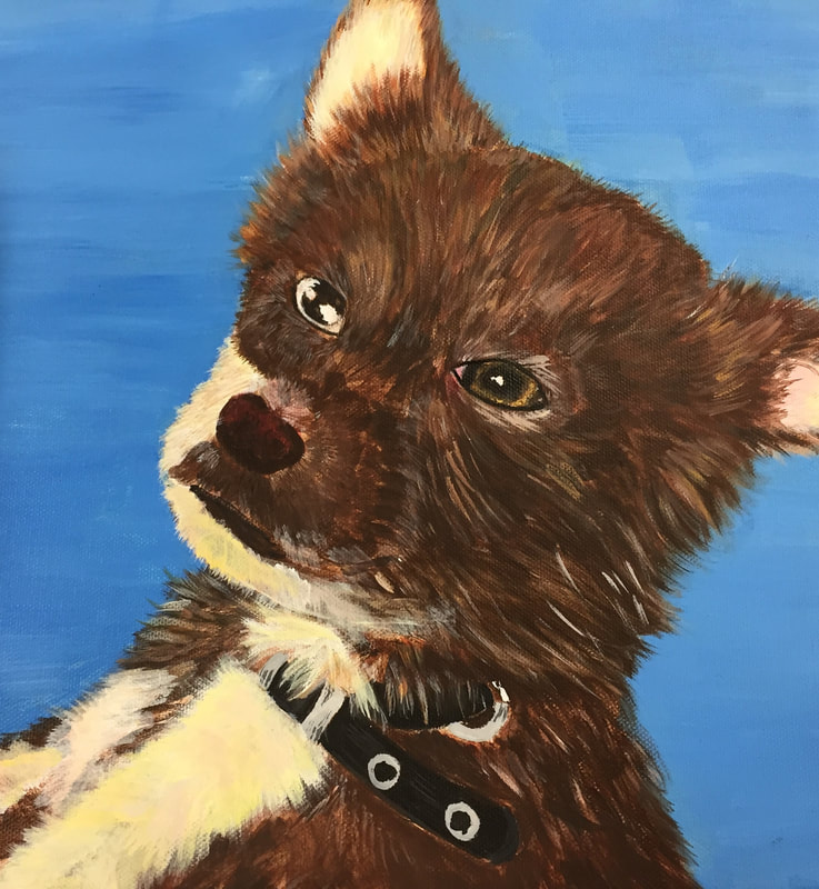
Animal Portrait Process
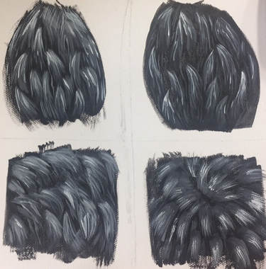
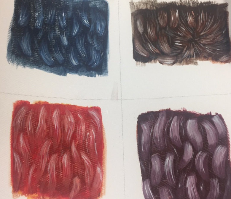
Fur Practice
In the pictures below were from practicing techniques for painting fur. On the left side are practice with only using black and whites to create values throughout the fur. Once completing the practice of black and white, we moved onto practicing painting fur with colors other than black but still using white.
|
|
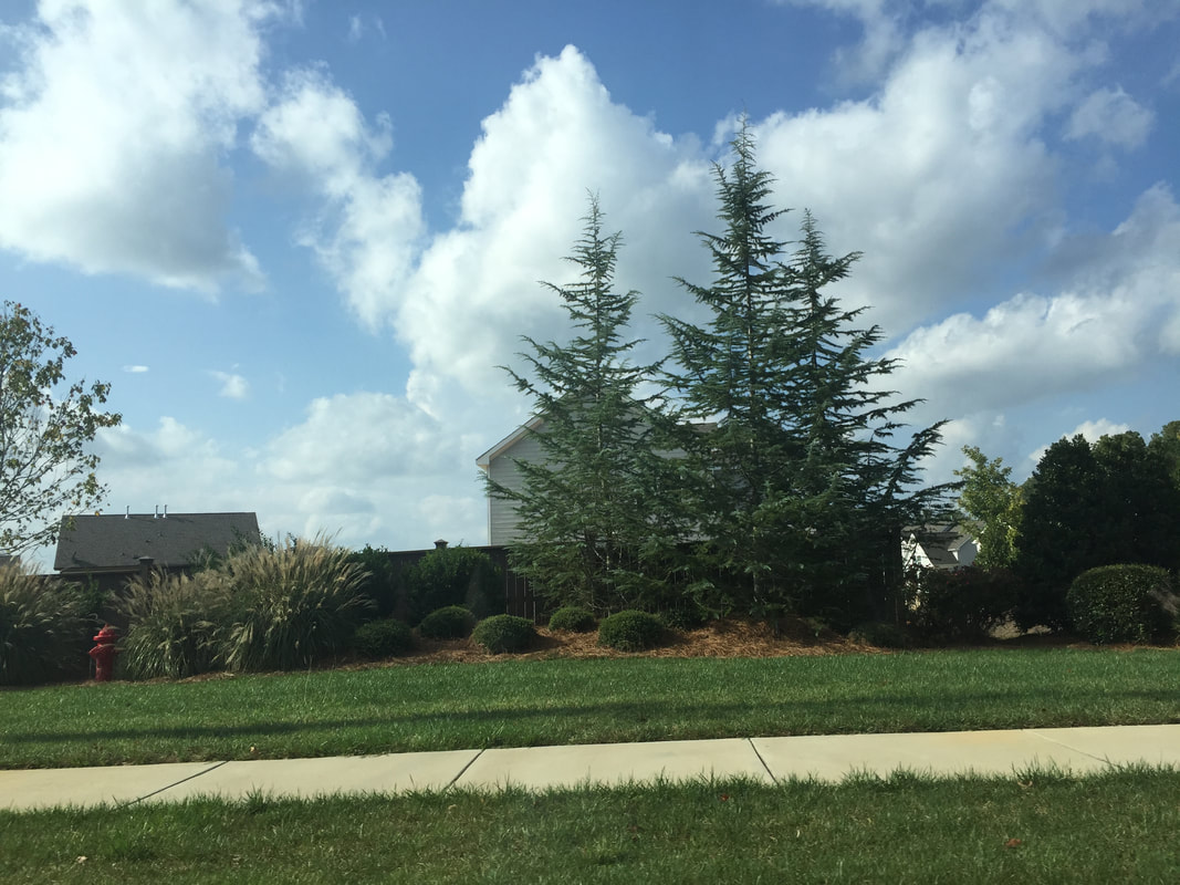
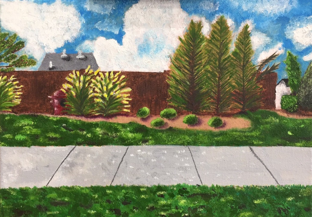
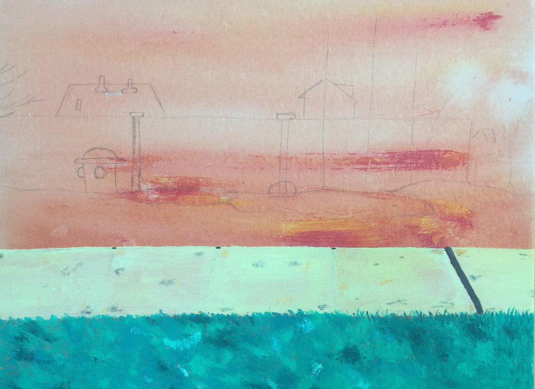
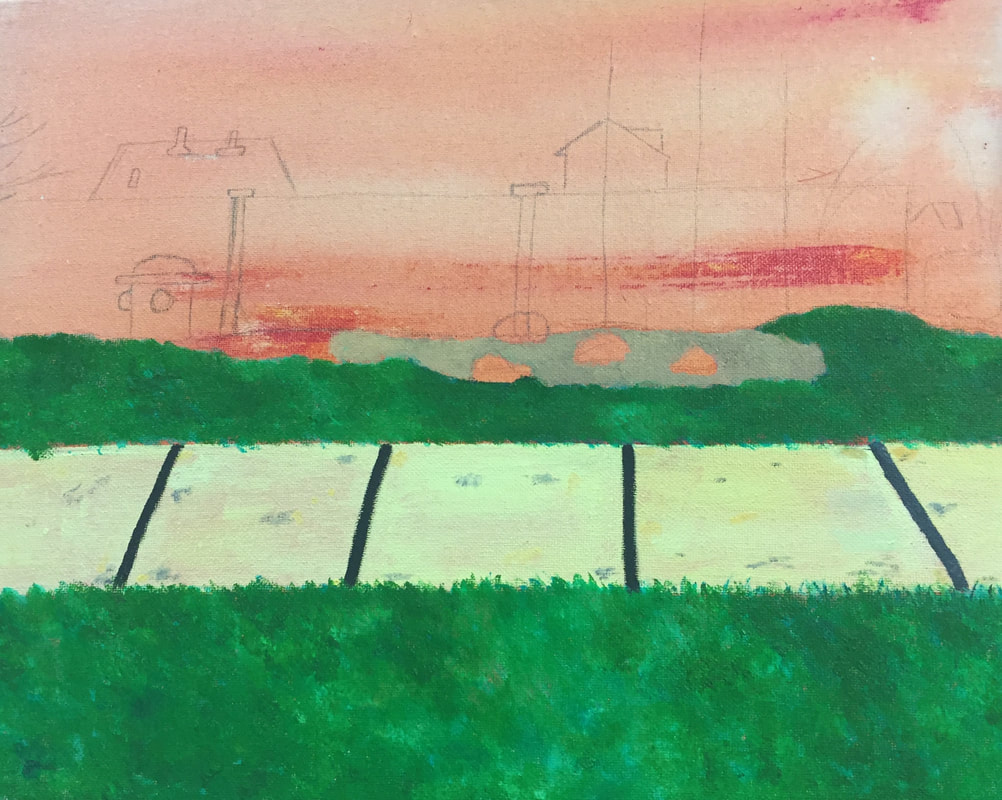
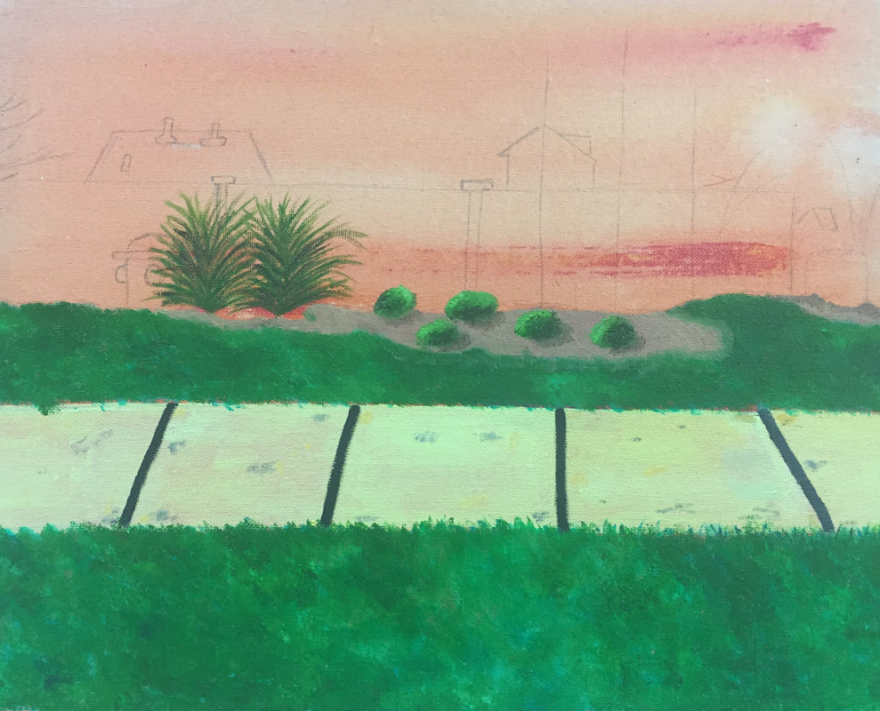
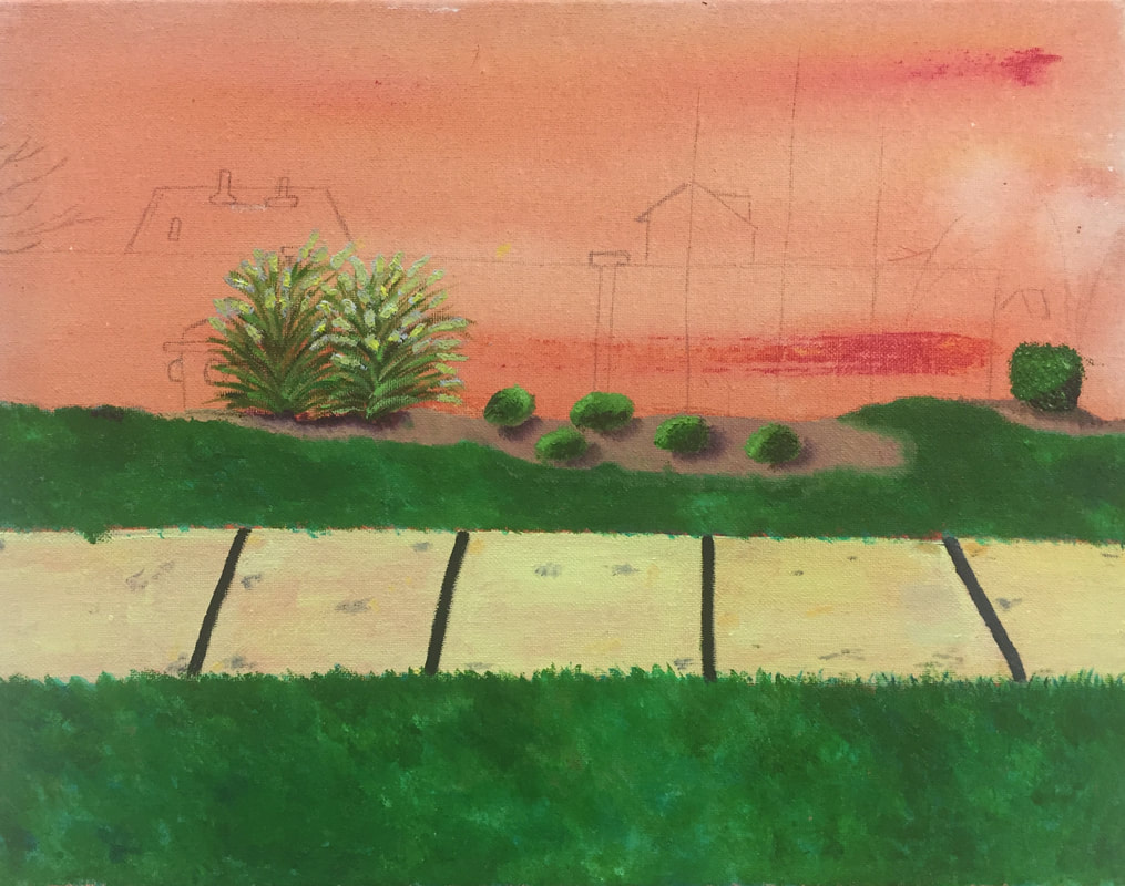
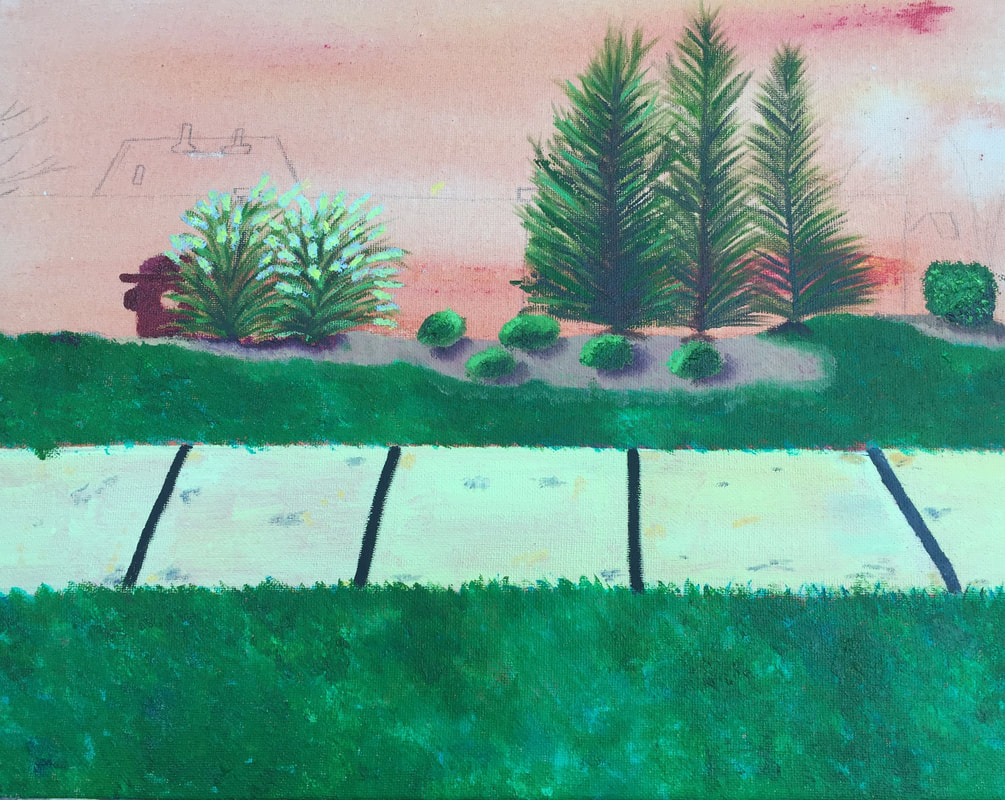
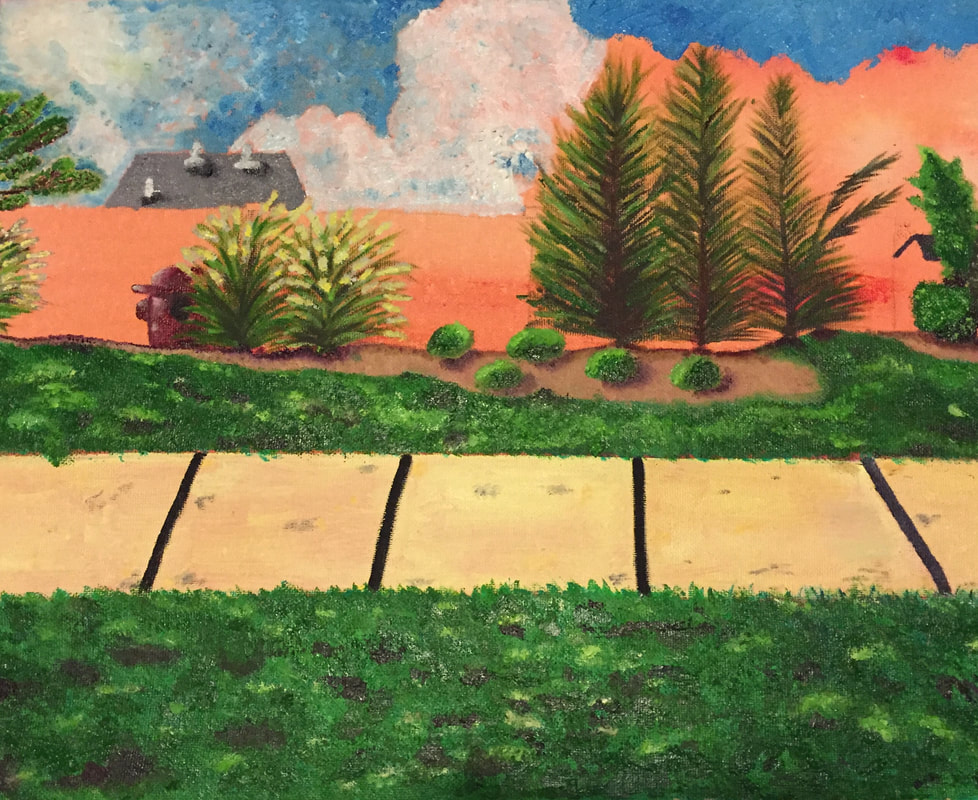
Landscape Final
|
|
1. I believe my painting could of been neater and I could of worked more around the tree area where the trees meet the sky and could of added more paint so the base color wouldn't be seen through. Other than that I believe my painting had a pretty good result in the end.
2. For the colors being used in my painting I tried to use the same colors as seen in the reference photo but throughout the process of the painting I ended up elaborating in which colors I used. For example, in the ended up changing up the color of the sidewalk from a brownish-yellow to a gray with specs of white to show where the light hit. I also changed the dirt underneath the trees to a tan color in order to brighten up the area because it was already dull due to the color of the fence.
3. I created contrast in my painting by using different values of the color so it wouldn't all be one single shade. Towards the bottom of my painting it has darker colors like the grays and the grass area and that contrast with the top portion of my painting where the sky and trees are placed.
4. In order to create texture throughout my painting I used the palette knife in some of the bigger areas for example the grass, but on areas like the small yellow flowers on the bush I used a small pointed brush. To help establish where there was light source I used white paint while when showing where there was shadows I used blacks and purples.
5. I was able to create depth in my painting by making objects that were further away smaller and darker to contrast from objects that were up closer.
6. I think the technique that made my painting most successful was being able to create values throughout to help demonstrate where the light hit certain part and show where there were shadows. Another technique that made my painting successful was using the palette knife for the grass and the sky which also made the painting process go much faster than it would of with the brush.
7. I struggled the most when making the trees because I painted them first and afterwards I painted the fence and the sky causing the base color to be see through. In order to improve, I can add more layer of paint onto the tree or add more branches to stop the base color from being see through. I had a hard time with sidewalk because the first time I did it I put the lines in the wrong perspective. In order to fix that I had to wait until the paint got dried so I could go over it fix it.
8. Overall I'm proud of my final outcome. I personally feel as if I was the most successful when creating the grass and not making it one single color and being able to incorporate purples to create where there was no light hitting and using a it of white to contrast. The small bushes were also a success in the way I was able to show where there was light and using purple/red to create a shadow underneath.
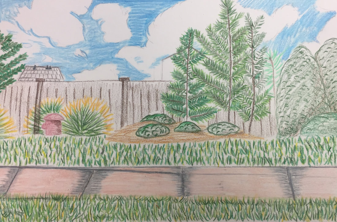
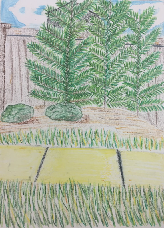
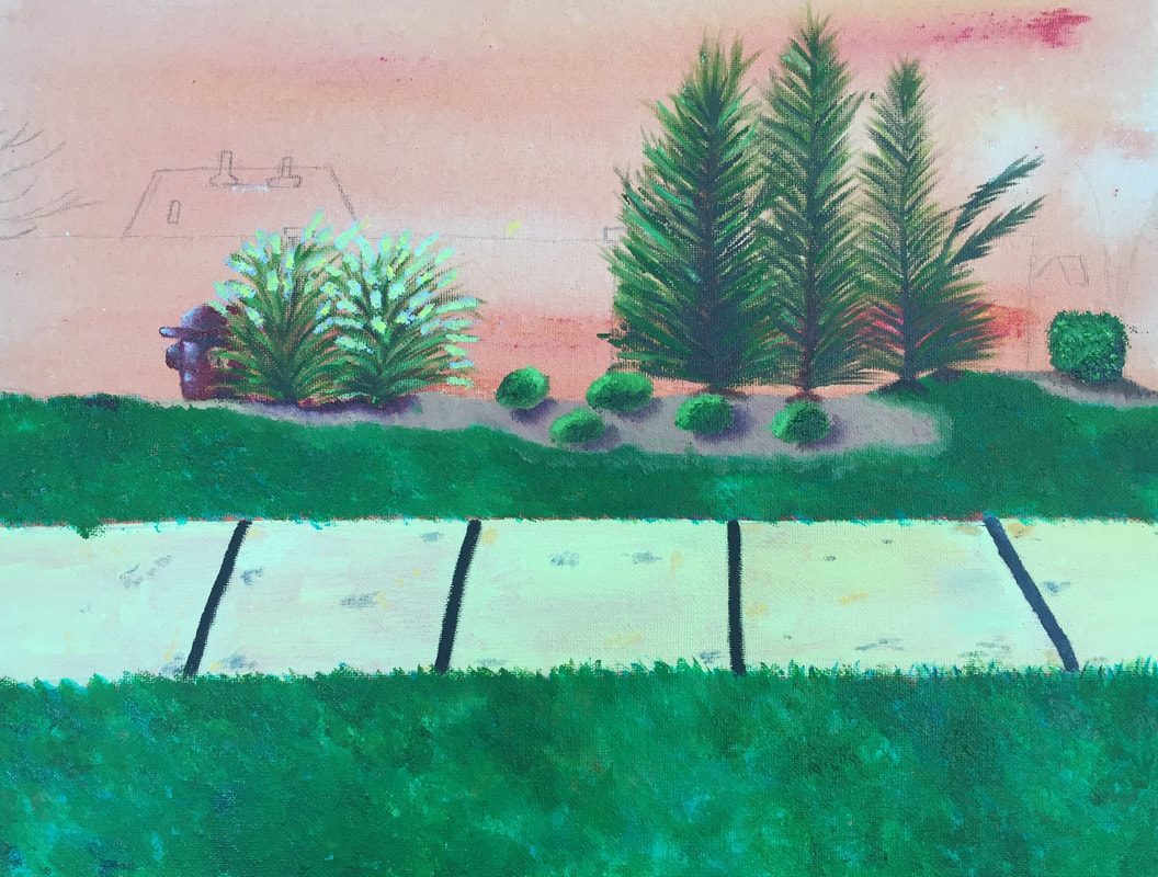
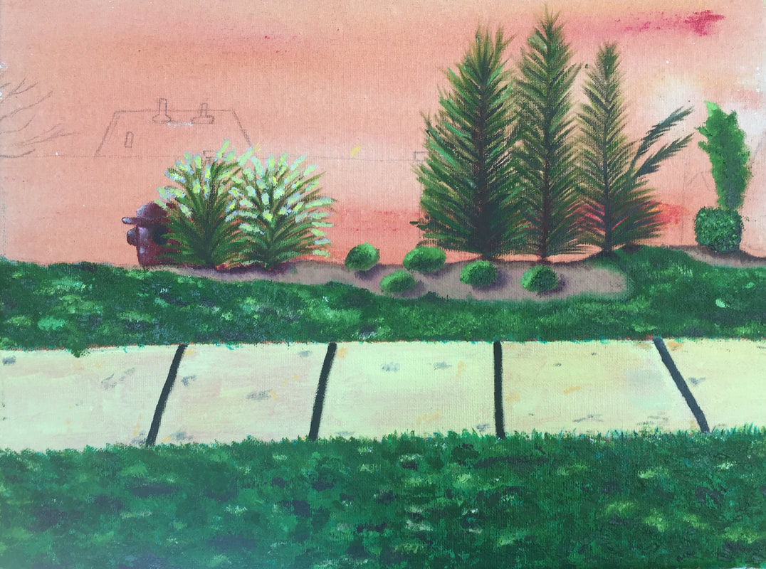
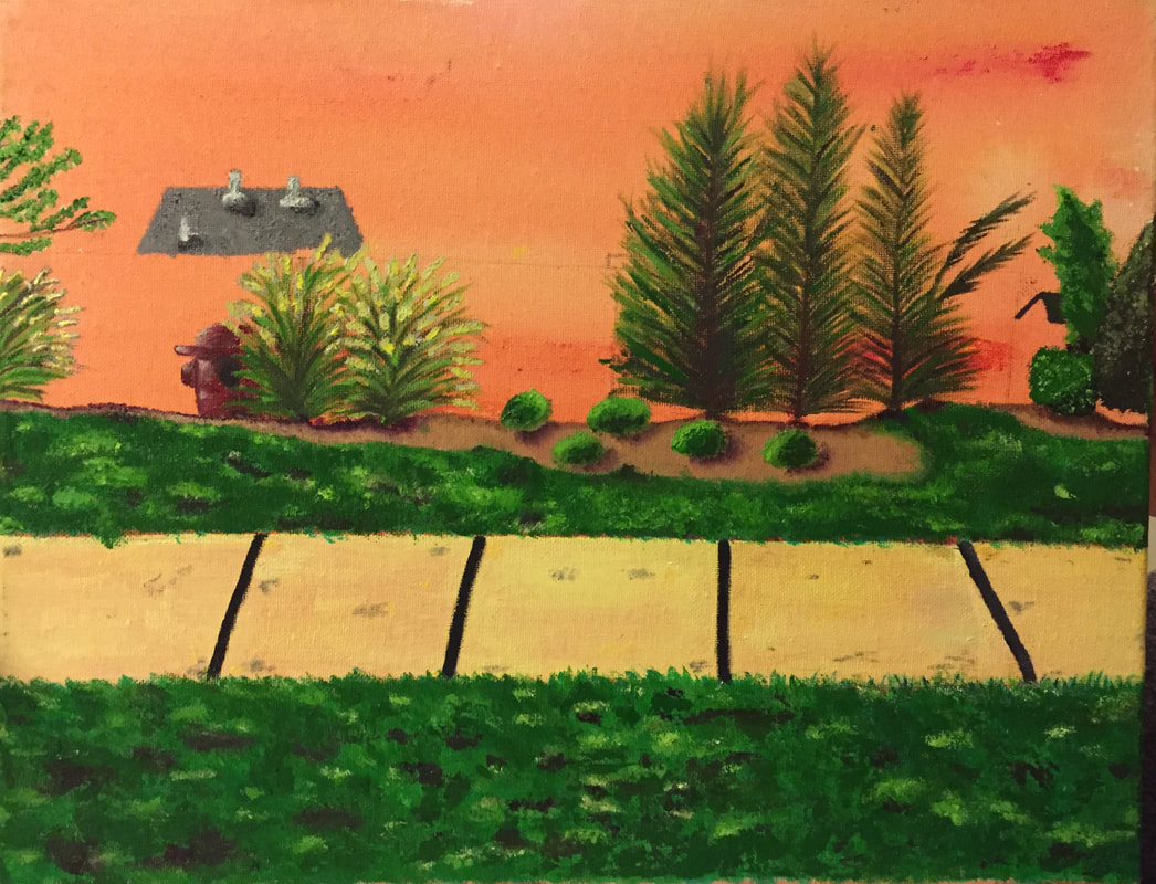
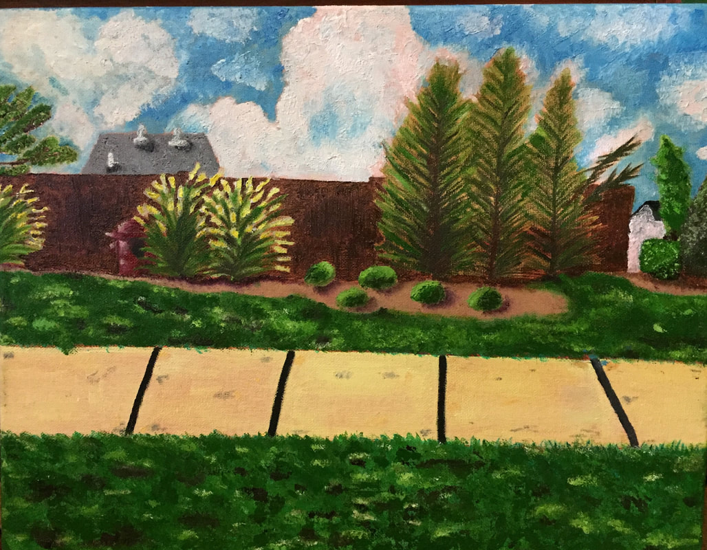
Landscape Sketches and Process
Oil Paint Practice
This was first working with oil paints and to be able to work with a palette knife instead of using a paint brush was a knew experience. I actually quite enjoyed it but I found it difficult to make precise lines.
|
I think I did a good job with the oil paints considering it was my first time but I did struggle a bit because when adding a little shade to a dark on the lighter shade got lost. Overall this experience with oil paint was a good experience.
|
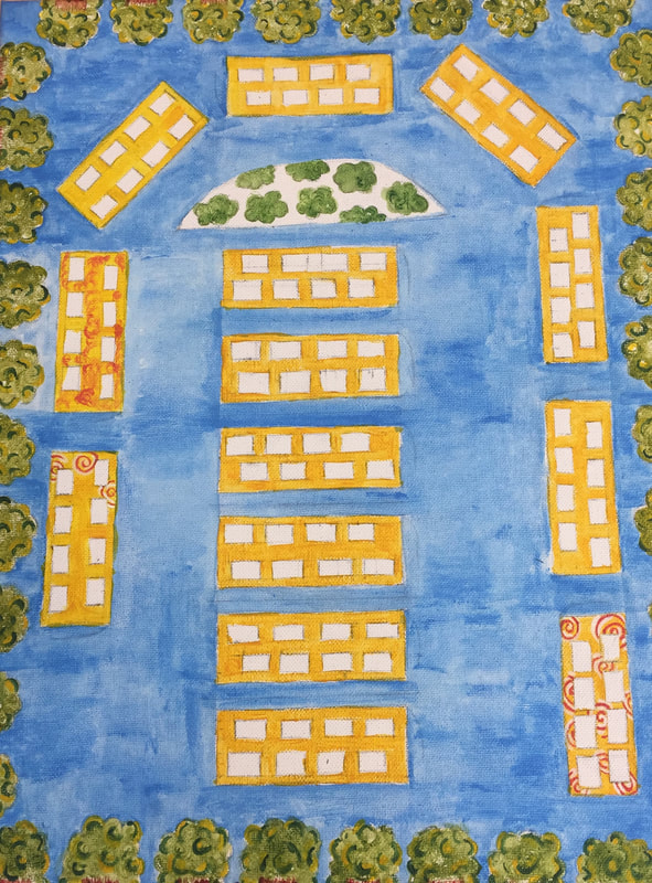
Hunderwasser Final Project
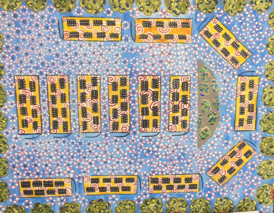
1. With craftsmanship for my painting I think I did a good job with making sure my painting neat. I spent most of my time with the details in the bus and the background. At the end I do believe that the detail in the background was too much but it worked and pulled everything together. Overall I think that my project was neat and was well executed.
2. I incorporated Hunderwasser's style into my protect by making my paint two dimensional when it originally came from a real life object. I also used repetition of colors and repeated patterns like the circles throughout my painting.
3. I really didn't have a specific color scheme when I started my project and I didn't know where I wanted to place the colors. Towards the end I decided to use cool colors like the the blues, greens and purple in the back or under color. In contrast of the cool colors I used reds, yellows and also included the color pink. I repeated these colors throughout my painting but I do wish I would done a dark shade of pink in the bus instead of the red and an different color other than purple.
4. When I started to do my painting my original idea was to make the bus the man focal point but at the end with the other different details I feel like they got lost throughout the painting. I wish I would of done something else the emphasis them .
5. I created texture throughout the trees by using different colors which included different shades of green and colors yellow and blue and incorporated gold. The pattern that I did the most throughout the painting was creating dots.
6. My border were trees that had shades of green, blue and yellow and I added the color gold with a sharpie. I also included the tree trunks that were painted brown with lines of red to create texture.
7. The only difficulty I had to face was during creating this painting was doing multiple layers and it was really time consuming making all the dots in the background.
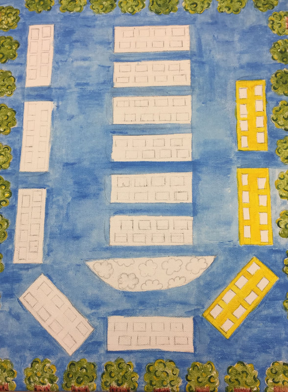
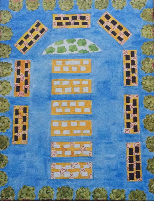
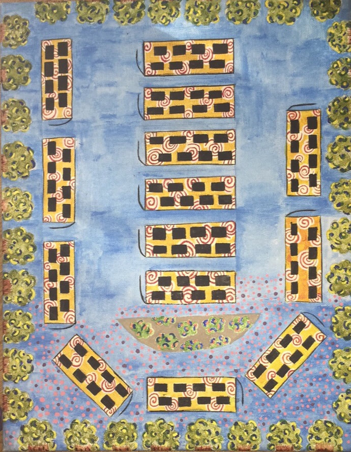
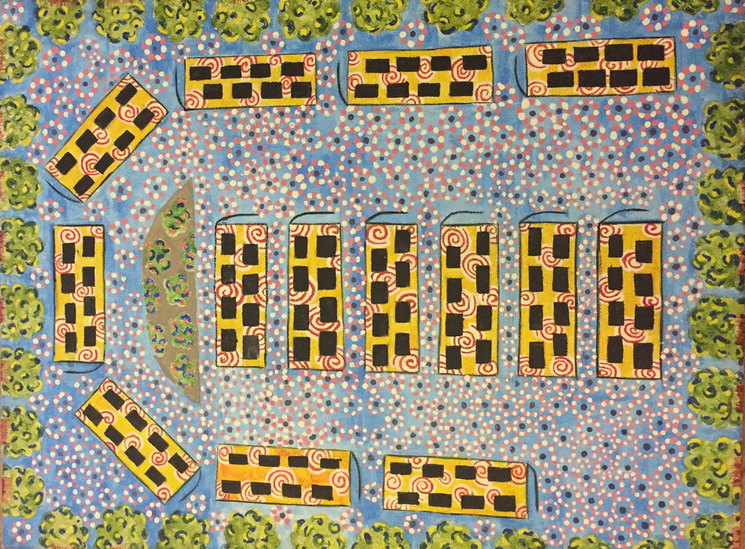
Hunderwasser Project Process Pictures
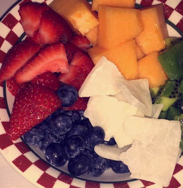
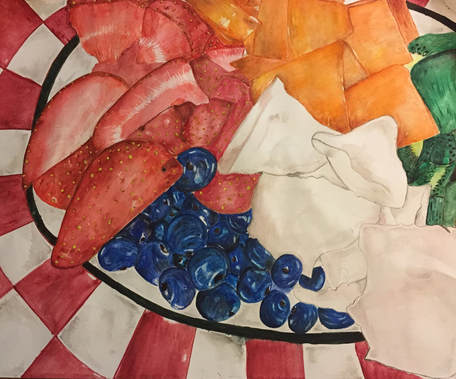
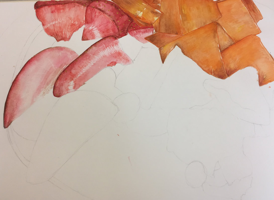
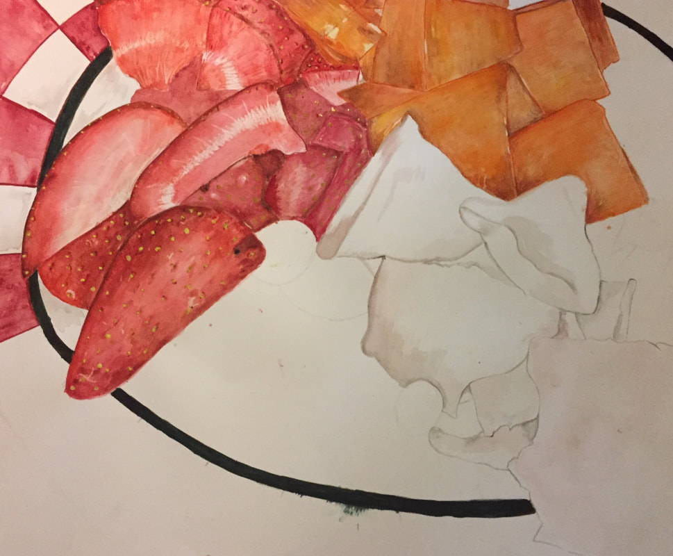
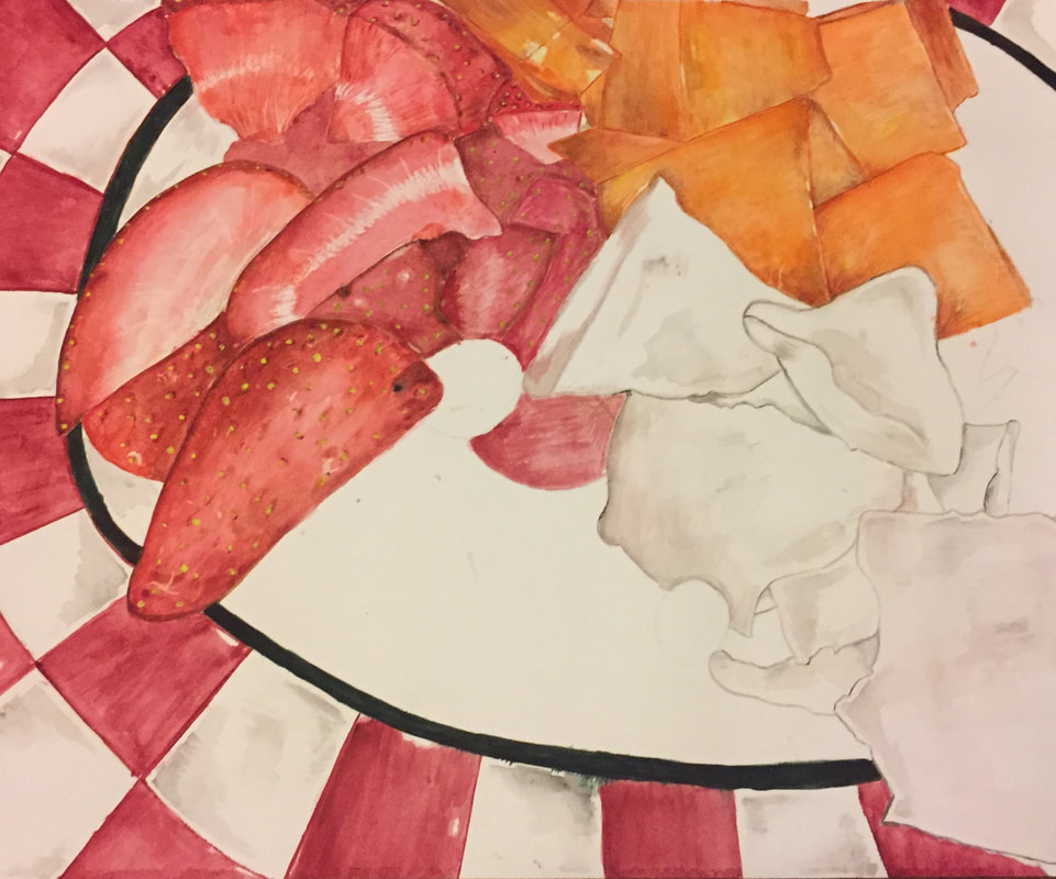
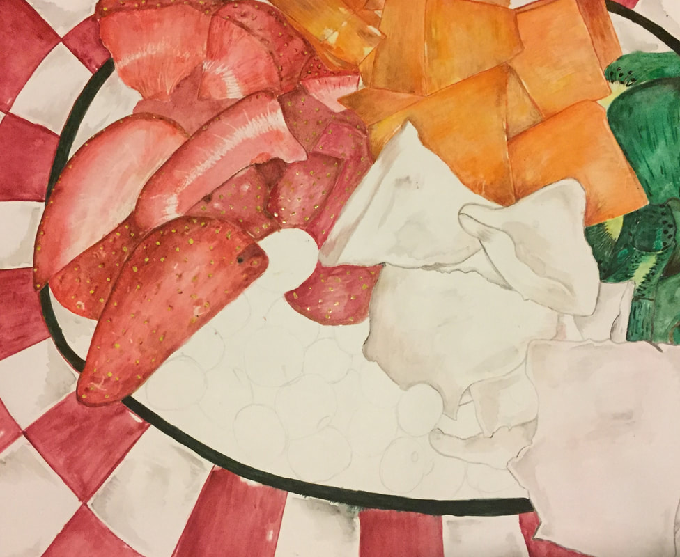
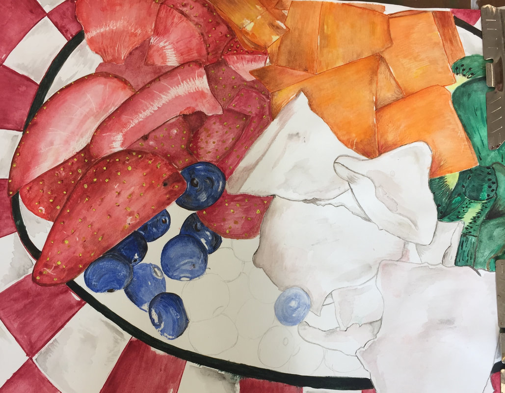
Watercolor Final Project
|
|
1. The watercolor techniques that helped me make this and improve my painting was dry on wet. This technique helped me improve my painting by allowing me to add more detail to the fruit for example the seeds on the strawberry. Another technique that really helped me improve my painting was wet on wet, this technique allowed me to create a shadow on the bowl that the fruit was in and it allowed me to add some shades and details into the pieces of coconut so it wouldn't just be plain white.
2. Using transparent layers in the painting was important because it allowed to me make values from where the light hit the fruit to where no light hit the fruit.
3. My painting was successful because I tried to make the fruits be the center of attention my adding the most detail there. Unlike the plate in which it was in the most I did was add a bit of shadows to make it look more realistic. For this painting the most important thing was values to make everything look more realistic show how the fruits were on top of each other.
4. Yes, the color choice was an important factor because creating different shades and not sticking to the normal color allowed to show the different shades that were found on the fruit.
5. My craftsmanship wasn't the best I struggle to show where some pieces of fruit started and where they ended so some pieces look like they are overlapping each other. I also feel like it looks too flat and it doesn't seem as if the fruit were really in a bowl, it seems as if it was in a plate.
6. If I could do something different I would of spent more time on how the strawberries because I didn't like how they turned out and I feel like could of turned out at least a little bit better.
7. With this project I learned that it takes a lot of patience and you can't just rush the process.This had discouraged and encouraged my development in art because it makes me realize than not everything can be rushed so I have to learn to patience and not get frustrated.
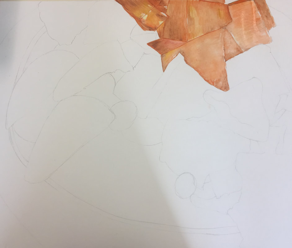
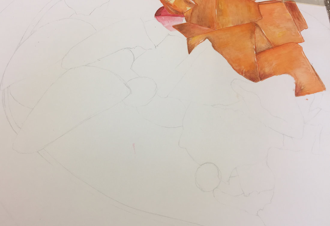
Watercolor Process Pictures
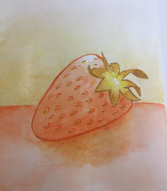
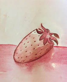
Watercolor Fruit
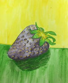
The first strawberry the color scheme I did was triadic.
|
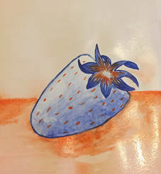
The color scheme I used for this strawberry was complementary.
|
For the second strawberry I did a analogous scheme.
|
The last color scheme I used was monochromatic
|
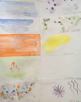
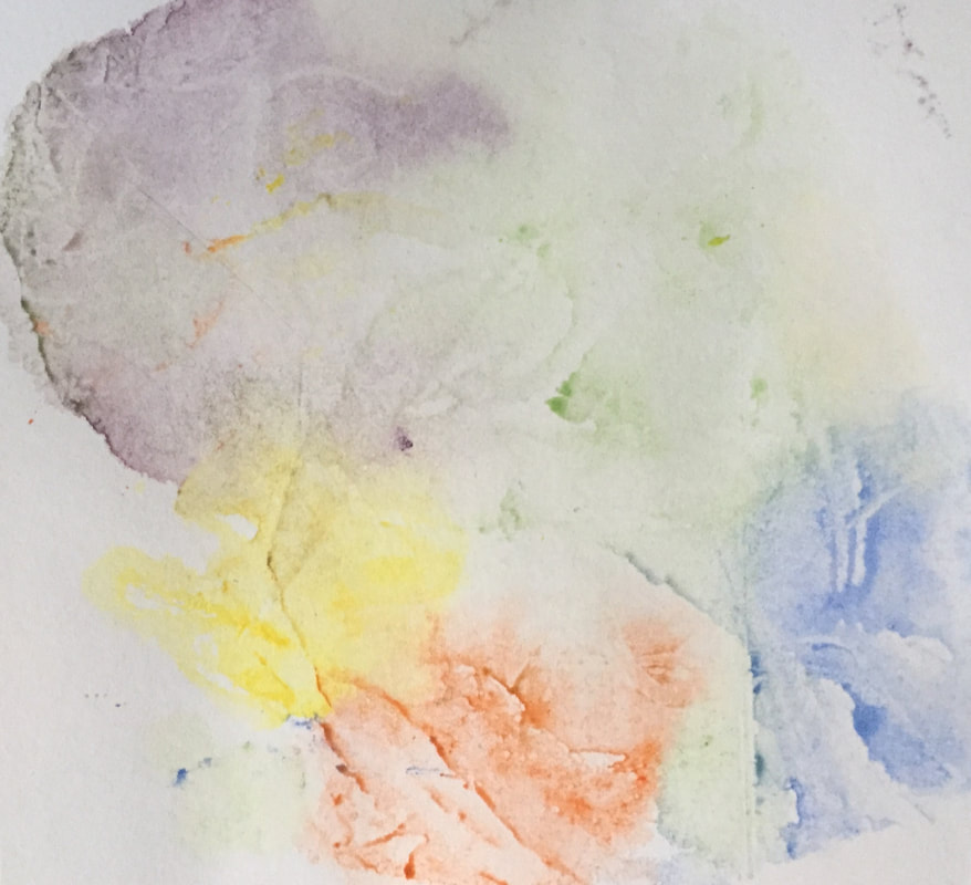
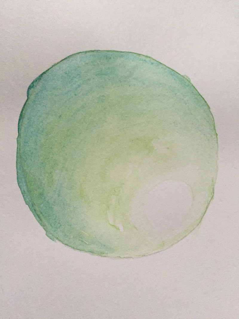
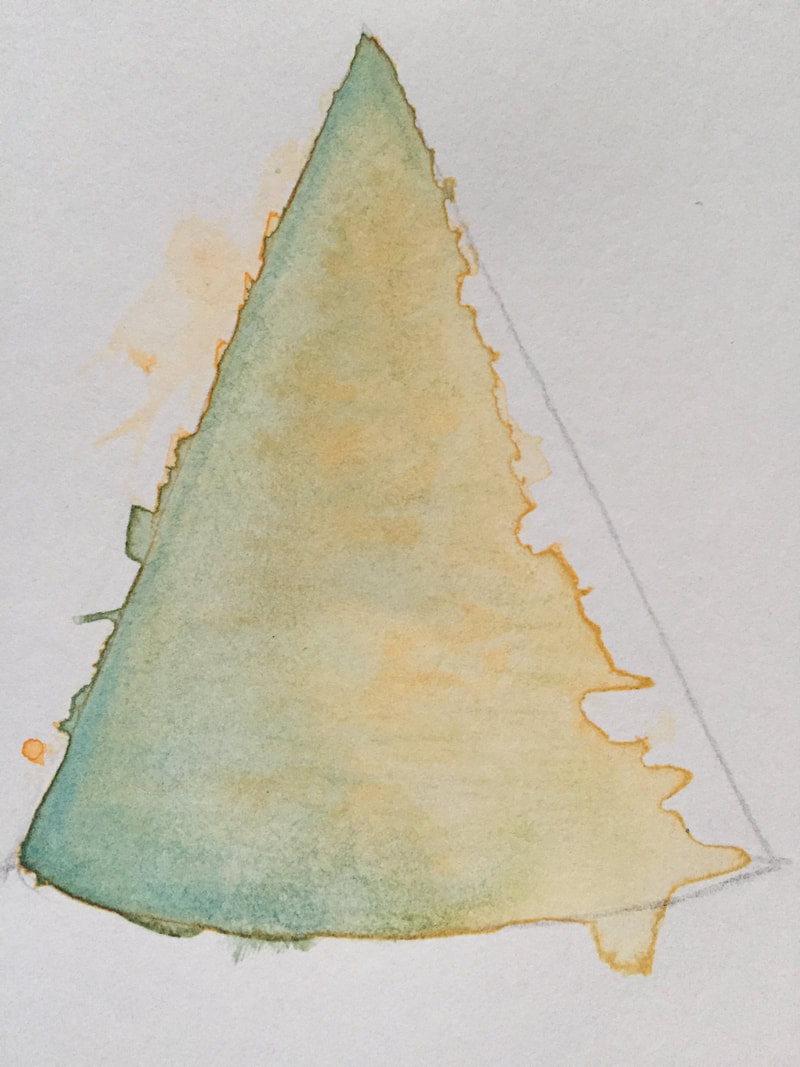
Watercolor Techniques
|
In class we were able to try out different techniques to use while using water color. On the left some of the techniques were dry brush, wet on wet and dry on wet. Meanwhile on the left, it shows the end results of using saran wrap.
|
|
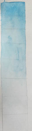
Value Chart and Forms
In the pictures below it's showing how to transiting from dark to light using watercolor.
|
|
|
