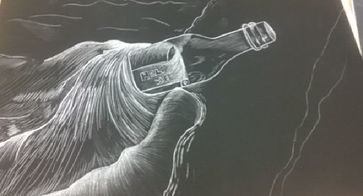
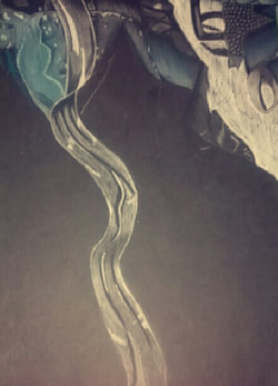
Scratchboard Final
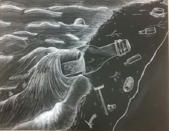
For the scratchboard project I decided to do a picture of a message in the bottle saying "help me" with other trash that has been pulled up to shore. The message behind my piece is help keep our oceans clean because if you throw something in a river, it'll eventually end up in the ocean and it can travel from miles until it lands some place half across the world from where it originally started. It's world wide issue and it's effect many things specifically ocean animals or other animals that capture food from the ocean, they think the trash is food when in reality it's just trash.
I used texture on the ocean the most to show the movement of the water moves with small waves and how it looks when it reaches the shore. I also added texture on the bottle to show where the light is hitting and on the paper I added texture to to show where the paper folds over and there's no light that hits it. I didn't really add too much texture on shore and on the trash which I think ruins the balance on my piece but if I could go back and add more texture I would to balance it out.
I implied movement by using lines and made some places more white than others. For the ocean I made lines to show how the water is moving. For example, I made the lines curve over the bottle to show that the bottle is on shore and its creating a small waves as the water crashes on the shore. I also implied movement to the the trash on the shore by adding lines near the objects to show how the objects were dragged by the water to where they are located now.
I demonstrated a wide range of shading values on the water the most for example on the top of the bottle where the water is going over it. I also added value on the paper inside the bottle to show where the light is hitting and where it's not. There is also values on the trash that are on shore. Overall I'm happy with the finished piece but if I could improve my piece I would add more thing to the shore to make it look less empty because there's too much back on that side of the piece.
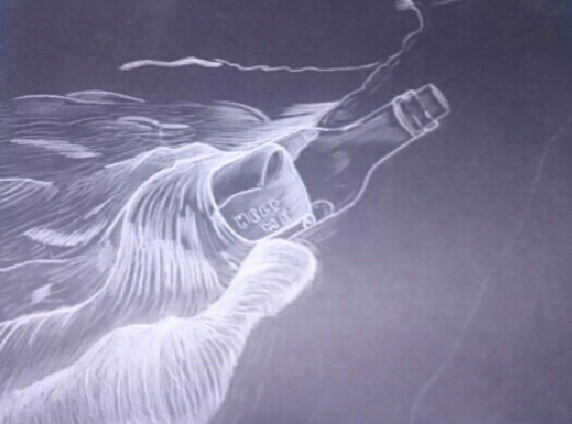
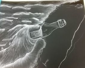
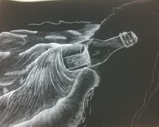
Scratchboard Process
|
|
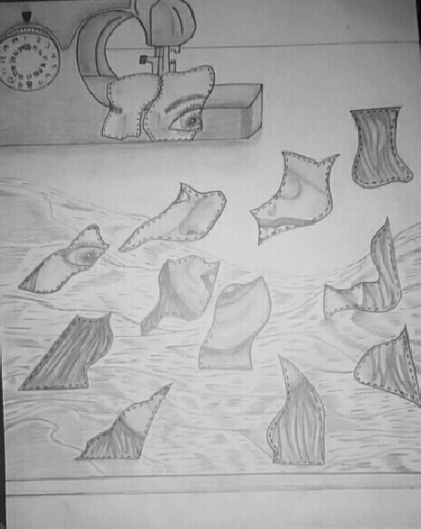
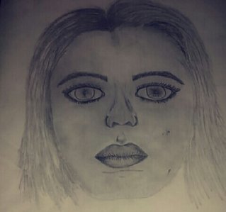
Final Self Portrait
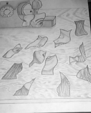
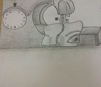
My drawing is a mechanical self-portrait, I consider it to be mechanical because I took my face and broke it down into pieces so later on the pieces of my face would be sewed back together by a sewing machine. I personally think I drawing was really successful compared to what I had originally envisioned. It is successful because I was able to add shadows on both the machine and on my face. I also managed to make the pieces of my face look like they were on the table instead of them floating in midair by using point perspective. I'm really proud on how this turned out, I just wish I had taken more time on the wooden desk to make it look more realistic.
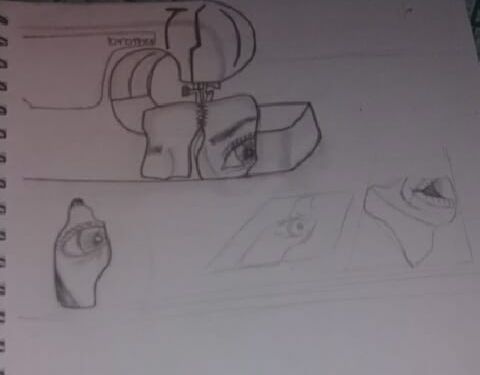
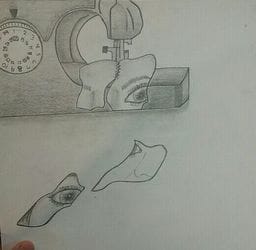
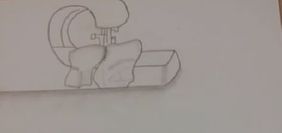
Self Portrait Process and Sketches
|
|
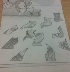
|
Skull Drawing
This is my skull drawing, I personally don't really like how it came out. I need more practice on drawing hair and noses.
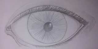
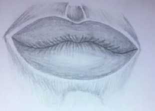
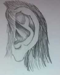
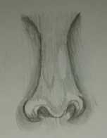
Facial Features
|
|
Opacity Final
1. I personally think it is neat beucase I tried erasing the smuggesh when there were some visible but I do feel like it could a bit more neat.
2. My backfround is a white wall like it was in the picture and I think it helped because it made the blue of the red stand out more and the jewerly. At the same time I feel like when you look at the art, you're eyes are attracted to the whiteness because its dark and bold.
3. I tried to stick with blacks, grays, and some white for most so the blue would stand out and that could be the point of attention. But I feel like I should for made the blacks darker so you can see how or when the piece of fabric folds and had it's figure.
4. I made contrast by using the black to make the blue stand out more and the white to make everything else around it stand out.
5. In order to show where there shadows I used back and tried blending dark blue and slowly decreased it into a lighter shade of blue and added some white in show where the light hit. That was hard because apart from that I also had to make the illusion of the dress being a plastic bag in which it is in.
6. As I have said before I choose the color white to be the background, I choose it because I thought it would make everything around it stand out more.
7. It is important to understand how to use prisma and pastels for example I used chalk pastels. Its important because you have to careful on how much you add and take away because you can either put way too much on. Or if you start blending it and you blend to much you can blend it to the point in which its completely off.
8. I had a hard time when I had to show where there was a new texture or design. Sp it looks like all the designs and textures are combined and just put together. I feel like I could of added more shade to show where one texture stopped and new one starts.
Opacity Process Pictures
|
|
The first picture I had just drawn the zipper of the bag in which my quinceanera dress was stored in and I had started drawing some of the background which included a hanger with a coat cover up for my dress and a white wall.The second picture, I had now darkened the background and had started drawing in the actual dress in the bag.
Smartie Final
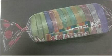
'This is the drawing of my smarties and I personally don't like it. I feel like its really dull but I think its mainly because of the colors I used to draw it. I do feel like I did a good job on showing where the plastic wrap was and where the light hit.
Candy Drawing
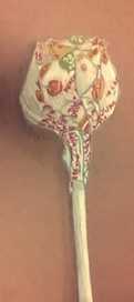
I drew a lollipop that was given to us during class.
|
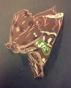
I drew a wrapper of a M&M's candy that was crumbled up.
|
Look At That View Final
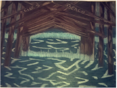
1. I tried creating a interesting point of view by using 2 point perspective. Overall I do think it was successful because you can tell where one thing ends and the other stops. The part I would say I didn't succeed was drawing the waves because they look nothing like waves.
2. It was important to know and understand the concept of perspective because then all the lines would be at the same place and the same size and mine weren't. They weren't because as they went farther away they got small and they got closer to each other to the point there wasn't no more space between them.
3. The colored pencils were important in the success of my piece because it help make my drawing look more realistic and makes it stand out more. Like the blue makes the browns pop out more.
4. The techniques I used was that I used black and white colored pencils to show where the shadows were located and where the light hit in the picture.
5. As things got further away they got smaller meaning they had less detail for example the ocean in the back you can't see the waves moving it just looks plain dark blue. Also as it got further it seem to get darker.
6. The obstacles I found during this was drawing the lines and making them all go to a current point and making sure the lines were drawn straight. Another obstacle I faced was making sure you could see where on object ended and where the other started because as things got further away they would get closer and smaller.
7. I think how we were taught was perfectly fine because with everything we were taught made me successful in my drawing. I do indeed feel like I was prepared for this project and because of this i was successful.
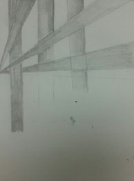
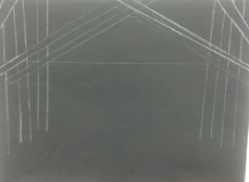
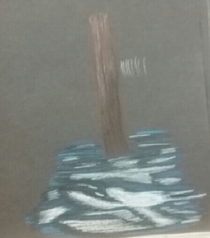
Look At That View Sketches
|
|
|
The picture on the left is a sketch that I did in my notebook and it was done in two point perspective. The one in the middle was me starting my final and in the last picture was practicing with color before I started my final project.
Colored Pencil Studies
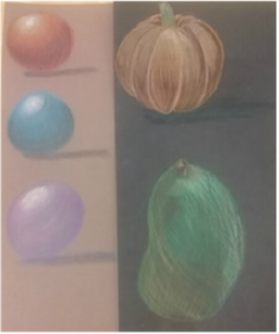
When we learned how to use colored pencils we learned three different methods to do values using colored pencil. We practiced those methods by drawing circles and creating value. Once we were comfortable we drew other things like the pumpkin and the pair.
Ribbon
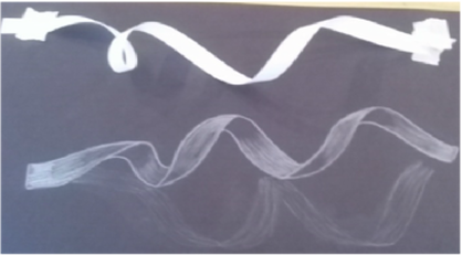
This was an activity we did in class where we learned how to do lights and shadows using a white pencil on black paper.
Still Life
|
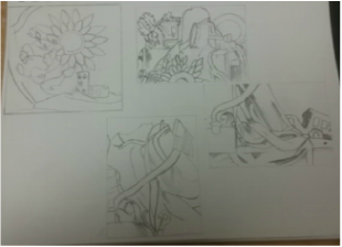
In class before we could do our final drawings we had to do four compositional sketches in out note book. here are mine
|
I personally think I did a good job on blending and transitioning from the lights to the darks. I feel like it was to light and wasn't bold enough to see where a object started and ended.
2. I think my values and shadows were realistic and I tried it vary the amounts of values included on my drawing. Values are important because they make a drawing look more realistic and it allows you to see where the light hits a object and where there is no light being hit.
3. Yes, there is a clear source of light, I personally feel like a picked a area that got a lot of light because there is so much white in my drawing.
4. I feel like compositional sketches are important because they allow you to see how and where you want to place things. They allow you to practice and see the amounts of color you want before you get to your final.
5. My final piece was successful inn the way I did the shadows and how I transitioned from the lights to the shadows and how i tried to make it as realistic as possible.
6. I think they're okay.
7. Yes because it creates different kinds of shadows and lighting.
8. Center of interest is the white blanket and its extends throughout the drawing.
9. I feel like I should of managed my time more carefully and I could of worked more on making the drawing a bit more darker in current areas.
10. The biggest challenge I faced during this was trying to figure out where to place the shadows and how dark to make them.
11. I learned how to transition from light to dark ad how adding shadows can make a drawing look completely different.
Final Fabric
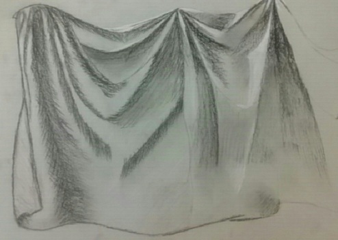
1. Yes, I feel like I did use a wide range of values in this drawing. This is evident because you can tell where the light hits the fabric to where there is no light hitting the fabric.
2. My practice helped with making my final by helping me improve in the parts that I was weakest at which would say be the shadows and some parts is the transitioning from the lights to darks.
3. For this drawing I used the charcoal pencil and at times I used the white pencil to help me show where the light was hitting the fabric. Overall I think I did a good job with transitioning from the lights to darks.
4. It shows where there are folds and where the light hits because its white in those sections. You are also able to tell where there are shadows because it's dark in those sections.
5. If I could recreate this piece I would practice more with drawing with charcoal because I wasn't here for the days the class practiced so I didn't have as much practice as the others. I would work more on the blending and transitioning my colors.
Practice Fabric
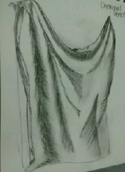
In this picture I used charcoal pencil which I prefer to use more than vine charcoal.
|
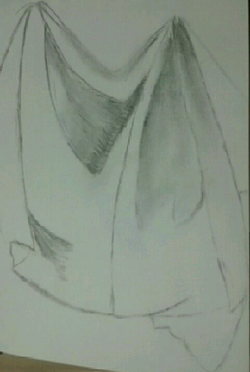
In this picture I used vine charcoal for my practice, which I personally don't like.
|
Shading Shapes
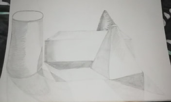
After doing our practice with shading shapes and learning how to do the value chart. We got objects which were then set in the middle of the table and we assigned to arrange them in a current position and draw them and add value into them.
Value Chrart and Practice
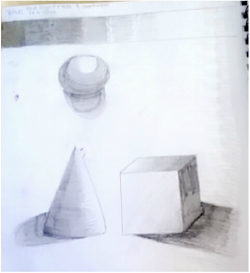
We drew a value scale of nine colors from the darkest color to the lightest. then we got practice objects to draw and shade them in and make them have a value chart from where the light hit to where the light light didn't hit making a shadow.
Practice Room Drawing
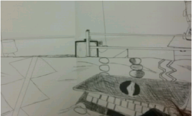
|
|
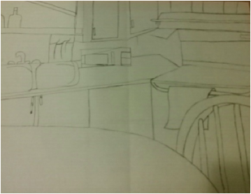
1. Yes, I used fluid line and this is evident because you cause see where I went back and forth to make the liner bolder.
2. I personally wouldn't consider this successful because I don't like how it looks. It has too much blank space in the background. But my practice on doing contour lining made it a bit easier for me and it helped me not get as frustrated as fast as I normally would.
3. The difference between my contour drawing and a outline drawing is well actually there's not much different because outline drawing doesn't have any form of shading. My contour drawing doesn't have much shading included in it.
4. My interpretation is essential in capturing the look of the room because I tried the best I could to make sure I drew every piece of furniture that was included in the room I drew.
5. The first thing I learned from this was to have the patience and that drawing something can't be rushed. If I had to create this I would add more shading into the drawing so it doesn't look too blank and looks at bit more realistic
Backpack Contour
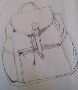
This drawing has the same concept of the last two drawings. We had to draw our book bags and had to draw it as best as we could without lifting up our pen.
Contour Hand Drawings
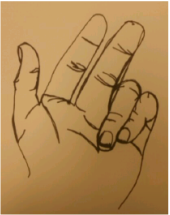
Modified Contour
This was similiar to the blind contour drawing but for this activity you could actually look at the paper and see what you were drawing. But you still could not lift the pen off of your paper.
This was similiar to the blind contour drawing but for this activity you could actually look at the paper and see what you were drawing. But you still could not lift the pen off of your paper.
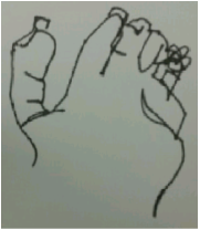
Blind Contour
One of the first days in drawing we were told to take out our sketchbook and a pen. Then move our bodies a direction so you were facing away from your sketchbook but so you were still able to have a hand on the sketchbook and draw. We were told to put our hands in one position and draw it but you can't lift your hand and nor look at your paper. Overall I think I did pretty good.
One of the first days in drawing we were told to take out our sketchbook and a pen. Then move our bodies a direction so you were facing away from your sketchbook but so you were still able to have a hand on the sketchbook and draw. We were told to put our hands in one position and draw it but you can't lift your hand and nor look at your paper. Overall I think I did pretty good.
